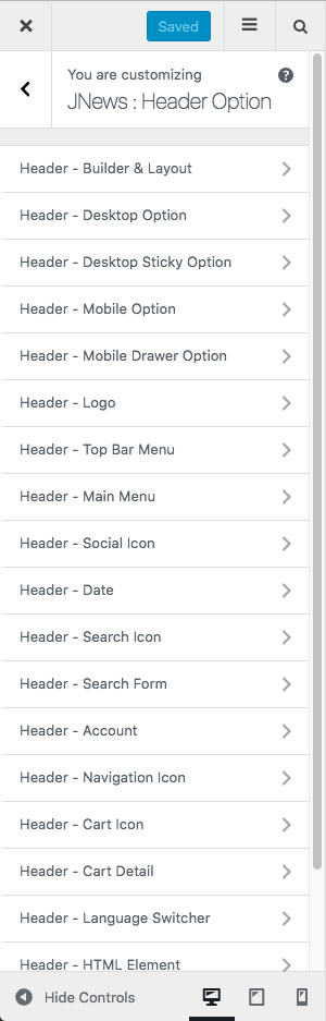
On JNews : Header Option, there are several section options that you will find:
-
- Header – Builder & Layout
- Header – Desktop Option
- Header – Sticky Option
- Header – Mobile Option
- Header – Mobile Drawer Option
- Header – Logo
- Header – Top Bar Menu
- Header – Main Menu
- Header – Social Icon
- Header – Date
- Header – Search Icon
- Header – Search Form
- Header – Account
- Header – Navigation Icon
- Header – Cart Icon
- Header – Cart Detail
- Header – Language Switcher
- Header – HTML Element
- Header – Button Element
- Header – Vertical Menu
- Header – Dark Mode
If you’re not familiar with JNews Customizer yet, you might need to check our Customizer Overview.
1. Header – Builder & Layout
In this part, you can choose header layout for your website.
- Starter Layout
Choose a desired layout for header. We provide 7 kinds of header for the best website’s look.
- We will reset all options inside header builder panel when you click one of the starter layout
- You can modify your header using header builder like normal after choosing header builder layout.
2. Header – Desktop Option
In this part, you can setup several options for desktop navigation.
- Dekstop Header Width
Choose header container width that you want to use.
Dekstop Header – Topbar
- Top Bar Height
Set height size of top bar height. - Top Bar Scheme
Choose scheme that you want to use for top bar. - Background Color
Set background color for top bar. - Border Bottom
Set border bottom color for top bar. - Side Border
Set side border color for top bar. - Default Text Color
Set default text color for top bar. - Default Link Color
Set default link color for top bar. - Top Bar Border – Top Height
Set border top height for top bar. - Top Bar Border – Top Color
Set border top color for top bar.
Dekstop Header – Middle Bar
- Middle Bar Height
Set middle bar height. - Middle Bar Scheme
Choose scheme for middle bar. - Middle Bar Background Color
Set background color for middle bar. - Middle Bar Background Image
Set background image for middle bar. - Background Repeat
Set background repeat for middle bar. Please note, this option will appear and work if you set Middle Bar Background option. - Background Position
Set background position for middle bar. Please note, this option will appear and work if you set Middle Bar Background option. - Attachment Background
Set background attachment for middle bar. Please note, this option will appear and work if you set Middle Bar Background option. - Background Size
Set background size for middle bar. Please note, this option will appear and work if you set Middle Bar Background option. - Middle Bar Border – Bottom Height
Set border bottom height for middle bar. - Middle Bar Border – Bottom Color
Set border bottom color for middle bar. - Default Text Color
Set default text color for middle bar. - Default Link Color
Set default link color for middle bar.
Desktop Header – Bottom Bar
- Bottom Bar Height
Set height size of bottom bar. - Boxed Navbar
Turn on this option to make bottom bar have boxed layout. - Fit Width Navbar
Turn on this option to make bottom bar have fit width effect. - Navbar Border
Turn on this option to add border for bottom bar. - Navbar Shadow
Turn on this option to add shadow for bottom bar. - Menu Scheme
Choose menu scheme for bottom bar. - Bottom Bar Background Color
Set background color for bottom bar. - Border Color
Set border color for bottom bar. - Default Text Color
Set default text color for bottom bar. - Default Link Color
Set default link color for bottom bar. - Border Top Height
Set border top height for bottom bar. - Border Top Color
Set border top color for bottom bar. - Border Bottom Height
Set border bottom height for bottom bar. - Border Bottom Color
Set border bottom color for bottom bar.
3. Header – Desktop Sticky Option
In this part, you can setup several options for desktop sticky navigation.
Sticky Bar Setting
- Menu Following Mode
Choose menu following mode for sticky bar. - Header Sticky Width
Set sticky bar width. - Sticky Bar Height
Set sticky bar height. - Boxed Navbar
Turn on this option to make sticky bar have boxed layout. - Fit Width Navbar
Turn on this option to make sticky bar have fit width effect. - Navbar Border
Turn on this option to add border on sticky bar. - Navbar Shadow
Turn on this option to add shadow on sticky bar.
Sticky Bar Style
- Menu Scheme
Choose menu scheme for sticky bar. - Sticky Bar Background Color
Set background color for sticky bar. - Border Color
Set border color for sticky bar. - Default Text Color
Set default text color for sticky bar. - Default Link Color
Set default link color for sticky bar. - Border Bottom Height
Set border bottom height for sticky bar. - Border Bottom Color
Set border bottom color for sticky bar.
4. Header – Mobile Option
In this part, you can setup several options for mobile navigation.
- Menu Following Mode
Choose menu following mode for mobile navigation. - Mobile Background Color
Set background color for mobile browser.
Mobile Header – Top Bar
- Top Bar Scheme
Set top bar scheme. - Top Bar Background Color
Set background color for top bar. - Default Text Color
Set default text color for top bar. - Default Link Color
Set default link color for top bar.
Mobile Header – Middle Bar
- Middle Bar Scheme
Choose middle bar scheme. - Middle Bar Height
Set middle bar height. - Background Color
Set background color for middle bar. - Default Text Color
Set default text color for middle bar. - Default Link Color
Set default link color for middle bar. - Bottom Bar Border Height
Set border height for bottom bar. - Mobile Top Bar Border – Top Color
Set border top color for mobile menu top bar.
Mobile Header – Below Header Menu / Scrolling Mobile Menu
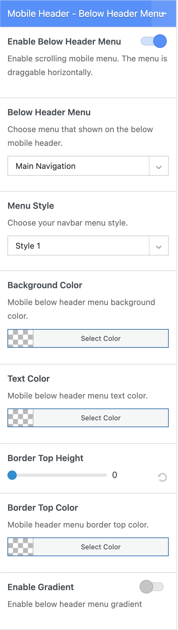
- Enable Below Header Menu / Scrolling Mobile Menu
Show below header menu on mobile view - Below Header Menu
Choose a menu to set as below header menu / Scrolling mobile menu - Menu Style
Choose below header menu style - Background Color
Set background color for below header menu. - Text Color
Set text color for below header menu. - Border Top Height
Set top border to separate header and menu. - Border Top Color
Set top border color. - Enable Gradient
Set gradient background color for below header menu.
5. Header – Mobile Drawer Option
In this part, you can setup several options for mobile drawer navigation.
- Drawer Scheme
Choose drawer scheme.
- Use New Dropdown Menu
You can enable this option to use the new JNews mobile dropdown menu. In the new dropdown menu, the user is only redirected to the parent menu link when clicking the menu name. Clicking the arrow or white space will only open/close the dropdown without redirecting the user to the menu link. - Background Color
Set background color for mobile drawer. - Overlay Color
Set overlay color for mobile drawer. - Mobile Drawer Background Image
Set background image for mobile drawer. - Background Repeat
Set background repeat. Please note, this option will appear and work if you set Mobile Drawer Background Image option. - Background Position
Set background position. Please note, this option will appear and work if you set Mobile Drawer Background Image option. - Attachment Background
Set attachment background. Please note, this option will appear and work if you set Mobile Drawer Background Image option. - Background Size
Set background size. Please note, this option will appear and work if you set Mobile Drawer Background Image option.
6. Header – Logo
In this part, you can setup several options for logo.
- Header Logo
Upload an image as logo for header. - Header Logo Retina
Upload a retina image as retina logo for header. - Logo Spacing
Insert logo spacing. You can use px or em unit. - Header Logo Alt
Insert alternate text for header logo. - Sticky Menu Logo
Upload an image as logo for sticky menu. - Sticky Menu Logo Retina
Upload a retina image as retina logo for sticky menu. - Sticky Menu Alt
Insert alternate text for sticky menu logo. - Mobile Device Logo
Upload an image as logo for mobile device. - Mobile Device Logo Retina
Upload a retina image as retina logo for mobile device. - Mobile Device Logo Alt
Insert alternate text for mobile device logo.
7. Header – Top Bar Menu
In this part, you can setup several options for top bar menu.
Dektop – Top Bar Menu
- Text Color
Set text color for top bar menu. - Menu Hover Color
Set menu hover color. - Drop Arrow Color
Set drop arrow color. - Submenu Background
Set background color for top bar submenu. - Submenu Text Color
Set text color for top bar submenu. - Submenu Background Hover Color
Set background hover color for top bar submenu. - Submenu Border Color
Set border color for top bar submenu.
8. Header – Main Menu
In this part, you can setup several options for main menu.
Main Menu Style
- Menu Style
Choose menu style. - Menu Text Color
Set menu text color. - Menu Hover Line Color
Set menu line color when hover - Menu Hover Background Color 4
Set menu background color when menu hover. Please note, this option will appear and work if you choose Style 4 on Menu Style option. - Menu Hover Text Color
Set menu text color when menu hover.
Main Submenu Style
- Submenu Arrow Icon Color
Set submenu arrow icon color. - Submenu Background Color
Set background color for submenu. - Submenu Text Color
Set submenu text color. - Submenu Hover Background Color
Set hover background color for submenu. - Submenu Hover Text Color
Set hover text color for submenu. - Submenu Border Color
Set border color for submenu.
Mega Menu
- Subcategory News Feed Background Color
Set background color for subcategory news feed. - Subcategory News Feed Border Color
Set border color for subcategory news feed. - Subcategory News Feed Text Color
Set text color for subcategory news feed. - Subcategory News Feed Hover Text Color
Set hover text color for subcategory news feed. - Subcategory News Feed Hover Background Color
Set hover background color for subcategory news feed. - News Feed Background Color
Set background color for news feed. - News Feed Overlay Background Color
Set overlay background color for news feed. - News Feed Preloader Color
Set preloader color for news feed. - News Feed Text Color
Set text color for news feed. - Tags Heading Color
Set tags heading color. - Tags List Color
Set tags list color. - Separator Border Color
Set separator border color. - Nav Arrow Color
Set nav arrow color. - Nav Arrow Background Color
Set background color for nav arrow. - Nav Arrow Border Color
Set border color for nav arrow. - Nav Arrow Hover Color
Set hover color for nav arrow. - Nav Arrow Hover Background Color
Set hover background color for nav arrow. - Nav Arrow Hover Border Color
Set hover boder color for nav arrow. - Nav Arrow Disabled Color
Set color when nav arrow disabled. - Nav Arrow Disabled Background Color
Set background color when nav arrow disabled. - Nav Arrow Disabled Border Color
Set border color when nav arrow disabled.
9. Header – Social Icon
In this part, you can setup several options for header social icon.
Social – Desktop Header
- Social Icon Type
Choose social icon type. - Icon Color
Set icon color. - Background Color
Set icon background color.
Social – Mobile Drawer
- Icon Color
Set icon color.
10. Header – Date
In this part, you can setup several options for header date.
- Date format for Header
Set date format for header. For more detail about date format, please refer to Developer Codec. - Text Color
Set text color for date. - Background Color
Set background color for date.
11. Header – Search Icon
In this part, you can setup several options for search icon.
Desktop – Search Icon
- Search Style
Choose your navbar search style. - Search Icon Color
Set color of search icon.
Desktop – Popup Drop Style
- Search Background Color
Set search background color. - Search Border Color
Set search border color. - Search Input Background Color
Set search input background color. - Search Input Border Color
Set search input border color. - Search Icon Color
Set search icon color. - Search Input Text Color
Set search input text color. - Search Placeholder Color
Set search placeholder color.
Desktop – Live Results
- Background Color
Set live results background color. - Border Color
Set live results border color. - Text Color
Set live results text color.
Desktop – Modal Style
- Search Modal Color
Set search modal color. - Search Modal Input Placeholder Color
Set search modal input placeholder color. - Search Modal Background Color
Set search modal background Color.
Mobile – Search Icon
- Search Icon Color
Set search icon color for mobile.
Mobile – Popup Drop Style
- Search Background Color
Set search background color. - Search Border Color
Set search border color. - Search Input Background Color
Set search input background color. - Search Input Border Color
Set search input border color. - Search Icon Color
Set search icon color. - Search Input Text Color
Set search input text color. - Search Placeholder Color
Set search placeholder color.
12. Header – Search Form
In this part, you can setup several options for search form.
- Search Form Style
Choose search form style that you want to use. - Form Width
Set search input form width in percentage.
Search Form Color Options
- Search Input Background Color
Set search input background color. - Search Input Border Color
Set search input border color. - Search Icon Color
Set search icon color. - Search Input Text Color
Set search input text color. - Search Input Placeholder Color
Set search input placeholder color.
Live Results Color Options
- Background Color
Set background color for live results. - Border Color
Set border color for live search results. - Text Color
Set text color for live search results.
13. Header – Account
In this part, you can setup several options for header account.
- Text Color
Set account text color. - Submenu Background
Set top bar submenu background color. - Submenu Text Color
Set top bar submenu text color. - Submenu Background Hover Color
Set top bar submenu background hover color. - Submenu Border Color
Set top bar submenu border color.
14. Header – Navigation Icon
In this part, you can setup several options for navigation icon.
- Desktop Navigation Icon Color
Set nav icon color for desktop navigation. - Mobile Navigation Icon Color
Set nav icon color for mobile navigation.
15. Header – Cart Icon
In this part, you can setup several options for cart icon.
- Cart Icon Color
Set cart icon color
Cart Drop Style
- Cart Background Color
Set cart background color. - Cart Text Color
Set cart text color. - Product Quantity Color
Set product quantity color. - Cart Border Color
Set cart border color. - Cart Button Background Color
Set background color for cart button. - Cart Button Color
Set cart button color. - Cart Button Background Hover Color
Set background hover color for cart button. - Cart Button Hover Color
Set hover color for cart button.
16. Header – Cart Detail
In this part, you can setup several options for cart detail.
- Cart Icon Color
Set cart icon color for cart detail element. - Cart Text Color
Set cart text color for cart detail element.
Cart Drop Style
- Cart Drop Background Color
Set background color for cart drop. - Cart Drop Text Color
Set text color for cart drop. - Product Quantity Text Color
Set text color for product quantity. - Cart Drop Border Color
Set border color for cart drop element. - Cart Drop Button Background Color
Set background color for cart drop button. - Cart Drop Button Text Color
Set text color for cart drop button. - Cart Drop Button Background Hover Color
Set background hover color for cart drop button. - Cart Drop Button Hover Text Color
Set hover text color for cart drop button.
17. Header – Language Switcher
In this part, you can setup several options for language switcher.
- Text Color
Set text color for language switcher. - Background Color
Set background color for language switcher.
18. Header – HTML Element
In this part, you can setup several options for HTML element.
- Mobile HTML
Insert html or shortcode element. - HTML Element 1
Insert html or shortcode element. - HTML Element 2
Insert html or shortcode element. - HTML Element 3
Insert html or shortcode element. - HTML Element 4
Insert html or shortcode element. - HTML Element 5
Insert html or shortcode element.
19. Header – Button Element
In this part, you can setup several options for button element.
Button 1
- Button Text
Insert button text. - Font Icon Class
Insert font icon for button. - Button Link
Insert button url link. - Button Style
Set button style. - Background Color
Set background color for the button. - Background Hover Color
Set background hover color for the button. - Text Color
Set text colot for the button. - Border Color
Set border color for the button.
Button 2
- Button Text
Insert button text. - Font Icon Class
Insert font icon for button. - Button Link
Insert button url link. - Button Style
Set button style. - Background Color
Set background color for the button. - Background Hover Color
Set background hover color for the button. - Text Color
Set text colot for the button. - Border Color
Set border color for the button.
Button 3
- Button Text
Insert button text. - Font Icon Class
Insert font icon for button. - Button Link
Insert button url link. - Button Style
Set button style. - Background Color
Set background color for the button. - Background Hover Color
Set background hover color for the button. - Text Color
Set text colot for the button. - Border Color
Set border color for the button.
20. Header – Vertical Menu
In this part, you can setup several options for vertical menu.
Vertical Menu 1
- Choose Vertical Menu
Choose menu for the vertical menu. - Top Bar Border Top Height
Set border top height. - Top Bar Border Top Color
Set border top color. - Link Color
Set link color for the vertical menu.
Vertical Menu 2
- Choose Vertical Menu
Choose menu for the vertical menu. - Top Bar Border Top Height
Set border top height. - Top Bar Border Top Color
Set border top color. - Link Color
Set link color for the vertical menu.
Vertical Menu 3
- Choose Vertical Menu
Choose menu for the vertical menu. - Top Bar Border Top Height
Set border top height. - Top Bar Border Top Color
Set border top color. - Link Color
Set link color for the vertical menu.
Vertical Menu 4
- Choose Vertical Menu
Choose menu for the vertical menu. - Top Bar Border Top Height
Set border top height. - Top Bar Border Top Color
Set border top color. - Link Color
Set link color for the vertical menu.
21. Header – Dark Mode
Configure your site’s dark mode options. You can drag the Dark Mode element to the header (if you choose to use the toggle option) to ensure visitors can toggle dark mode.
The options are as follows.
- User Toggle Button (Light)
Light site & allow the user to switch to dark mode. - User Toggle Button (Dark)
Dark site & allow the user to switch to light mode. - User Toggle Button (Auto)
Auto switch to dark mode based on device theme & allow the user to switch mode. - Full Dark Mode
Make your site using dark mode as the default scheme. - Night Time Only
Auto switch to dark mode between 6 pm to 6 am. - Use Device Theme
Auto switch to dark mode based on device theme.
Dark mode will be disabled while you are editing in Elementor/ WPBakery.