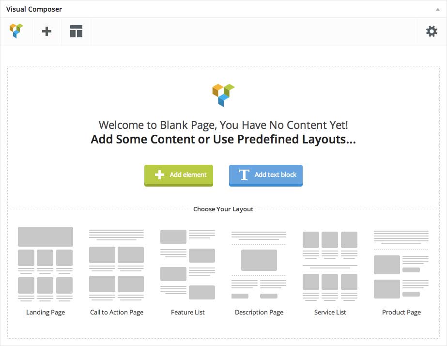
Visual Composer is a fantastic plugin that adds a drag & drop page builder to your WordPress theme. You can create unique page easily & fast with a lot of page elements.
Make sure you have install and activate Visual Composer plugin to take advantage of all it’s wonderful features. Once activated, Visual Composer gives you control over the layout of your pages. Just add a new page, and select template Landing Page Builder – Visual Composer then click Publis button and after that on the blue Backend Editor button to access the builder.
Visual Composer
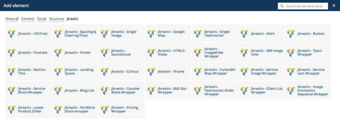
To add element you just need to click Add Element button and you will see 4 group elements :
- Content Elements
- JKreativ Elements
- Social Elements
- Structure Elements
Content Elements
Content Elements
-
Row
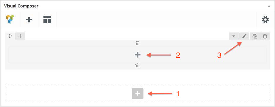
Row of root element is like Section on section builder. It’s wrap elements in a section that has options to set Background type, Margin, Text Color Schema, Ribbon and Section Name just like section in section builder. To start building page, you need to add row as wrapper of page elements.
1. Add Row
2. Add Elements Button Inside Row
3. Row Setting
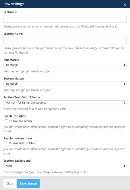
Section Text Color Schema
If you are using light background, you will need to use normal text schema. It’s fit for light background or if you are using dark background, you can choose to use light text color. It will fix for darker background color.
Section Background Type
We have 5 option for Section Background type option, such as :
-
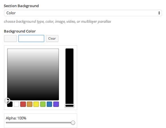
Color Background
Choose this option if you want to use color for your section background.
-
Image Background
With this option you can put different image, or pattern as your section background.
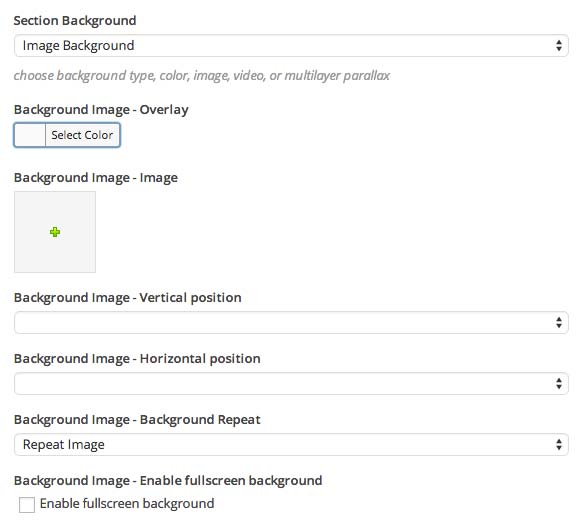
Image Background Options :
- Image Background : Select or upload your image for section background.
- Background Overlay : Set color for overlay background.
- Image background vertical position : Select vertical position of background (Left, Right or Center)
- Image background horizontal position : Select horizontal position of background (Top, Bottom or Center)
- Image background repeat : Select repeat mode (No Repeat, Repeat Vertical, Repeat Horizontal or Repeat Image)
- Enable fullscreen background : Enable this option to make background fit into section container size.
-
Moving Image Background
This option will move your image background from left to right. You can put icon or something like that to make your section look more alive. This element will move overtime.
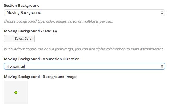
Moving Image Background Options :
- Background Overlay : Set color for overlay background.
- Animation Direction : Select animation direction (Horizontal, Vertical or Diagonal)
- Image Background : Select or upload your image for section background.
-
Multi Layer Parallax Background
Create background with very Smooth Parallax effect and with Unlimited layers. You can enable the Parallax Layer 1 until 10 as you need.

Parallax Background Options :
- Background Overlay : Set color for overlay background.
- Parallax Image : Select or upload your image for section background.
- Background Align : Select background align (Center, Left or Right)
- Enable cover background : Enable this option to make background fit into section container size.
- Parallax Speed : Set number of parallax speed. Note: Use minus number to make it reverse scrolling
-
Video Background
You can also have option to use video background for your section element.
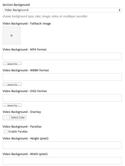
Video Background Options :
- Background Fallback Image : Select or upload image to display if video doesn’t load properly.
- MP4 format Video : select or upload MP4 video format.
- WEBM format Video : Select or upload WEBM video format.
- OGG format Video : Select or upload OGG video format
- Background Overlay : Ser color for overlay background.
- Enable Video Parallax : Enable this option if you want to add parallax effect.
- Video Height : Set number of video height (Example: 1080)
- Video Width : Set number of video width (Example: 1920)
-
-
Grid Column
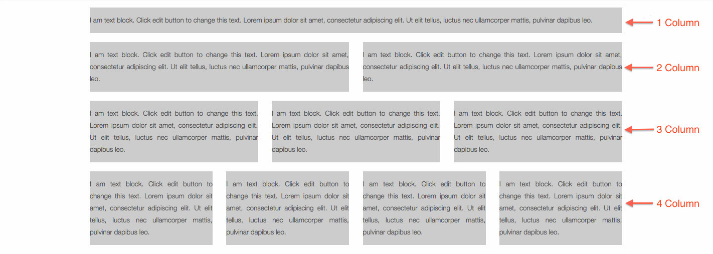
We are using quite different method to add column on Visual Composer. We are disabling top column spliting but only enable inner row & column spliting.
To create Column, first you need to Add Row (this row will be a section). Then you will need to Add Row once again by select Add Element Button Inside Row after that select Row element and this row will be a column on these row that you’ve created previously.
Add Element Button Inside Row


Edit Row Settings
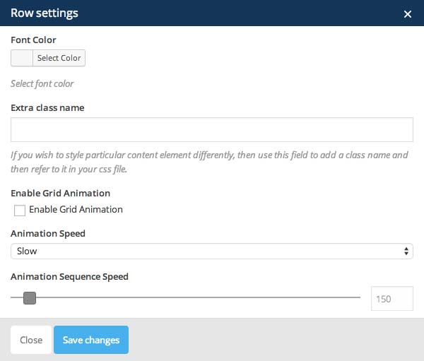
Edit Row Options :
- Font Color : Set your font color for this row.
- Extra Class Name (Optional) : Add aditional class in case you need to add custom styling for this element.
- Enable Grid Animation : Check this to enable show animation for row.
- Animation Speed : Select animation speed (Fast, Slow, or Slower)
- Sequence Speed : Set numer of sequence speed of animation.
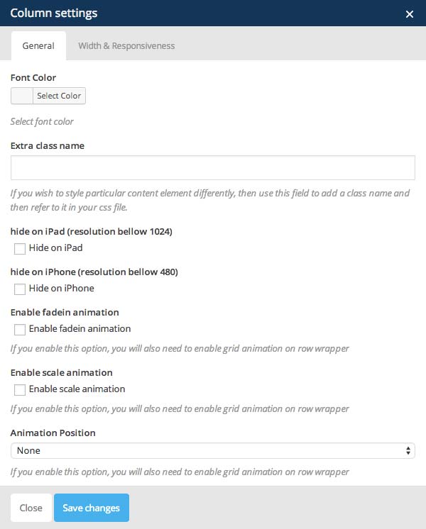
General Column Settings
General Column Options :
- Font Color : Set your font color for this column.
- Extra Class Name (Optional) : Add aditional class in case you need to add custom styling for this element.
- Hide on iPad : Check this to hide this column and entire content on iPad device.
- Hide on iPad : Check this to hide this column and entire content on device with resolution 1024px width and lower, such as iPad.
- Hide on iPhone : Check this to hide this column and entire content on device with resolution 480px width and lower, such as iPhone.
- Enable fadein animation : Check this to enable fadein effect on this column (make sure if you’ve enable grid animation option)
- Enable scale animation : Check this to enable scale effect on this column (make sure if you’ve enable grid animation option)
- Animation Position : Select where to start the animation (None, Top, Bottom, Left or Right)
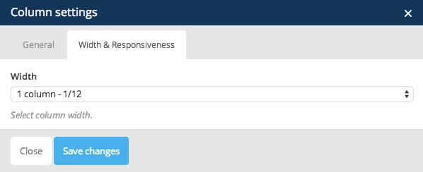
Width Column Setting
Column Preview
-
Text Block
You can use this element if you want to add some of content or description into your landing page. On this element you also have JKreativ General Shortcode options. General shortcode will appear on most text area element on admin panel. For more detail information you can take a look right here JKreativ General Shortcode.
Text Block Settings
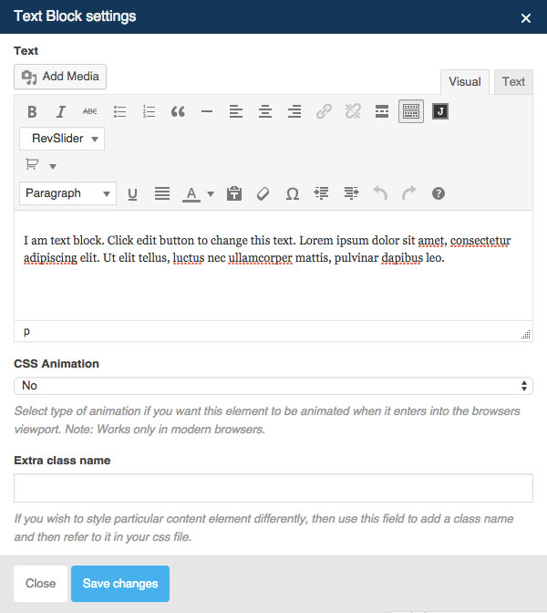
Text Block Options :
- CSS Animation : Select type of animation if you want this element to be animated when it enters into the browsers viewport.
- Extra Class Name (Optional) : Add aditional class in case you need to add custom styling for this element.
-
Separator
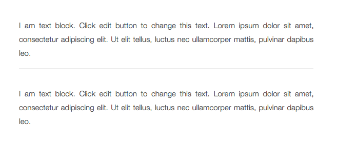
Add Separator line along the content or column width used to separate content.
Separator Settings
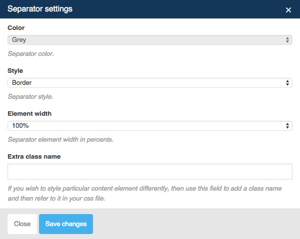
Separator Options :
- Color : Set separator color.
- Style : Choose separator style (Border, Dashed, Dotted or Double)
- Element Width : Set separator element width in percents.
- Extra Class Name (Optional) : Add aditional class in case you need to add custom styling for this element.
Separator Preview
-
Separator with Text
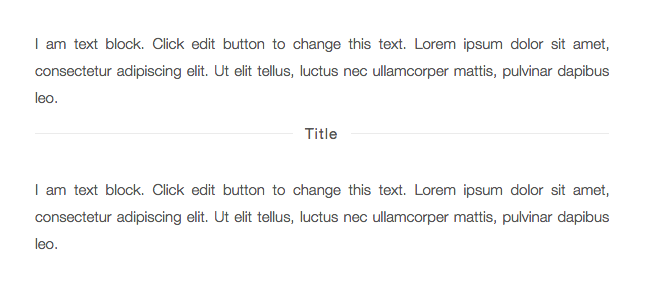
Add Separator line with Text on center are along the content or column width used to separate content.
Separator with Text Settings
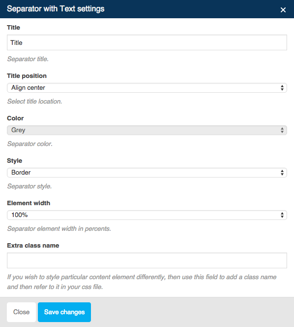
Separator with Text Options :
- Title : Set title for the separator.
- Title Position : Set title position (Center Align, Left Align or Right Align)
- Color : Set separator color.
- Style : Choose separator style (Border, Dashed, Dotted or Double)
- Element Width : Set separator element width in percents.
- Extra Class Name (Optional) : Add aditional class in case you need to add custom styling for this element.
Separator with Text Preview
-
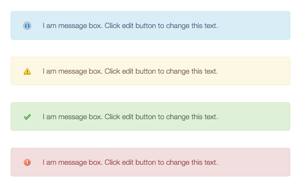
Message Box
Add standard alert box or message box.
Message Box Settings
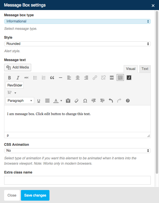
Separator with Text Options :
- Message Box Type : Select message type (Informational, Warning, Success or Error)
- Style : Choose separator style (Rounder, Square, Round, Outlined, 3D or Square Outlined)
- Message Text : Insert your message text.
- CSS Animation : Select type of animation if you want this element to be animated when it enters into the browsers viewport.
- Extra Class Name (Optional) : Add aditional class in case you need to add custom styling for this element.
Message Box Preview
-
FAQ
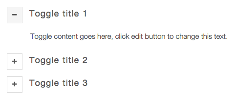
Expand and collapse the content inside a container with a title.
FAQ Settings
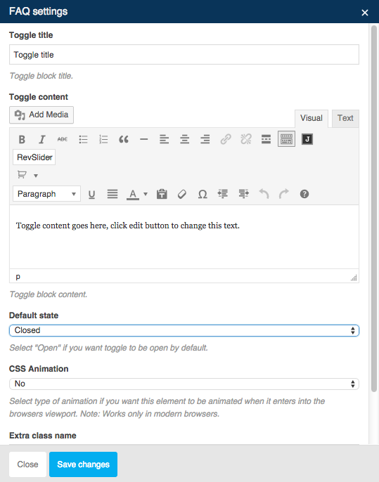
FAQ Options :
- Toggle Title : Set toggle block title.
- Toggle Content : Insert your toggle content.
- Default State : Select Open if you want this toggle to be opened by default.
- CSS Animation : Select type of animation if you want this element to be animated when it enters into the browsers viewport.
- Extra Class Name (Optional) : Add aditional class in case you need to add custom styling for this element.
FAQ Preview
-
Single Image
Add an image on your site content.
Single Image – General Settings
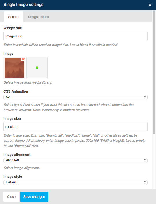
General Options :
- Widget Title : Set your image title. Leave blank if no title is needed.
- Image : Select or upload your image.
- CSS Animation : Select type of animation if you want this element to be animated when it enters into the browsers viewport.
- Image Size : Set your image size.
- Image Alignment : Select image alignment (Left Align, Right Align or Center Align)
- Image Style : Select image style that you want to use.
- Link to Large Image : Enable this option if you want to this image linked to the large image when clicked.
- Image Link : Insert URL if you want this image to have a link.
- Extra Class Name (Optional) : Add aditional class in case you need to add custom styling for this element.
Single Image – Design Options
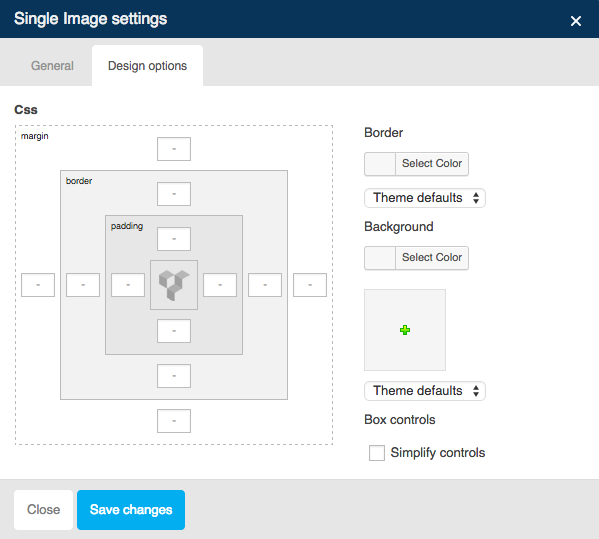
Design Options :
- Border Color : Set border color for image.
- Border Type : Select border type.
- Background Color : Set the background color for image.
- Background Image : Select of upload an image for background.
Single Image Preview

-
Image Gallery
Insert a series of images using from gallery.
Image Gallery Settings
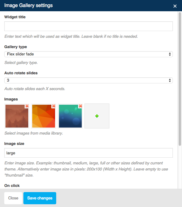
Image Gallery Options :
- Widget Title : Set your image title. Leave blank if no title is needed.
- Gallery Type : Select gallery type (Slide or Grid Layout)
- Auto Rotate Slides : Set the number of auto rotate slide your images each x seconds.
- Image : Select or upload your image.
- Image Size : Set your image size.
- On Click : Define action for onclick event if needed (Open Pretty Photo, Do Nothing or Open Custom Link)
- Extra Class Name (Optional) : Add aditional class in case you need to add custom styling for this element.
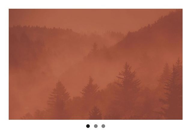
Image Gallery Preview
-
Image Carousel
Insert a series of images from gallery.
Image Carousel Settings
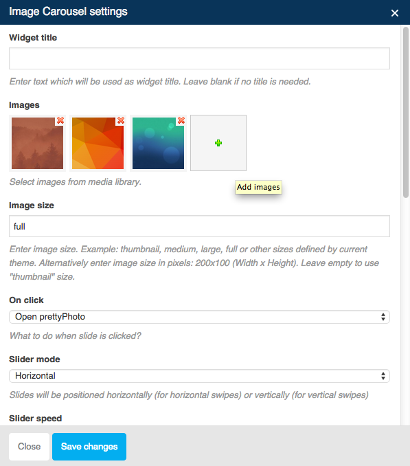
Image Carousel Options :
- Widget Title : Set your image title. Leave blank if no title is needed.
- Image : Select or upload your image.
- Image Size : Set your image size.
- On Click : Define action for onclick event if needed (Open Pretty Photo, Do Nothing or Open Custom Link)
- Slider Mode : Set your image slides for horizontal or vertical swipes.
- Slider Speed : Set your image slides speed.
- Slides per View : Set numbers of slides you want to display at the same time on slider’s container for carousel mode.
- Slider Autoplay : Enable this option if you want to make your image slides automatically.
- Hide Pagination Control : Enable this option if want to remove pagination control.
- Hide Prev/Next Buttons : Enable this option if want to remove Prev/Next control.
- Partial View : Enable this option if you want part of the next slide will be visible on the right side.
- Slider Loop : Enable this option if you want to make your image slides on loop mode.
- Extra Class Name (Optional) : Add aditional class in case you need to add custom styling for this element.
Image Carousel Preview
-
Tabs
Tabbing alias tabs allow you to show more content on the page using less space.
Tabs Settings

Tabs Options :
- Widget Title : Set your tab title. Leave blank if no title is needed.
- Auto Rotate Tabs : Set the number of auto rotate tabs each x seconds.
- Extra Class Name (Optional) : Add aditional class in case you need to add custom styling for this element.
Tab Settings
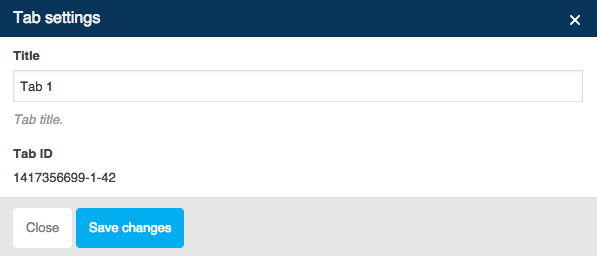
Tabs Options :
- Title : Set your tab title.
Tabs Preview

-
Tour
Tour is same like tabs that allow you to show more content on the page using less space.
Tour Settings
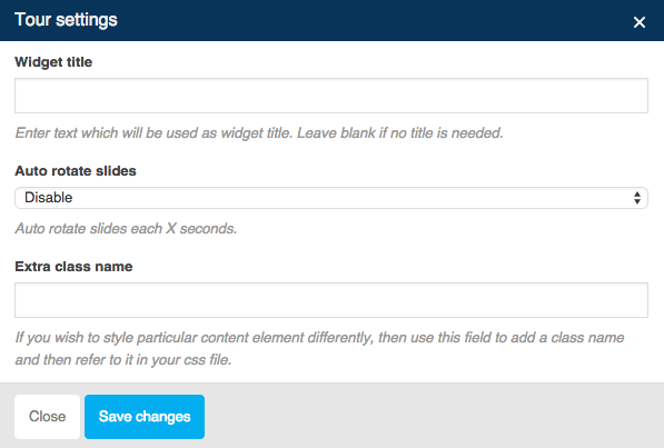
Tour Options :
- Widget Title : Set your tour title. Leave blank if no title is needed.
- Auto Rotate Tabs : Set the number of auto rotate slides each x seconds.
- Extra Class Name (Optional) : Add aditional class in case you need to add custom styling for this element.
Tour Title Settings
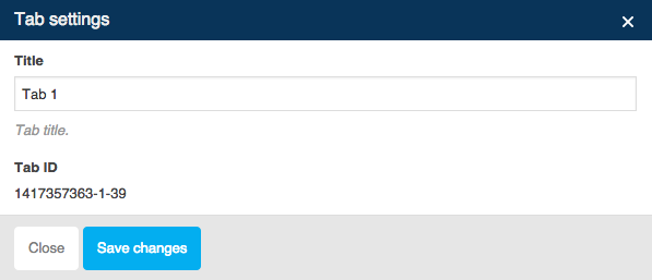
Tour – Title Options :
- Title : Set your tour title.
Tour Preview

-
Accordion
Expand and collapse the content inside a container with a title.
Accordion Settings
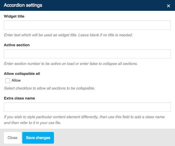
Accordion Options :
- Widget Title : Set your accordion title. Leave blank if no title is needed.
- Active Section : Insert section number to be active automatically or leave blank if you want to collapse all sections.
- Allow Collapsible All : Enable this option if you want to allow all sections to be collapsible.
- Auto Rotate Tabs : Set the number of auto rotate slides each x seconds.
- Extra Class Name (Optional) : Add aditional class in case you need to add custom styling for this element.
Accordion – Section Settings
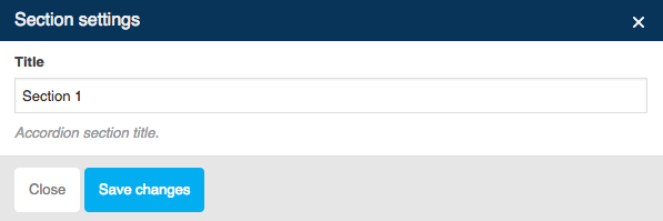
Section Options :
- Title : Set your section title.
Accordion Preview

-
Button
Insert button with anchor tags to direct users to other pages or sites.
Button Settings
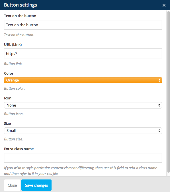
Button Options :
- Text on the Button : Fill text for the button.
- URL (link) : Insert link into button.
- Color : Choose button color that you want to use.
- Icon : Select icon for button if you want your button have an icon.
- Size : Select your button size (Regular Size, Large, Small and Mini)
- Extra Class Name (Optional) : Add aditional class in case you need to add custom styling for this element.
Button Preview

-
Button2
Insert button with anchor tags to direct users to other pages or sites.
Button 2 Settings
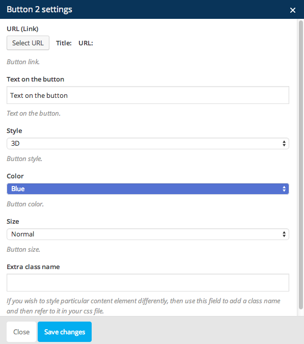
Button 2 Options :
- URL (link) : Insert link into button.
- Text on the Button : Fill text for the button.
- Style : Select button style that you want to use.
- Color : Choose button color that you want to use.
- Size : Select your button size (Regular Size, Large, Small and Mini)
- Extra Class Name (Optional) : Add aditional class in case you need to add custom styling for this element.
Button 2 Preview

-
Progress Bar
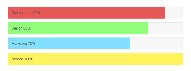
Display skills info with nice animation progress bar.
Progress Bar Settings
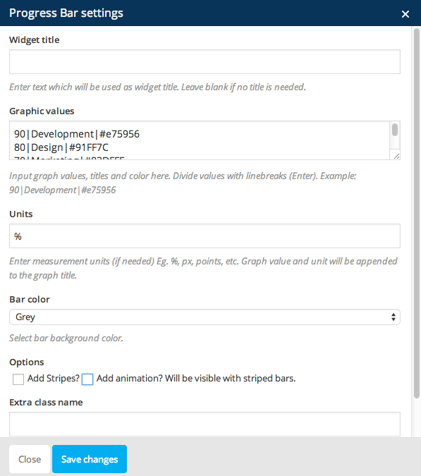
Progress Options :
- Widget Title : Set your accordion title. Leave blank if no title is needed.
- Graphic Values : Insert the graph values, titles and color. Divide each graphich item with linebreaks or just enter new line.
- Units : Insert measurement units for the graph value.
- Bar Color : Select bar background color.
- Options : Enable the Add Stripes option if you want to make striped bar. Enable the Add Animation option if you want to make the Stripes to be animated.
- Extra Class Name (Optional) : Add aditional class in case you need to add custom styling for this element.
Progress Bar Preview
-
Pie Chart
Display skills info with nice pie chart animation.
Pie Chart Settings
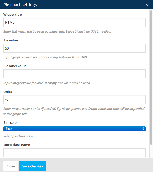
Pie Chart Options :
- Widget Title : Set your accordion title. Leave blank if no title is needed.
- Pie Value : Insert number of range between 0 and 100 for graph value.
- Pie Label Value : Insert integer value for label.
- Units : Insert measurement units for the graph value.
- Bar Color : Select bar background color.
- Extra Class Name (Optional) : Add aditional class in case you need to add custom styling for this element.
Pie Chart Preview

-
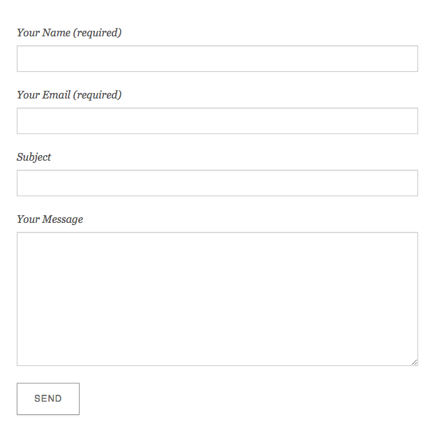
Contact Form 7
Insert form or contact form into your site content.
Contact Form 7 Settings
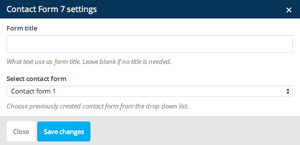
Contact Form 7 Options :
- Form Title : Set your form title. Leave blank if no title is needed.
- Select Contact Form : Select contact form that you’ve created. For more detail information you can take a look right here.
Contact Form 7 Preview
-
Empty Space
This element is important for clearing floated element above or bellow content.
Empty Space Settings
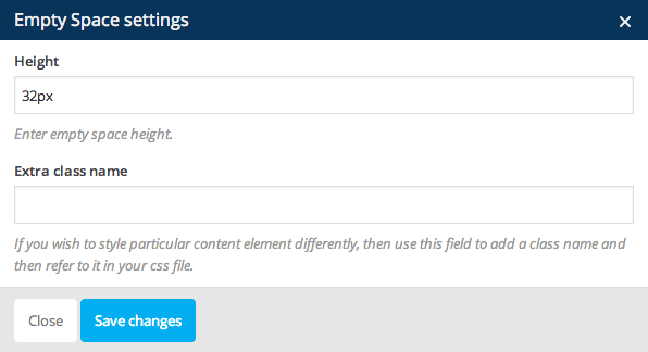
Empty Space Options :
- Height : Set height size of empty space.
- Extra Class Name (Optional) : Add aditional class in case you need to add custom styling for this element.
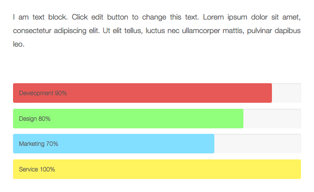
Empty Space Preview
-
Custom Heading
Create custom title for your site content.
Custom Heading Settings
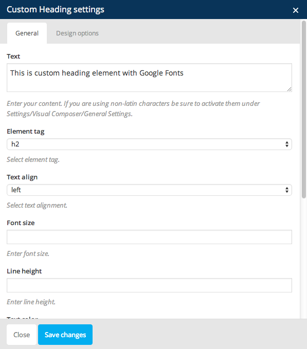
Custom Heading Options :
- Text : Set your heading title.
- Element Tag : Choose the heading tag type.
- Text Align : Select the align of the title.
- Font Size : Set the font size for heading title.
- Line Height : Set the line height for heading title.
- Text Color : Select color for your heading title.
- Font Family : Select font family for your heading title.
- Extra Class Name (Optional) : Add aditional class in case you need to add custom styling for this element.
Custom Heading Preview

-
Revolution Slider
You can insert Revolution Slider into your site content with this option.
Revolution Slider Settings

Custom Heading Options :
- Widget Title : Set your accordion title. Leave blank if no title is needed.
- Revolution Slider : Select revolution slider that you’ve created.
- Extra Class Name (Optional) : Add aditional class in case you need to add custom styling for this element.
Revolution Slider Preview

JKreativ Elements
JKreativ Elements
-
JKreativ – HR Line
Add horizontal line along the content or column width used to separate content.
JKreativ – HR Line Settings
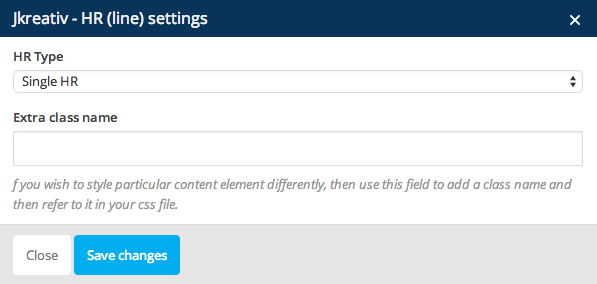
JKreativ – HR Line Options :
- HR Type : Select HR type that you want to use.
- Extra Class Name (Optional) : Add aditional class in case you need to add custom styling for this element.
JKreativ – HR Line Preview

-
JKreativ – Spacing & Clear Floating
This option is important for clearing floated element above or bellow content.
JKreativ – Space & Clear Floating Settings
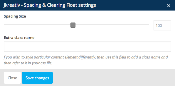
JKreativ – Space & Clear Floating Options :
- Spacing Size : Set spacing size that you need.
- Extra Class Name (Optional) : Add aditional class in case you need to add custom styling for this element.
JKreativ – Space & Clear Floating Preview

-
JKreativ – Single Image
Insert an image into your site content.
JKreativ – Single Image Settings
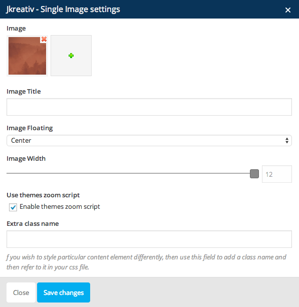
JKreativ – Single Image Options :
- Image : Select or upload an image that you want to use.
- Image Title : Insert title for your image.
- Image Floating : Set align for your image (Center, Right or Left)
- Image Width : Set width size your image.
- Use Themes Zoom Script : Check this to enable image zooming into modal popup when image clicked.
- Spacing Size : Set spacing size that you need.
- Extra Class Name (Optional) : Add aditional class in case you need to add custom styling for this element.
JKreativ – Single Image Preview
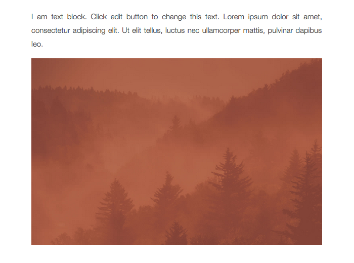
-
JKreativ – Image Slider
Insert a series of slides images.
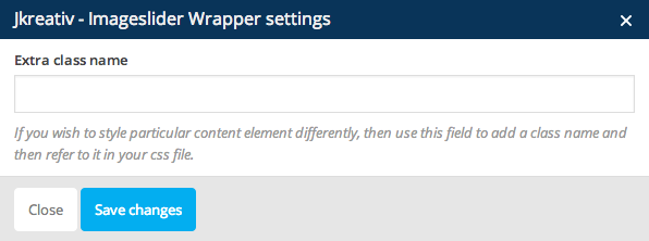
JKreativ – Image Slider Wrapper Settings
JKreativ – Image Slider Wrapper Option :
- Extra Class Name (Optional) : Add aditional class in case you need to add custom styling for this element.
JKreativ – Image Slider Settings
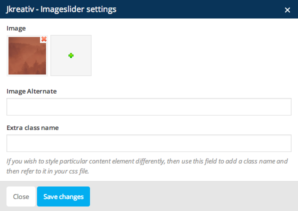
JKreativ – Image Slider Options :
- Image : Select or upload image that you want to use.
- Image Alternate : Set image alternate text.
- Extra Class Name (Optional) : Add aditional class in case you need to add custom styling for this element.
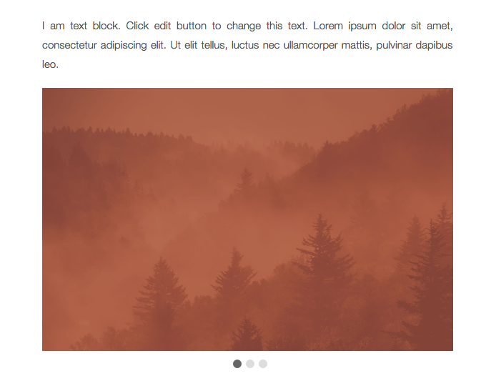
JKreativ – Image Slider Preview
-
JKreativ – Image Animation Sequence
Create motion animation with a series of images.
JKreativ – Image Animation Sequence Wrapper Settings
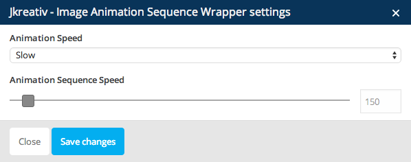
JKreativ – Image Animation Sequence Wrapper Options :
- Animation Speed : Set animation speed your image.
- Animation Sequence Speed : Set the sequence speed of animation.
JKreativ – Image Animation Sequence Settings
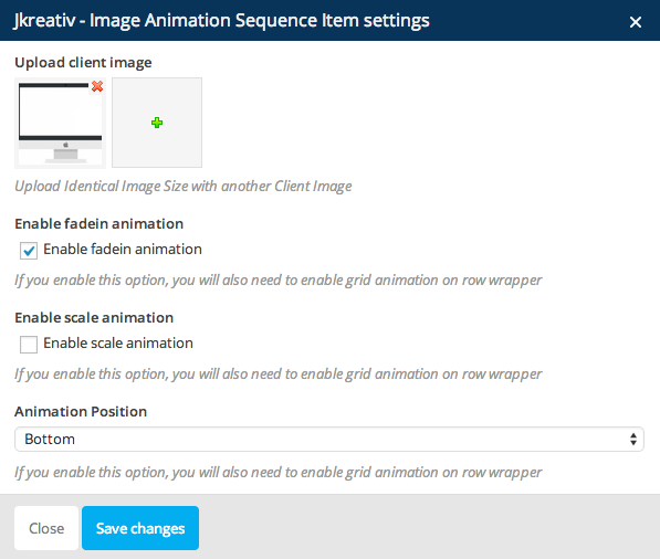
JKreativ – Image Animation Sequence Item Option :
- Upload Client Image : Select of upload your image that you want to use.
- Enable Fadein Animation : Enable this option if you want your image have fade in animation.
- Enable Scale Animation : Enable this option if you want your image have scale effect.
- Animation Position : Set your image animation position.
To create perfect image for animation, you will need to have the same image size (width & height). For example, to create image animation like bellow you will need to 3 layer of images :



JKreativ – Image Animation Sequence Preview

-
JKreativ – Google Maps
Add maps to your content with possibilities to set place/location and adding title.
JKreativ – Google Maps Settings
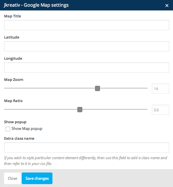
JKreativ – Google Maps Options :
- Map Title : Insert your map title.
- Latitude : Set Latitude coordinate of location or place you want to show on maps.
- Longitude : Set Longitude coordinate of location or place you want to show on maps.
- Map Zoom : Set number of zoom level.
- Map Ratio : Set ratio or dimension of maps size.
- Show Popup : Check this to show tooltip with title above map pin.
- Extra Class Name (Optional) : Add aditional class in case you need to add custom styling for this element.
JKreativ – Google Maps Preview
-
JKreativ – Single Testimonial
Add a single testimonial block with client picture.
JKreativ – Single Testimonial Settings
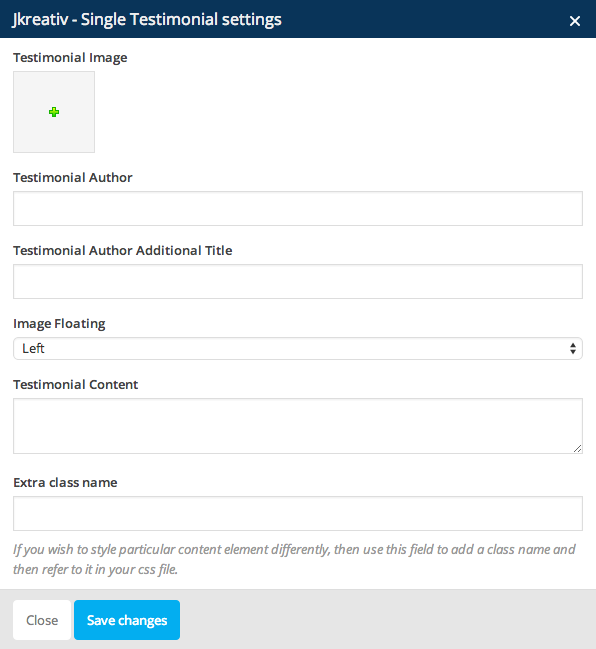
JKreativ – Single Testimonial Options :
- Testimonial Image : Upload or choose image of author.
- Testimonial Author : Set name of testimonial author.
- Testimonial Author Additional Title : Set additional text that will be added next to author name.
- Image Floating : select image align (Left or Right)
- Testimonial Content : Insert testimonial of content.
- Extra Class Name (Optional) : add aditional class in case you need to add custom styling for this element.
JKreativ – Single Testimonial Preview

-
JKreativ – Testimonial Slider
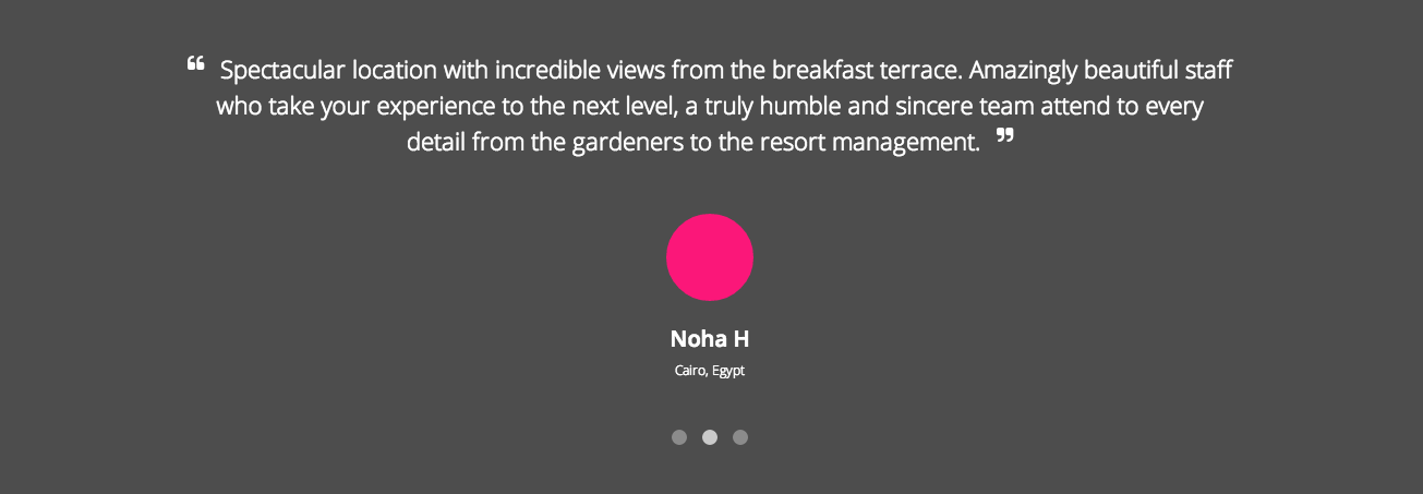
Add slider of customer testimonials about your product or service.
JKreativ – Testimonial Slider Wrapper Settings
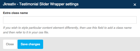
JKreativ – Testimonial Slider Wrapper Option :
- Extra Class Name (Optional) : Add aditional class in case you need to add custom styling for this element.
JKreativ – Testimonial Slider Settings
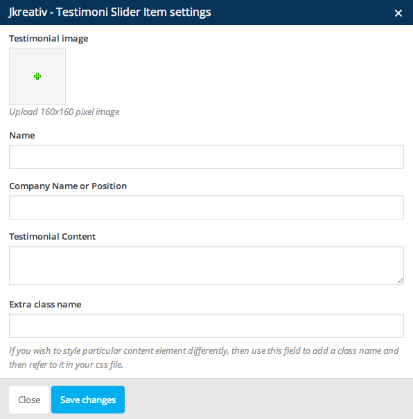
JKreativ – Testimonial Slider Item Options :
- Testimonial Image : Select or upload image of testimonial author.
- Name : Name of testimonial author.
- Company Name or Position : Company name or position of testimonial author.
- Testimonial Content : Insert testimonial content.
- CSS Class (Optional) : add aditional class in case you need to add custom styling for this element.
JKreativ – Testimonial Slider Preview
-
JKreativ – Alert
Add standard alert box or message box.
JKreativ – Alert Settings
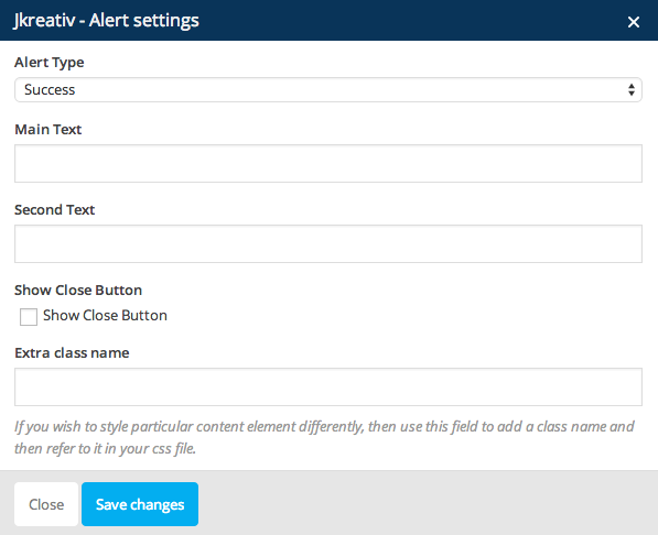
JKreativ – Alert Options :
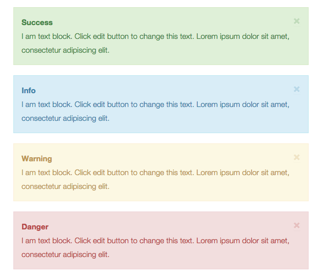
- Alert Type : Type of alert box (Success, Info, Warning or Danger)
- Main Text : Caption of alert box.
- Second Text : Main message of alert box.
- Show Close Button : Check this to show close button on alert box.
- Extra Class Name (Optional) : Add aditional class in case you need to add custom styling for this element.
JKreativ – Alert Preview
-
JKreativ – Button
Insert button with anchor tags to direct users to other pages or sites.
JKreativ – Button Settings
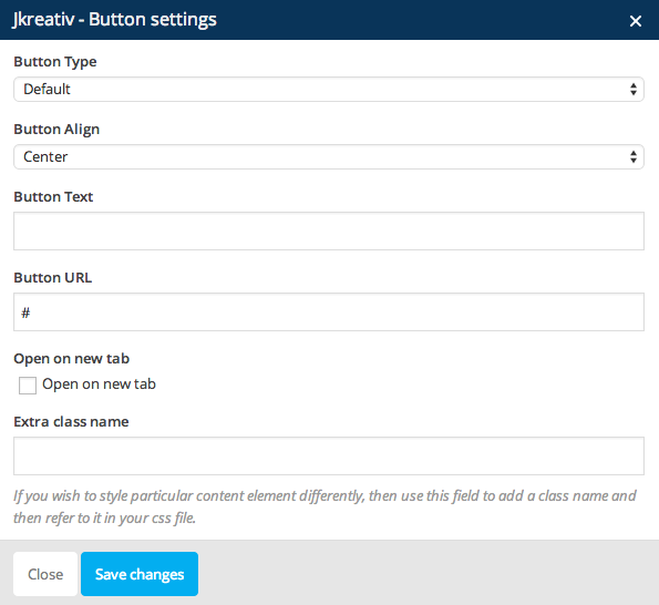
JKreativ – Button Options :
- Button Type : Type of button (Default, Primary, Success, Info, Warning or Danger)
- Button Align : Set your button align (Left, Right or Center)
- Button Text : Button text to show what is button do or direct to.
- Button URL : Link of page to follow when clicked
- Open on new tab : If this option checked it will open target link on new browser tab.
- Extra Class Name (Optional) : Add aditional class in case you need to add custom styling for this element.
JKreativ – Button Preview

-
JKreativ – YouTube
JKreativ – YouTube Settings
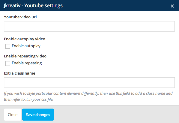
JKreativ – YouTube Options :
- YouTube URL : Insert your youtube video url.
- Enable Autoplay Video : Enable this option if you want to make autoplay your video.
- Enable Repeating Video : Enable this option if you want to make your video repeated.
- Extra Class Name (Optional) : Add aditional class in case you need to add custom styling for this element.
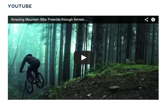
JKreativ – YouTube Preview
-
JKreativ – Vimeo
JKreativ – Vimeo Settings
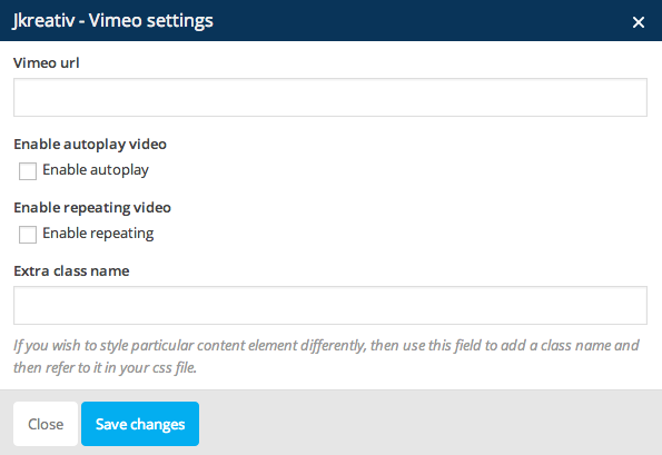
JKreativ – Vimeo Options :
- Vimeo URL : Insert your vimeo video url.
- Enable Autoplay Video : Enable this option if you want to make autoplay your video.
- Enable Repeating Video : Enable this option if you want to make your video repeated.
- Extra Class Name (Optional) : Add aditional class in case you need to add custom styling for this element.
JKreativ – Vimeo Preview

-
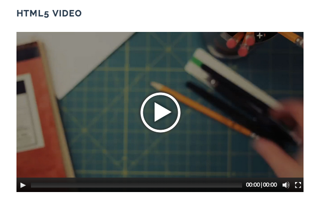
JKreativ – HTML 5 Video
JKreativ – HTML 5 Video Settings
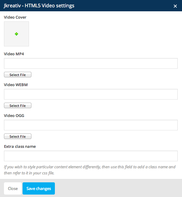
JKreativ – HTML 5 Video Options :
- Video Cover : Insert an image as video cover.
- Video MP4 : Select or upload mp4 video format.
- Video WEBM : Select or upload webm video format.
- Video OOG : Select or upload oog video format.
- Extra Class Name (Optional) : Add aditional class in case you need to add custom styling for this element.
JKreativ – HTML 5 Video Preview
-
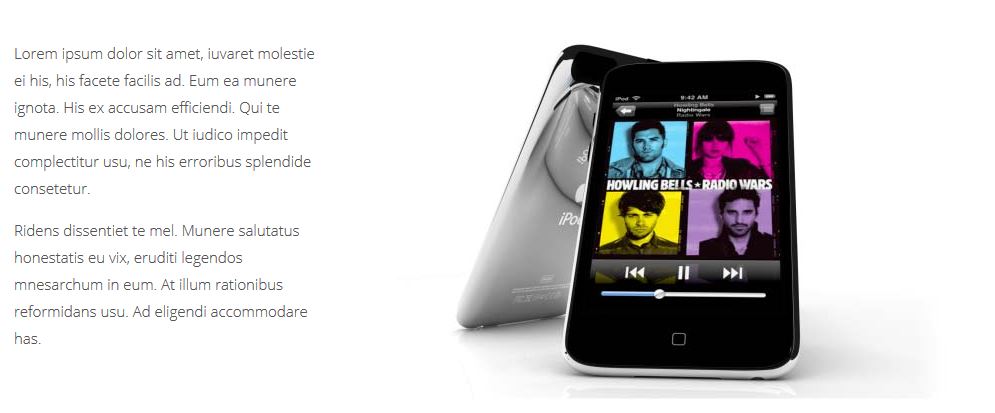
JKreativ – 360 Image View
Showcasing your product in 360 degrees.
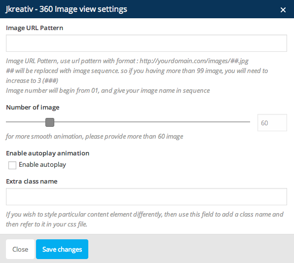
JKreativ – 360 Image View Settings
JKreativ – 360 Image View Options :
- Image URL Pattern : Url pattern of where 360 images placed.
- Number of Image : Set number of image that you provide.
- Enable Autoplay Animation : Enable this option if you want to make your image autoplay.
- Extra Class Name (Optional) : Add aditional class in case you need to add custom styling for this element.
JKreativ – 360 Image View Preview
-
JKreativ – Team Member
Add all member of your team work with this option.
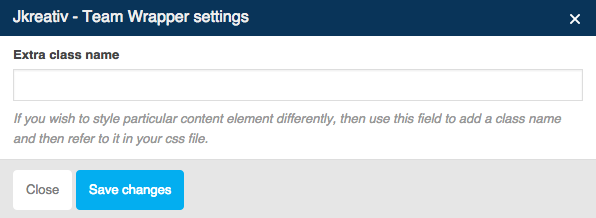
JKreativ – Team Member Wrapper Settings
JKreativ – Team Member Wrapper Option :
- Extra Class Name (Optional) : Add aditional class in case you need to add custom styling for this element.
JKreativ – Team Member Item Settings
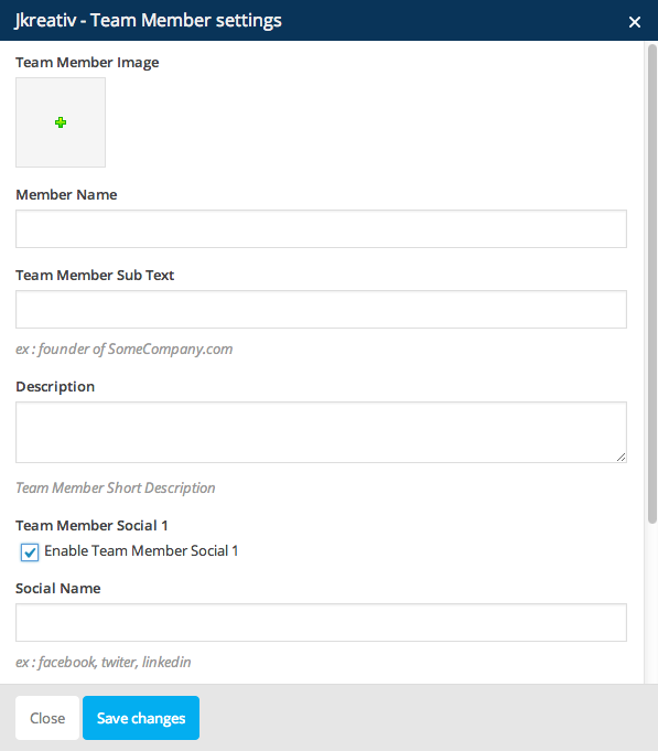
JKreativ – Team Member Item Options :
- Team Member Image : Select of upload your team image.
- Member Name : Insert your team member name.
- Team Member Sub Text : Insert sub text for your team member (Ex : your team position)
- Description: Insert description for your team member.
- Team Member Social : Enable this option to show your team member social.
- Social Name : Insert your team member social name.
- Social Url : Insert your tema member social url.
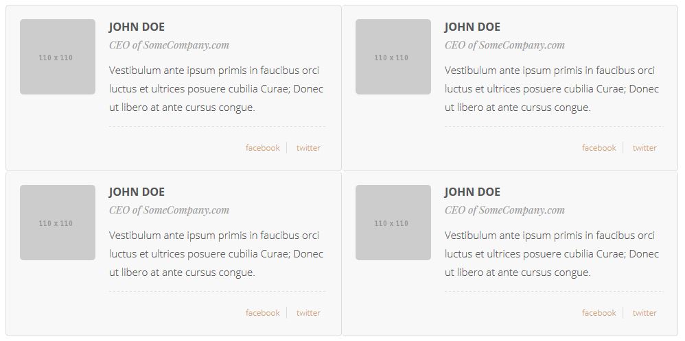
JKreativ – Team Member Preview
-
JKreativ – Section Title
Add heading title of section.
JKreativ – Section Title Settings
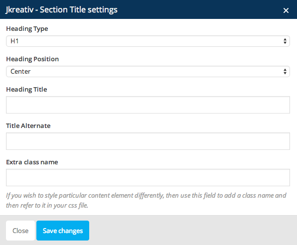
JKreativ – Section Title Options :
- Heading Type : Select heading type for section title.
- Heading Position : Set your section title position.
- Heading Title : Insert your section title.
- Title Alternate : Insert alternate text for your section title.
- Extra Class Name (Optional) : Add aditional class in case you need to add custom styling for this element.
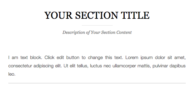
JKreativ – Section Title Preview
-
JKreativ – Landing Quote
Show a pull quote within a paragraph or article of text.
JKreativ – Landing Quote Settings
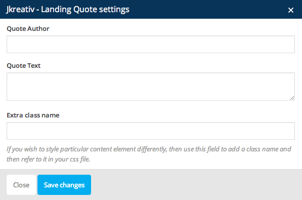
JKreativ – Landing Quote Options :
- Quote Author : Insert name quote author.
- Quote Text : Insert quote text.
- Extra Class Name (Optional) : Add aditional class in case you need to add custom styling for this element.
JKreativ – Landing Quote Preview

-
JKreativ – Callout
Show promotion text with call-to-action button.
JKreativ – Callout Settings
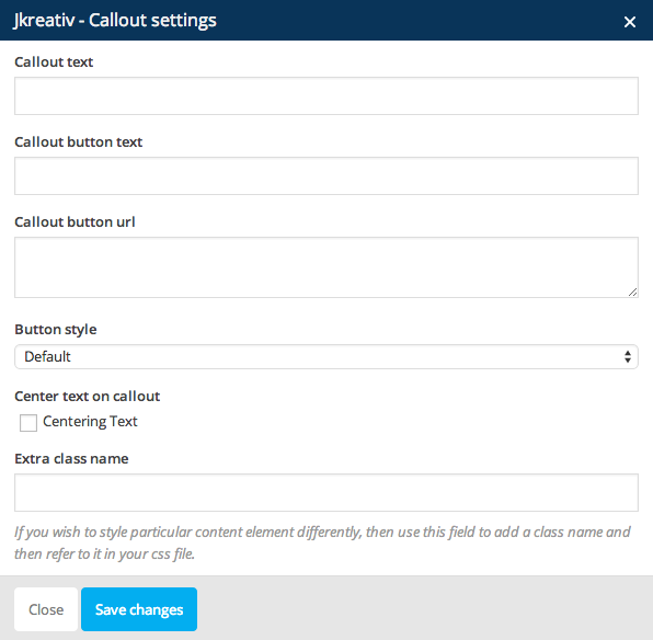
JKreativ – Callout Options :
- Callout Text : Insert text content of callout.
- Callout Button Text : Insert text of callout button.
- Callout Button Url : Insert url link of callout button.
- Button Style : Choose button style that you want to use.
- Center Text on Callout : Enable this option if you want to make the callout text have center align.
- Extra Class Name (Optional) : Add aditional class in case you need to add custom styling for this element.
JKreativ – Callout Preview

-
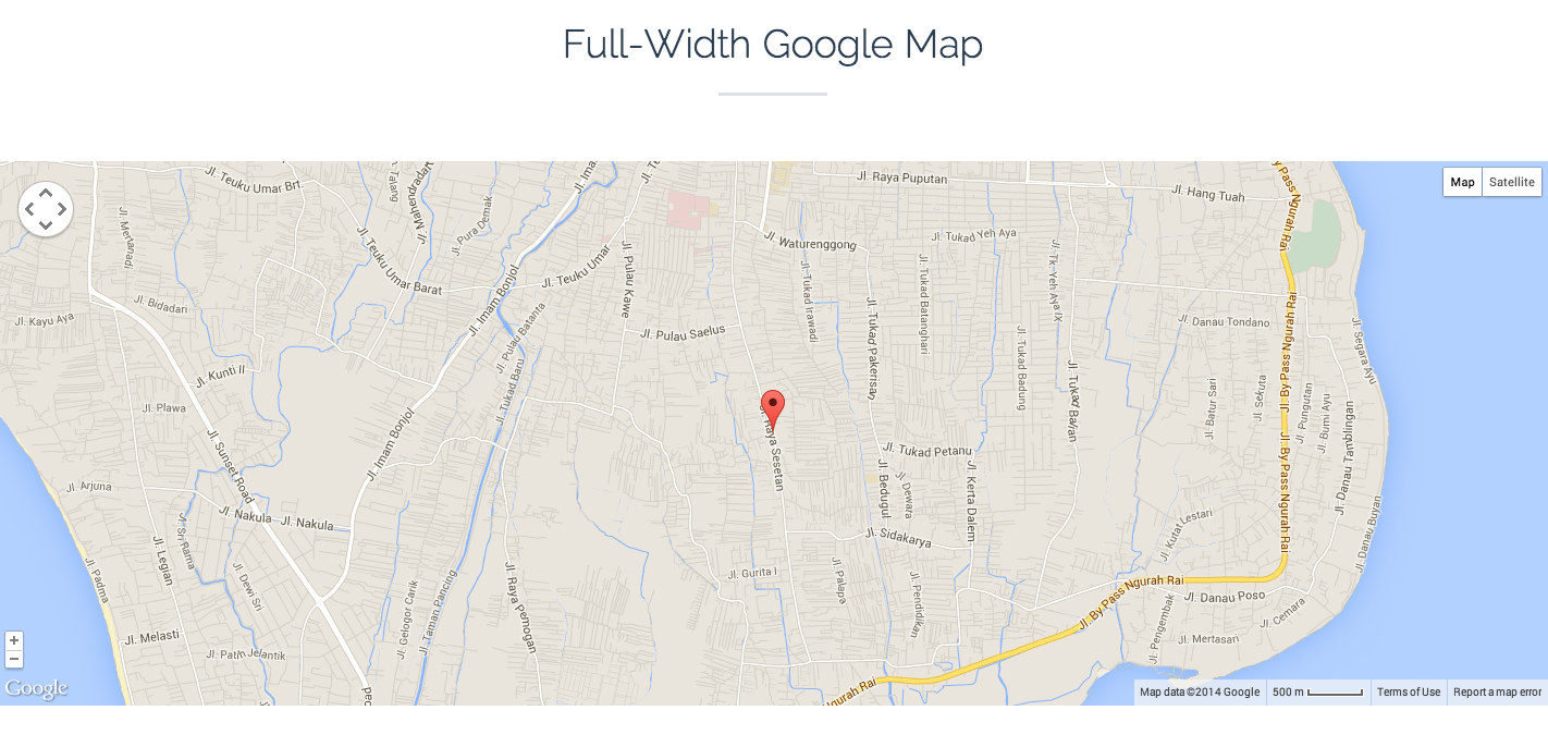
JKreativ – Fullwidth Map
Add fullwidth maps to your content.
JKreativ – Fullwidth Map Wrapper Settings

JKreativ – Fullwidth Map Wrapper Options :
- Map Title : Insert your map title.
- Latitude : Set Latitude coordinate of location or place you want to show on maps.
- Longitude : Set Longitude coordinate of location or place you want to show on maps.
- Map Zoom : Set number of zoom level.
- Container Height : Set container height or dimension of maps size.
- Don’t Use Fullwidth Map : Enable this option if you want to use boxed map.
JKreativ – Fullwidth Map Detail Settings
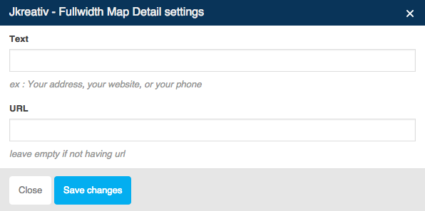
JKreativ – Fullwidth Map Detail Options :
- Text : Insert text for map detail.
- URL : Insert url link or leave empty if not having url.
JKreativ – Fullwidth Map Preview
-
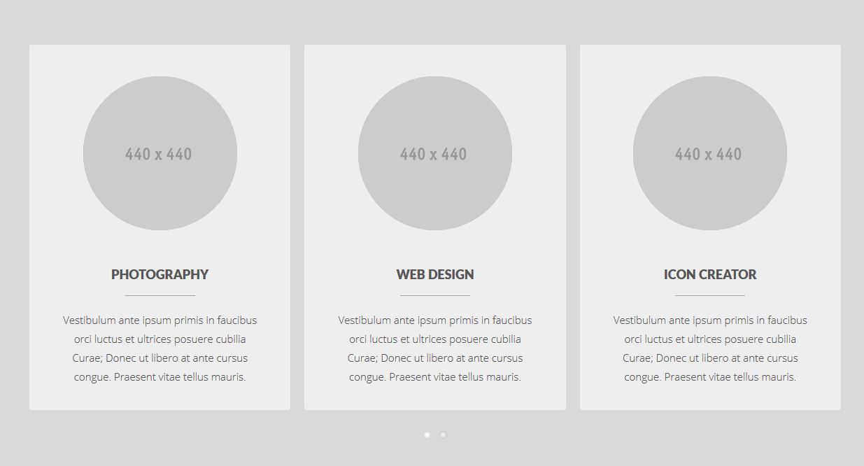
JKreativ – Service Image
Add list slider with images, title and description. For example it used to show list of services.
JKreativ – Service Image Wrapper Settings
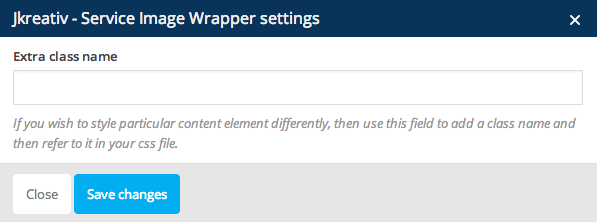
JKreativ – Service Image Wrapper Option :
- Extra Class Name (Optional) : Add aditional class in case you need to add custom styling for this element.
JKreativ – Service Image Item Settings
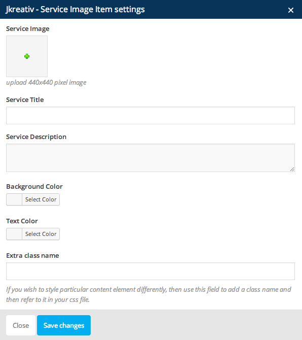
JKreativ – Service Image Item Options :
- Service Image : Select or upload image with size 440×440 px.
- Service Title : Insert title of your service item.
- Service Description : Insert short description of your service item.
- Background Color : Set background color for item block.
- Text Color : Set text color for all text on item block.
- Extra Class Name (Optional) : add aditional class in case you need to add custom styling for this element.
JKreativ – Service Image Preview
-
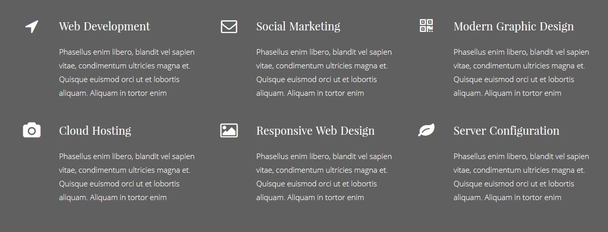
JKreativ – Service Icon
Add section list with icon, title and description. For example it used to show list of services.
JKreativ – Service Icon Wrapper Settings

JKreativ – Service Icon Wrapper Options :
- Service Item Width : Set width of service item.
- Extra Class Name (Optional) : Add aditional class in case you need to add custom styling for this element.
JKreativ – Service Icon Item Settings

JKreativ – Service Icon Item Options :
- Service Icon : Select icon from list.
- Service Title : Insert title of your service item.
- Service Description : Insert short description of your service item.
- Extra Class Name (Optional) : Add aditional class in case you need to add custom styling for this element.
JKreativ – Service Icon Preview
-
JKreativ – Service Block
Add section list with icon, title and description. For example it used to show list of services.
JKreativ – Service Block Wrapper Settings
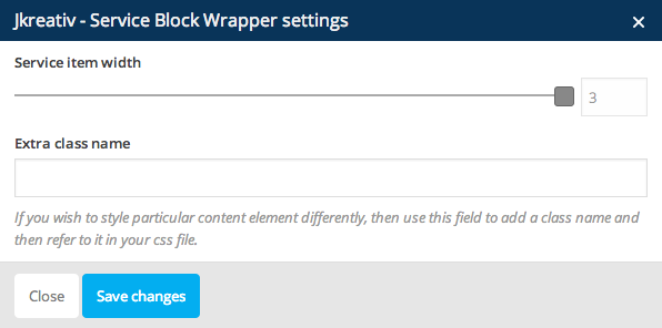
JKreativ – Service Block Wrapper Options :
- Service Item Width : Set width of service item.
- Extra Class Name (Optional) : Add aditional class in case you need to add custom styling for this element.
JKreativ – Service Block Item Settings
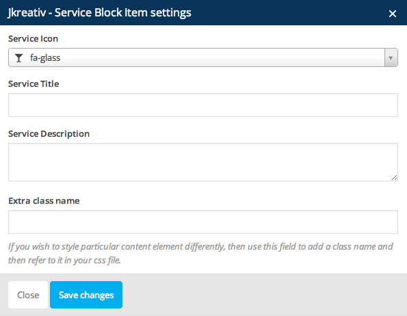
JKreativ – Service Block Item Options :
- Service Icon : Select icon from list.
- Service Title : Insert title of your service item.
- Service Description : Insert short description of your service item.
- Extra Class Name (Optional) : Add aditional class in case you need to add custom styling for this element.
JKreativ – Service Block Preview

-
JKreativ – Counter Block
Display counter block info with nice animation.
JKreativ – Counter Block Wrapper Settings
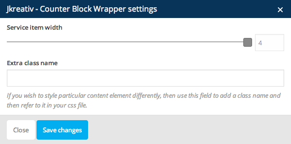
JKreativ – Counter Block Wrapper Options :
- Service Item Width : Set number of counter item.
- Extra Class Name (Optional) : Add aditional class in case you need to add custom styling for this element.
JKreativ – Counter Block Item Settings
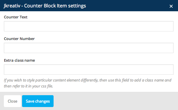
JKreativ – Counter Block Item Options :
- Counter Text : Insert text for counter item.
- Counter Number : Insert number for counter item.
- Extra Class Name (Optional) : Add aditional class in case you need to add custom styling for this element.
JKreativ – Counter Block Preview

-
JKreativ – Skill Bar
Display skills info with nice animation progress bar.
JKreativ – Skill Bar Wrapper Settings
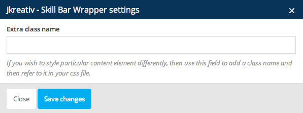
JKreativ – Skill Bar Wrapper Option :
- Extra Class Name (Optional) : Add aditional class in case you need to add custom styling for this element.
JKreativ – Skill Bar Item Settings
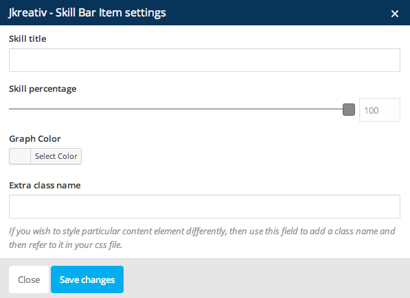
JKreativ – Skill Bar Item Options :
- Skill Title : Insert title for skill bar.
- Skill Percentage : Set percentage of skill bar.
- Graph Color : Set graph color of skill bar.
- Extra Class Name (Optional) : Add aditional class in case you need to add custom styling for this element.
JKreativ – Skill Bar Preview

-
JKreativ – Client List
Insert logo list slider of clients or brands that you use.
JKreativ – Client List Wrapper Settings
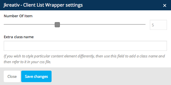
JKreativ – Client List Wrapper Options :
- Number of Item : Set number of item.
- Extra Class Name (Optional) : Add aditional class in case you need to add custom styling for this element.
JKreativ – Client List Item Settings
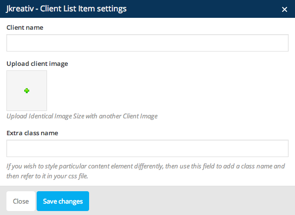
JKreativ – Client List Item Options :
- Client Name : Insert name of client or brand.
- Upload Image : Select or upload logo image of client or brand.
- Extra Class Name (Optional) : Add aditional class in case you need to add custom styling for this element.
JKreativ – Client List Preview

-
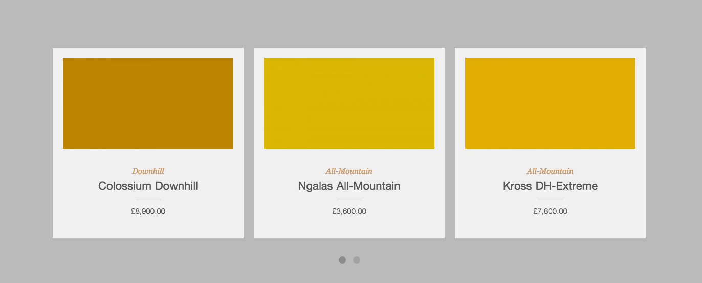
JKreativ – Latest Product Slider
Add slides of your latest product.
JKreativ – Latest Product Settings
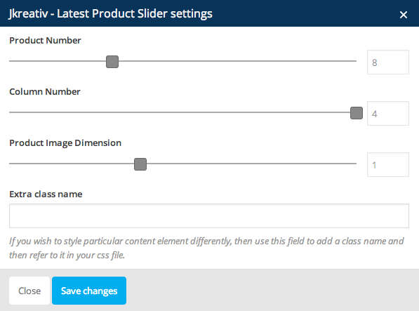
JKreativ – Latest Product Options :
- Product Number : Set number of product that you want to show.
- Column Number : Set number of column for product slider item.
- Product Image Dimension : Set dimention of product image.
- Extra Class Name (Optional) : Add aditional class in case you need to add custom styling for this element.
JKreativ – Latest Product Preview
-
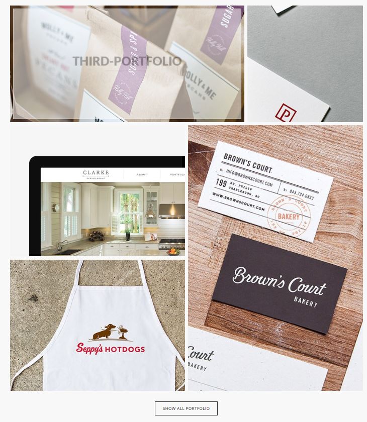
JKreativ – Portfolio Block
Portfolio block using masonry effect, but you will need to arrange it as you want. it having 3 option for width (1/3, 1/2, 2/3) and also 2 option for height, (1, 2 height size).
JKreativ – Portfolio Block Wrapper Settings
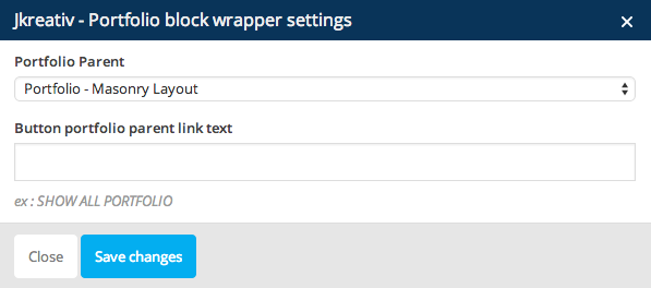
JKreativ – Portfolio Block Wrapper Options :
- Portfolio Parent : Select portfolio parent page that you want to show up.
- Button Portfolio Parent Link Text : Insert text of button portfolio parent.
JKreativ – Portfolio Block Item Settings
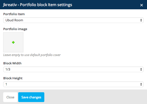
JKreativ – Portfolio Block Item Options :
- Portfolio Item : Select portfolio item you want to add.
- Portfolio Image : Select or upload image for portfolio cover (thumbnail). Leave it empty if you want to use default portfolio cover.
- Block Width : Select block width (1/3, 1/2 or 2/3)
- Block Height : Select block height (1 or 2)
JKreativ – Portfolio Block Preview
-
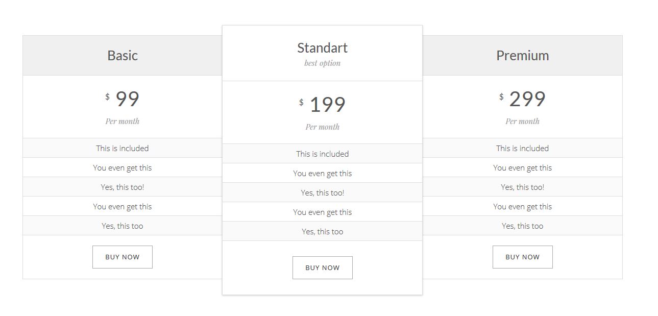
JKreativ – Pricing Table
Add pricing list of your product.
JKreativ – Pricing Table Wrapper Settings

JKreativ – Pricing Wrapper Options :
- Pricing Column Number : Set number of column for pricing table.
JKreativ – Pricing Table Item Settings
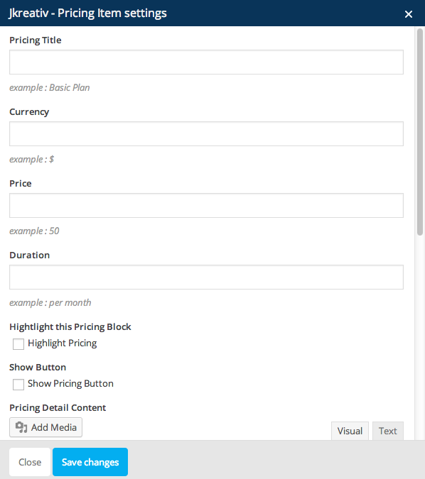
JKreativ – Pricing Item Options :
- Pricing Title : Insert title of pricing table.
- Currency : Set currency that you want to use.
- Price : Insert the price value.
- Duration : Insert duration or periode.
- Highlight this Pricing Block : Enable this option if you want this item to be highlight.
- Show Button : Enable this option to show up the pricing button.
- Pricing Detail Content : Inset detail information content of pricing item.
JKreativ – Pricing Table Preview
Social Elements
Social Elements
-
Facebook
Facebook Like Settings
-
Twitter
Tweetmeme Settings

-
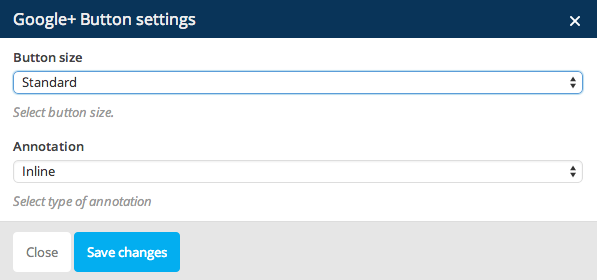
Google+
Google+ Button Settings
-
Pinterset
Pinterest Settings
Structure Elements
Structure Elements
-
Widget Sidebar
Widget Sidebar Settings
Widget Sidebar Options :
- Widget Title : Insert title for widget. Leave empty if no titles is needed.
- Sidebar : Choose widget that you want to show up on sidebar.
- Extra Class Name (Optional) : Add aditional class in case you need to add custom styling for this element.
-
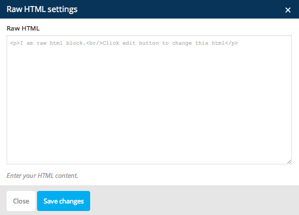
Raw HTML
Raw HTML Settings
-
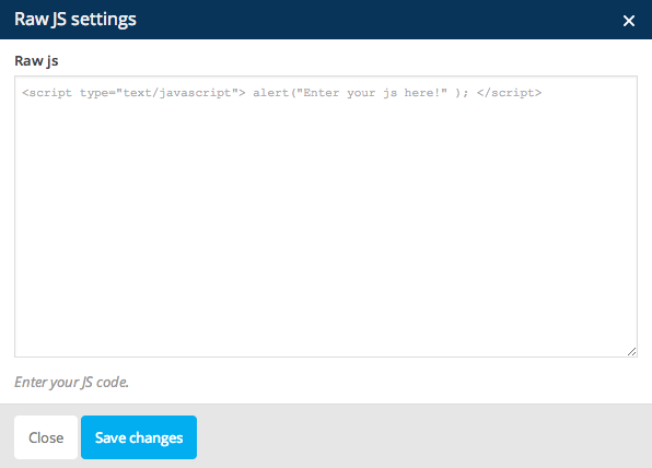
Raw JS
Raw JS Settings


