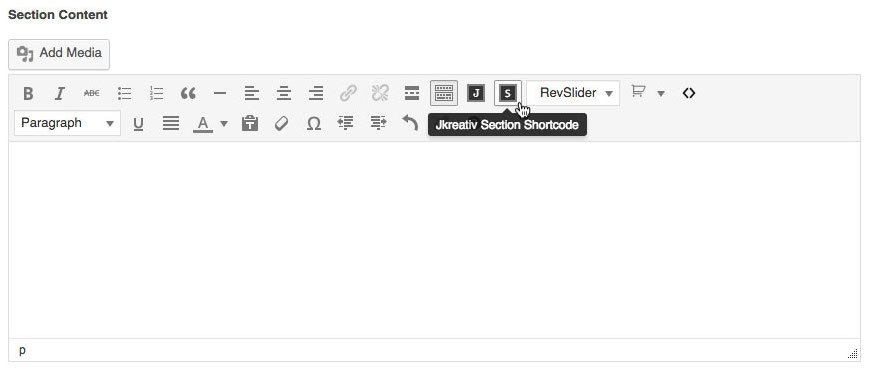
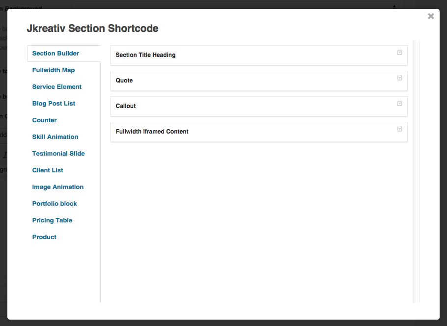
When you create a page with Landing Page Template, beside Visual Composer plugin we also provide you Section Shortcode on Legacy Section Builder page template. You can create unique page easily & fast with a lot of page elements by using shortcode.
Section Shortcode will show on landing page template, portfolio landing page, and also on admin panel (Footer for landing page & Extended Portfolio) .
Make sure if you’ve enable Legacy Section Builder when using Section Shortcode. Then you just need to add a new page, and select template Landing Page Builder – Legacy Section Builder then click Publish button.
JKreativ Section Shortcode List :
-
Section Builder
-
Section Title Heading
Add heading title of section.
Section Title Heading Settings
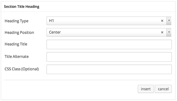
Section Title Heading Options :
- Heading Type : Select type of heading: H1, H2, H3, H4, H5 or H6.
- Heading Position : Set where to place heading: Center, Left or Right.
- Heading Title : Text of heading title.
- Title Alternate : Subheading text or short description.
- CSS Class (Optional) : Add aditional class in case you need to add custom styling for this element.
Section Title Heading Preview

-
Qoute
Show a full width quote over section or column. Nice to show wise words or motivating words.
Quote Settings
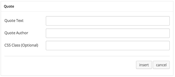
Quote Options :
- Quote Text :Main text for your quote.
- Quote Author : Set author name.
- CSS Class (Optional) : Add aditional class in case you need to add custom styling for this element.
Quote Preview

-
Callout
Show promotion text with call-to-action button.
Callout Settings
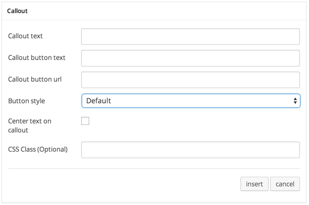
Callout Options :
- Callout Text : Main callout text or heading title.
- Callout Button Text : Text for button.
- Buton Style : Type of button: Default, Primary, Success, Info, Warning or Danger.
- Center Text on Callout : If checked text will have align centered.
- CSS Class (Optional) : Add aditional class in case you need to add custom styling for this element.
Callout Preview

-
Fullwidth Iframed Content
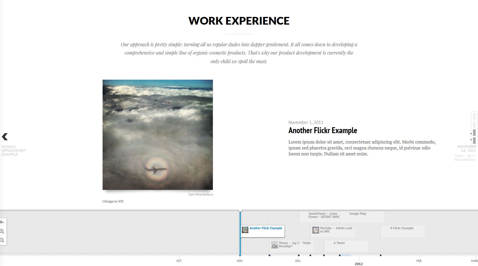
Insert or include content from external sources inside your page with HTML Iframe tag.
Fullwidth Iframed Content Settings
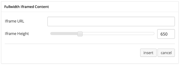
Fullwidth Iframed Content Options :
- Iframe URL : Link of content source.
- Iframe Height : Set height of content will be displayed.
Fullwidth Iframed Content Preview
-
-
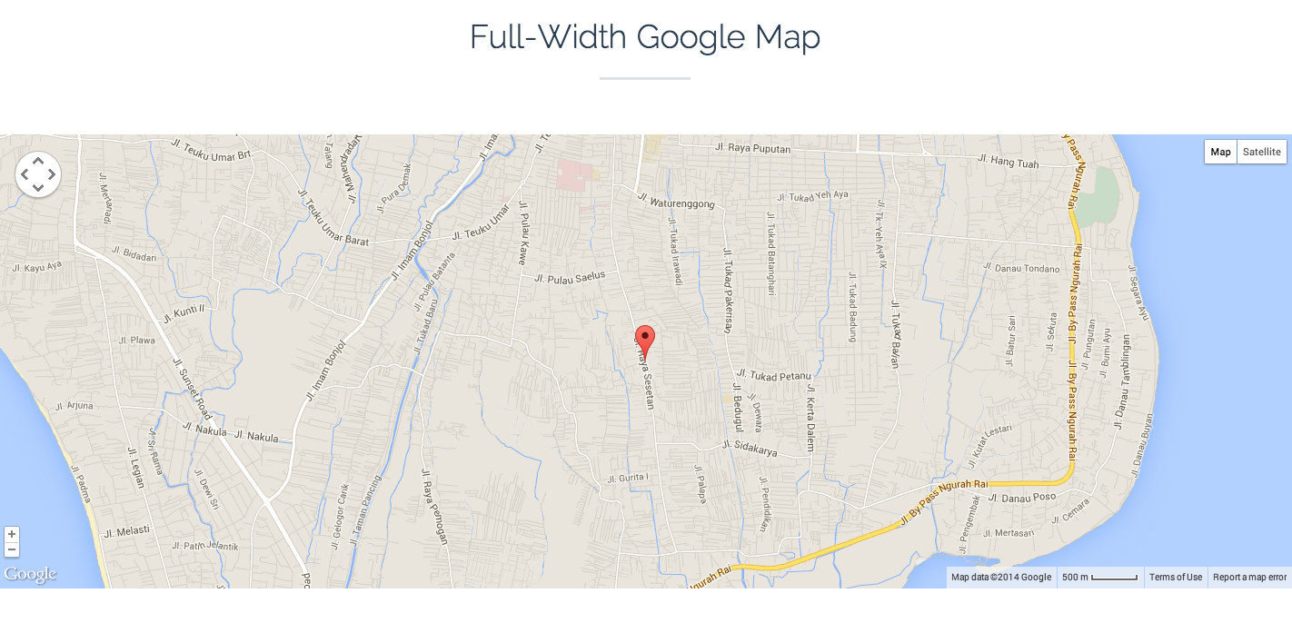
Fullwidth Map
Add fullwidth maps to your content.
Fullwidth Map Settings

Fullwidth Map Options :
- Latitude : Set Latitude coordinate of location or place you want to show on maps.
- Longitude : Set Longitude coordinate of location or place you want to show on maps.
- Title : Insert your map title.
- Map Zoom : Set number of zoom level.
- Container Height : Set container height or dimension of maps size.
- Don’t Use Fullwidth Map : Enable this option if you want to use boxed map.
Fullwidth Map Detail Settings
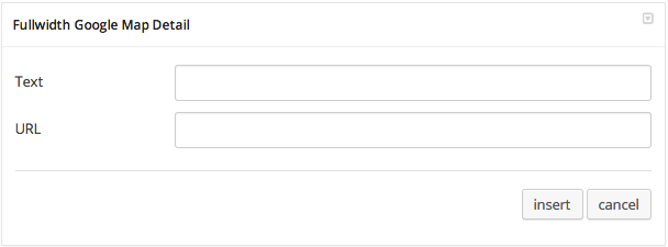
Fullwidth Map Detail Options :
- Text : Insert text for map detail.
- URL : Insert url link or leave empty if not having url.
Fullwidth Map Preview
-
Service Element
-
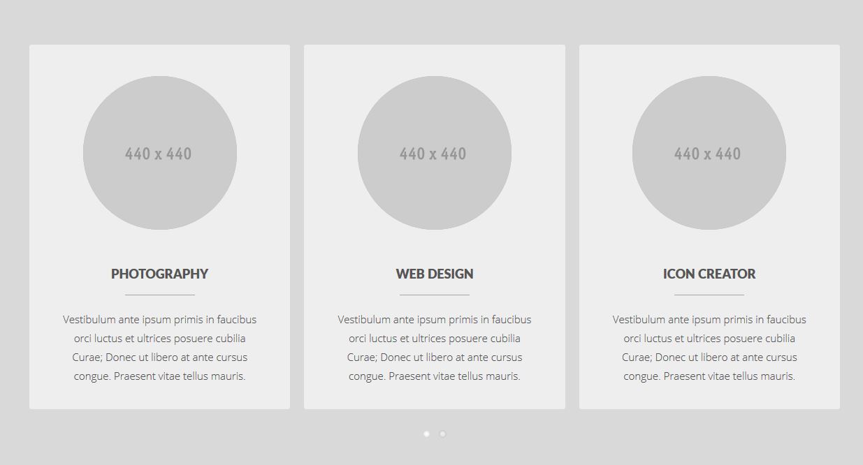
Service Image
Add list slider with images, title and description. For example it used to show list of services.
Service Image – Wrapper Setting

Service Image Wrapper Option :
- Extra Class Name (Optional) : Add aditional class in case you need to add custom styling for this element.
Service Image – Item Settings
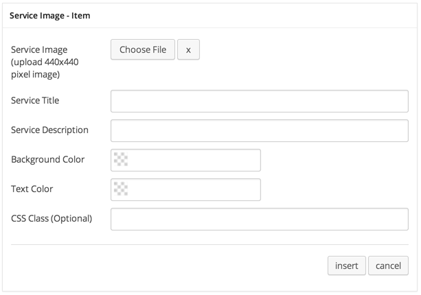
Service Image Item Options :
- Service Image : Select or upload image with size 440×440 px.
- Service Title : Insert title of your service item.
- Service Description : Insert short description of your service item.
- Background Color : Set background color for item block.
- Text Color : Set text color for all text on item block.
- CSS Class (Optional) : add aditional class in case you need to add custom styling for this element.
Service Image Preview
-
Service Icon
Add section list with icon, title and description. For example it used to show list of services.
Service Icon – Wrapper Settings
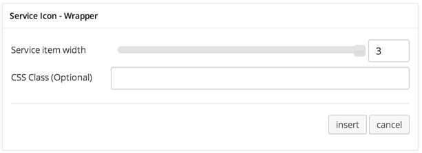
JKreativ – Service Icon Wrapper Options :
- Service Item Width : Set width of service item.
- CSS Class (Optional) : Add aditional class in case you need to add custom styling for this element.
Service Icon – Item Preview

Service Icon Item Options :
- Service Icon : Select icon from list.
- Service Title : Insert title of your service item.
- Service Description : Insert short description of your service item.
- CSS Class (Optional) : Add aditional class in case you need to add custom styling for this element.
Service Icon Preview
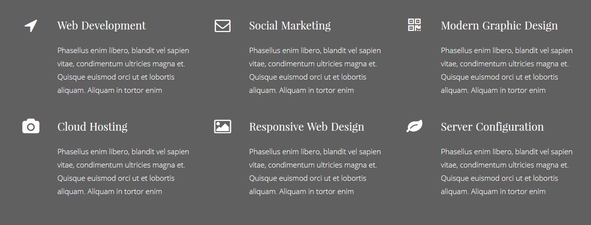
-
Service Block
Add section list with icon, title and description. For example it used to show list of services.
Service Block – Wrapper Settings
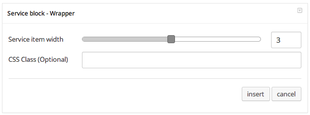
Service Block Wrapper Options :
- Service Item Width : Set width of service item.
- CSS Class (Optional) : Add aditional class in case you need to add custom styling for this element.
Service Block – Item Settings
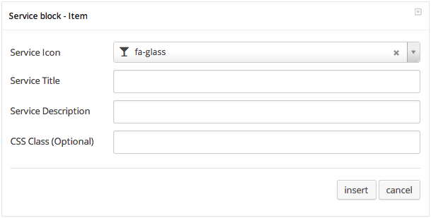
Service Block Item Options :
- Service Icon : Select icon from list.
- Service Title : Insert title of your service item.
- Service Description : Insert short description of your service item.
- CSS Class (Optional) : Add aditional class in case you need to add custom styling for this element.
Service Block Preview

-
-
Blog Post List
Add section blog post list.
Blog List Settings
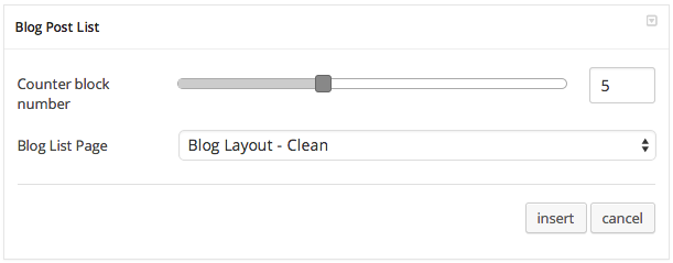
Blog List Options :
- Counter Block Number : Set number of post that you want to show.
- Read More Page Link : Insert your blog page list that will show up when clicked.
Blog List Preview
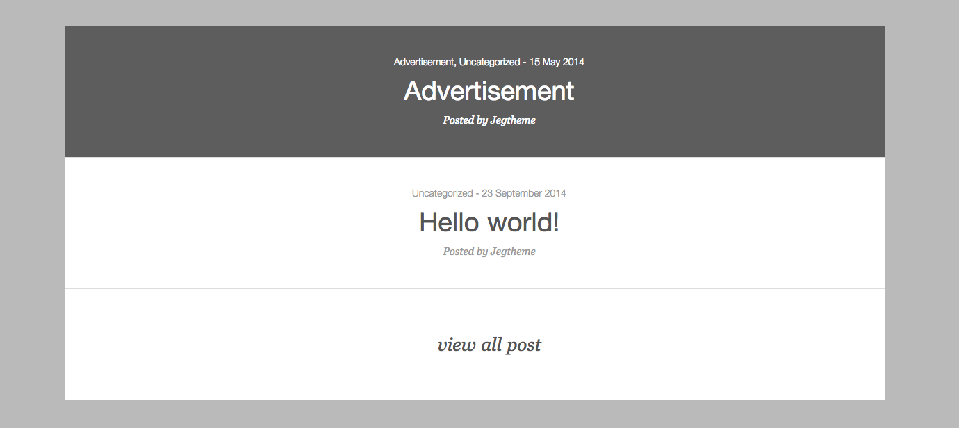
-
Counter
Display counter block info with nice animation.
Counter Wrapper Settings
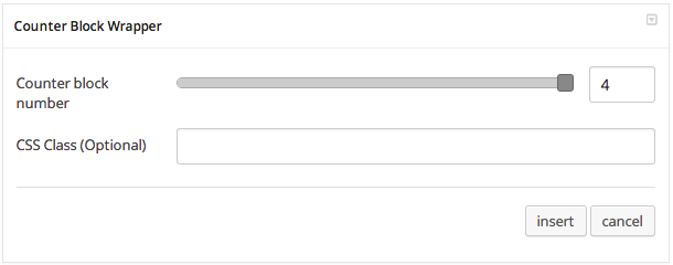
Counter Wrapper Options :
- Counter Block Wrapper : Set number of counter item.
- CSS Class (Optional) : Add aditional class in case you need to add custom styling for this element.
Counter Item Settings
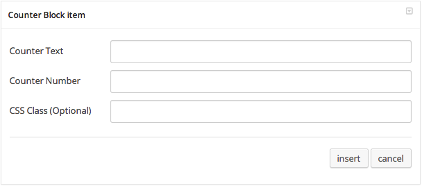
Counter Item Options :
- Counter Text : Insert text for counter item.
- Counter Number : Insert number for counter item.
- CSS Class (Optional) : Add aditional class in case you need to add custom styling for this element.
Counter Preview

-
Skill Animation
Display skills info with nice animation progress bar.
Skill Animation Wrapper Setting

Skill Animation Wrapper Option :
- CSS Class (Optional) : Add aditional class in case you need to add custom styling for this element.
Skill Animation Item Settings

Skill Animation Item Options :
- Skill Title : Insert title for skill bar.
- Skill Percentage : Set percentage of skill bar.
- Graph Color : Set graph color of skill bar.
- CSS Class (Optional) : Add aditional class in case you need to add custom styling for this element.
Skill Animation Preview

-
Testimonial Slide
Add slider of customer testimonials about your product or service.
Testimonial Wrapper Setting

Testimonial Wrapper Option :
- CSS Class (Optional) : Add aditional class in case you need to add custom styling for this element.
Testimonial Slide Item Settings
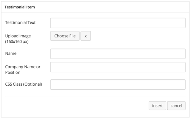
Testimonial Slide Item Options :
- Testimonial Text : Insert testimonial text here.
- Upload image : Select or upload image of testimonial author.
- Name : Name of testimonial author.
- Company Name or Position : Company name or position of testimonial author.
- CSS Class (Optional) : Add aditional class in case you need to add custom styling for this element.
Testimonial Slide Preview

-
Client List
Insert logo list slider of clients or brands that you use.
Client List
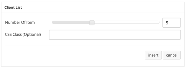
Client List Options :
- Number of Item : Set number of item per page.
- CSS Class (Optional) : Add aditional class in case you need to add custom styling for this element.
Client Image
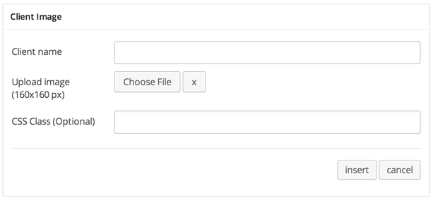
Client Image Options :
- Client name : Name of client or brand.
- Upload image : Select or upload logo image of client or brand.
- CSS Class (Optional) : Add aditional class in case you need to add custom styling for this element.
Client List Preview

-
Image Animation
Create motion animation with images.
Image Animation Wrapper Settings
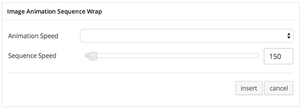
Image Animation Wrapper Options :
- Animation Speed : Select animation speed: Fast, Slow, or Slower.
- Sequence Speed : Set numer of sequence speed of animation.
Image Animation Item Settings
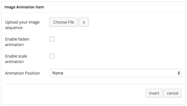
Image Animation Item Options :
- Upload your image sequence : Select or upload image that will be animated.
- Enable fadein animation : Check it if you want to enable fade in effect in motion.
- Enable scale animation : Check it if you want to enable scale effect in motion.
- Animation Position : Select where to start the animation: None, Top, Bottom, Left or Right.
To create perfect image for animation, you will need to have the same image size (width & height). For example, to create image animation like bellow you will need to 3 layer of images :
Layer 1

Layer 2

Layer 3

Image Animation Item Preview

-
Portfolio Block
Portfolio block using masonry effect, but you will need to arrange it as you want. it having 3 option for width (1/3, 1/2, 2/3) and also 2 option for height, (1, 2 height size).
Portfolio Block Wrapper Settings

Portfolio Block Wrapper Options :
- Portfolio Parent : Select page of portfolio list (page that using portfolio template).
- Button portfolio parent link text : Set text of button that direct to portfolio list page.
Portfolio Block Setting

Portfolio Block Options :
- Portfolio Item : Select portfolio item you want to add.
- Portfolio Image : Select or upload image for portfolio cover (thumbnail). Leave it empty if you want to use default portfolio cover.
- Block Width : Select block width: 1/3, 1/2 or 2/3
- Block Height : Select block height: 1 or 2
Portfolio Block Preview

-
Pricing Table
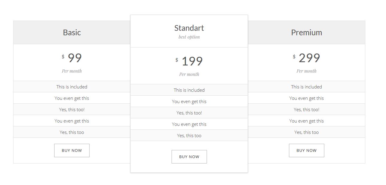
Add pricing list of your product. Number of pricing table item: 3, 4 and 5.
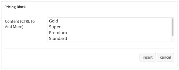
Pricing Table Before you can use Pricing Table shortcode, you need to create / post Pricing Table first. Please go to: Pricing Table Post Type for further information.Pricing Table Setting
Pricing Table Options :
- Content : select pricing item that you want to display. Note: max 5 items
Pricing Table Preview
-
Product
Add slides of your latest product.
Latest Product Settings
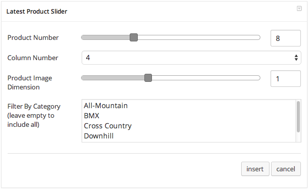
Latest Product Options :
- Product Number : Set number of product that you want to show.
- Column Number : Set number of column for product slider item.
- Product Image Dimension : Set dimention of product image.
- Filter By Category : Choose your product item that you want to show up that filter by category. Leave empty to include all.


