Landing Page Builder Overview
JKreativ themes comes with two options in creating unique page, which is Section Builder or Page Builder using Visual Composer Plugin. Generally both of Landing Page template contain 3 main elements :
- Heading Element
- Body Page Builder
- Footer Element
Landing Page – Heading Element
On Landing Page, you have option to add heading element. We provide 3 type of heading, or you can choose not using any header by choosing No Heading option. Those heading are :
Landing Page – Heading Element
-
JKreativ Slider Format
We also provide you with 3 type of JKreativ Slider Format, which is Parallax Slider, Split Slider and Fullscreen Text Slider. To create new Landing Slider just go to Landing Slider→Add Slider
-
Split Slider
We only have for half screen option on Split Slider. This slider beside having Split Slider also have parallax effect on scrolling. This instruction will help you to setup Landing Slider – Split Slider :
- Set Title for naming Landing Slider
- Set Slider Type to Split Slider
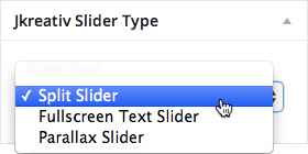
- Setup JKreativ Split Slider options
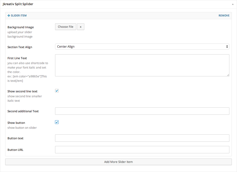 You can add unlimited Slider Item that has individual options.
Global Options Explanation :
- Background Image : Select or upload your slider background image.
- Section Text Align : Select position of text element (Center Align, Left Align or Right Align)
- First Line Text : Set text for heading.
- Show second line Text : Enable this option if you want to set text for sub-heading or short description.
- Second additional Text : Set text for sub-heading or short description.
- Show Button : Enable this option if you want to have button on this slide.
- Button text : Button text to show what is button do or direct to.
- Button url : Fill the link of page to follow when clicked.
- Split Slider Preview

-
Fullscreen Text Slider
If you willing to use single page, this Fullscreen Text Slider is really fit for you. You can also use video as background for this element. This instruction will help you to setup Landing Slider – Fullscreen Text Slider :
- Set Title for naming Landing Slider
- Set Slider Type to Fullscreen Text Slider
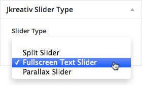
- Setup JKreativ Fullscreen Text Slider options
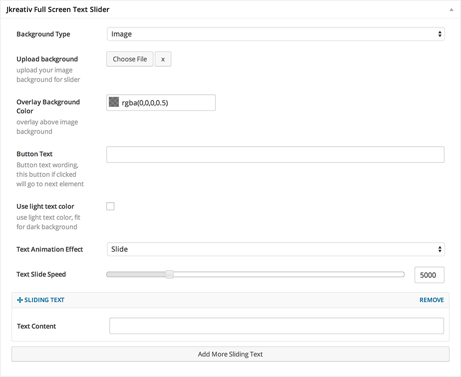
You can add unlimited Slider Item that has individual options.
Global Options Explanation :- Background Type : Select type of slider background (Image, HTML5 Video or Youtube Video)
Image option :- Upload Background : Select or upload your slider background image.
HTML5 Video options :
- Background Fallback Image : Select or upload image background for slider to display if video doesn’t load properly.
- MP4 format Video : Select or upload MP4 video format.
- WEBM format Video : Select or upload WEBM video format.
- OGG format Video : Select or upload OGG video format.
- Video Height : Set number of video height (Example: 1080)
- Video Width : Set number of video width (Example: 1920)
YouTube Video options :
- Background Fallback Image : Select or upload image background for slider to display if video doesn’t load properly.
- Youtube as Slider background video : Insert YouTube video URL (Example:
http://youtube.com/watch?v=qjP4QdZK7tc) - Use Static Video Background instead Parallax : Enable this option if you want to make global background on section transparent background.
- Overlay Background Color : Set background overlay color with solid or tranparent color.
- Button text : Set text for button when clicked will scroll down to content under the Landing Slider.
- Use light text color : Enable light text color if you use dark background.
- Text Animation Effect : Select type of text animation effect (Slide or Type)
- Text Slide Speed : Set number of slide animation speed of text if you choose Slide Animation.
Sliding Text Option (On this option you can add unlimited Sliding Text item)
- Text Content : Fill your main text content for text slider item.
- Background Type : Select type of slider background (Image, HTML5 Video or Youtube Video)
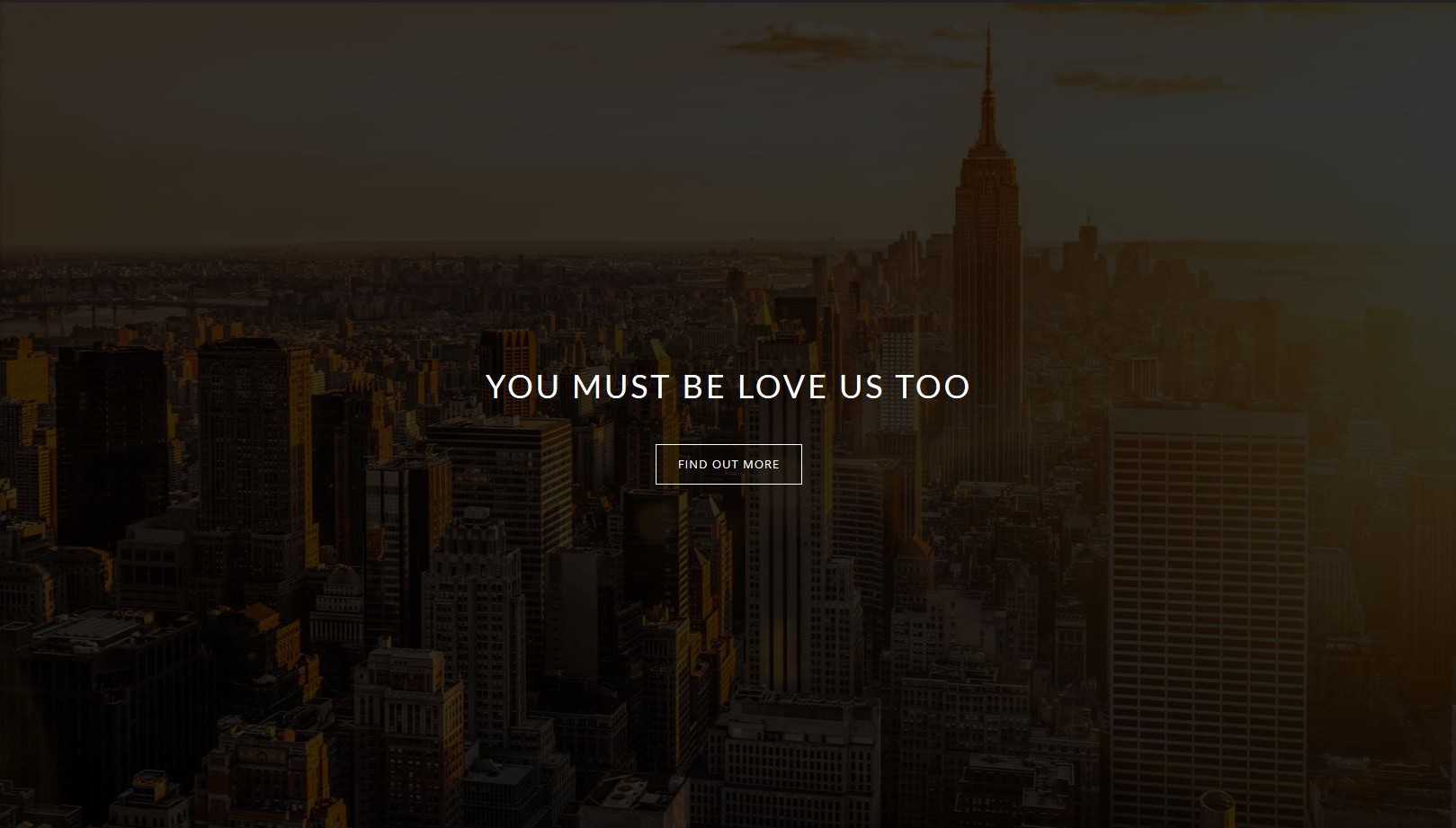
- Fullscreen Text Slider Preview
-
Parallax Slider
This Parallax Slider have option to use fullscreen or half size screen option. You can adjust it base on your requirement. This instruction will help you to setup Landing Slider – Parallax Slider :
- Set Title for naming Landing Slider
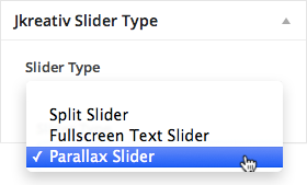
- Set Slider Type to Parallax Slider
- Setup Jkreativ Parallax Slider options
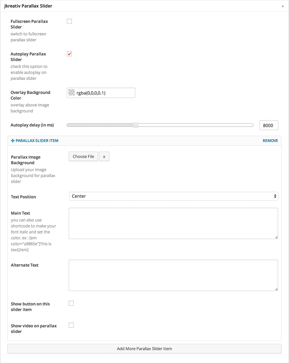
You can add unlimited Slider Item that has individual options.Global Options Explanation :- Fullscreen Parallax Slider : Enable this option if you want to use fullscreen mode.
- Autoplay Parallax Slider : Enable this option if you want to make autoplay the slide animation.
- Overlay Background Color : Set background overlay color with solid or tranparent color.
- Autoplay Delay : Set number of slide animation delay in millisecond.
Parallax Slider Item Options (On this option you can add unlimited Sliding Text item)
- Parallax Image Background : Select or upload image background for slider item.
- Text Position : Select position of text element (Center or Left)
- Main Text : Insert text for heading title.
- Alternate Text : Insert alternate text for sub-heading or short description.
- Parallax Slider Preview

-
-
Normal Parallax Heading
This is simple parallax heading option that will have 2 text you can fill. It’s good use for your page title.
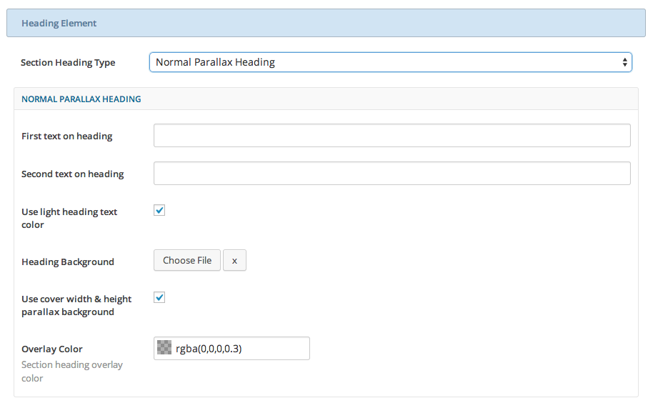
Global Options Explanation :
- First Text on Heading : Insert text for heading title.
- Second Text on Heading : Insert alternate text for sub-heading or short description.
- Use Light Heading Text Color : Enable light text color if you use dark background.
- Heading Background : Select or upload your slider background image.
- Use Cover Width & Height Parallax Background : Enable this option if you want to set cover width and height parallax background.
- Overlay Color : Set background overlay color with solid or tranparent color.
Normal Parallax Heading Preview
-
Shortcode Heading
By using Shortcode Heading, you can put Revolution Slider or any other slider to build heading slider that you need.
Also you have option to have Fullscreen slider (This option will need your slider plugin have option to adapt with fullscreen page also
Landing Page – Navigation Option
On Landing Page we provide two additional option for navigation which is Horizontal Bottom Navigation and Landing Navigation especially on this page template.
-
Horizontal Bottom Navigation
We also provide Horizontal Bottom Navigation position on Lading Page, only if you’re using Top Navigation position. So you can put your Top Navigation on bottom section of the Landing Slider on your Landing Page by enabling this option.

-
Landing Navigation
When your browse on long Landing Page, which part of website you currently and how long you currently scrolling. We provide feature to give your user easy access, and know what section available.
You can easily use this feature just by adding Section name on your section builder. On this option we provide 2 type of Landing Navigation which is Rectangle (by default) and Circle.
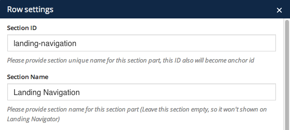
This image below will help you to setup Section Name for Landing Navigation on Landing Page Builder that using Legacy Section Builder and Visual Composer :
Landing Page – Footer Element
We provide you an option to disable footer on this template. By enabling this option footer element will doesn’t occur and your setting on General Setting for footer element will override.
Landing Page Template
As we said on above previously, JKreativ themes comes with two options in creating unique page, which is Section Builder and Page Builder that using Visual Composer Plugin. You can use one of them to create you Landing Page and generally both of Landing Page template have same option to create several element such as Testimonial, Progress Bar, Service Element and etc.
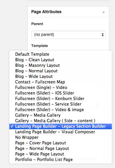
To create Landing Page with Legacy Section Builder just go to Pages→Add New
Landing Page Builder – Legacy Section Builder
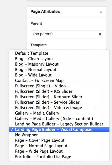
To create Landing Page with Visual Composer just go to Pages→Add New


