JKreativ General Shortcode
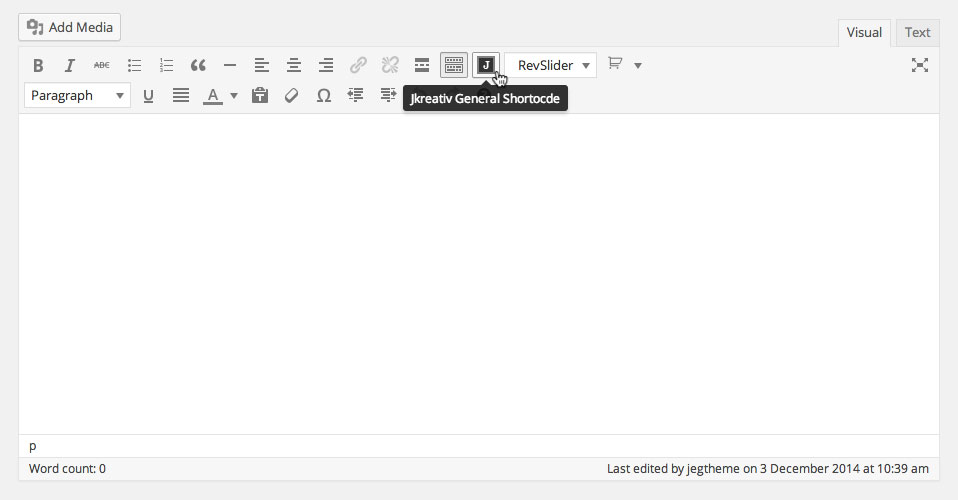
General shortcode will appear on most text area element on admin panel.
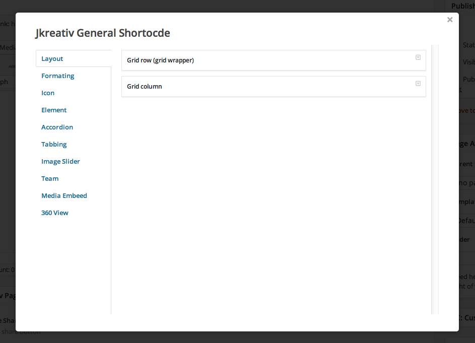
General Shortcode Content List :
-
Layout
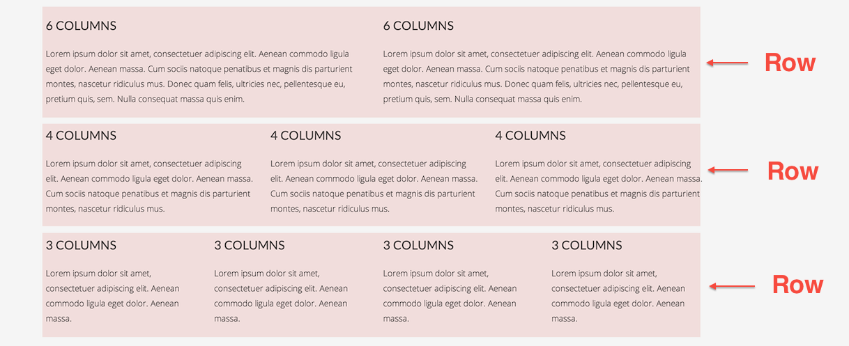
Our layout is implemented grid system that can be divide into 12 columns inside row. Each section can have unlimited number of rows.
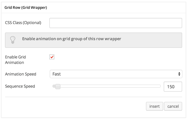
- Grid Row (Grid Wrapper) : Add new row to begining create grid layout.
Options :
- CSS Class (Optional) : Add aditional class in case you need to add custom styling for this element.
- Enable Grid Animation : Check this to enable show animation for row.
- Animation Speed : Select animation speed: Fast, Slow, or Slower
- Sequence Speed : Set numer of sequence speed of animation.
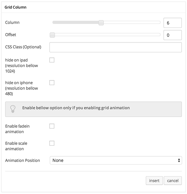
- Grid Column : Add new column inside existing row.
Options :
- Column : Set number of column you want to add.
- Offset : Set number of column offset you want to add.
- CSS Class (Optional) : Add aditional class in case you need to add custom styling for this element.
- Hide on iPad : Check this to hide this column and entire content on iPad device.
- Hide on iPad : Check this to hide this column and entire content on device with resolution 1024px width and lower, such as iPad.
- Hide on iPhone : Check this to hide this column and entire content on device with resolution 480px width and lower, such as iPad.
- Enable fadein animation : Check this to enable fadein effect on this column.
- Enable scale animation : Check this to enable scale effect on this column.
- Animation Position : Select where to start the animation: None, Top, Bottom, Left or Right
- Grid Row (Grid Wrapper) : Add new row to begining create grid layout.
-
Formating
-
Drop Cap
Add a large initial letter that drops below the first line of a paragraph, usually used at the beginning of a text content.

Options :
- CSS Class (Optional) : Add aditional class in case you need to add custom styling for this element.
Drop Cap

-
HR
Add horizontal line along the content or column width used to separate content.
HR

-
Short HR
Add short width of horizontal line used to separate content.
Short HR

-
Double HR
Add double size horizontal line along the content or column width used to separate content.
Double HR

-
Highlight
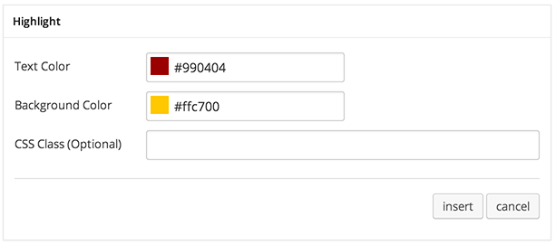
Add shading to text.
Options :
- Text Color : Set text color.
- Background Color : Set background color of highlighted text.
- CSS Class (Optional) : Add aditional class in case you need to add custom styling for this element.
Highlight

-
Tooltip
Add tooltip or infotip or hint on mouse hover text.
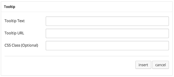
Options :
- Tooltip Text: Insert tooltip text.
- Tooltip URL : Insert url into tooltip text.
- CSS Class (Optional) : Add aditional class in case you need to add custom styling for this element.
Tooltip

-
Clear Spacing
This shortcode is important for clearing floated element above or bellow content.

Option :
- Spacing Size: Set size of spacing that you need.
Clear Spcing

-
Emphasis
Make emphasis for certain text.
-
-
Icon
-
Single Icon
Add an icon into your site content.

Options :
- Select Icon : Choose icon that you want to use.
- Color : Set color icon.
- Size : Set size of icon.
-
Icon List
Add list of icon into your site content.
To insert Icon list begin with adding Icon List Wrapper and continue by adding Icon List inside wrapper shortcode.
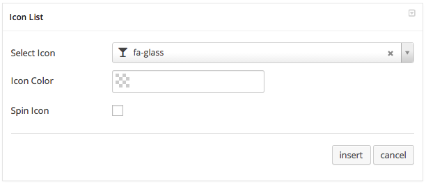
Options :
- Select Icon : Choose icon that you want to use.
- Color : Set color icon.
- Spin Icon : Check this option if you want to make icon spinner.
-
-
Element
-
Single Image
Add image with image zooming feature.
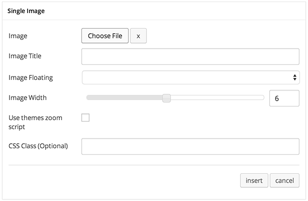
Options :
- Image : Upload or choose image that you want to add.
- Image Title : Add caption or title of image when it zoomed.
- Image Floating : Select image align: Center, Left or Right
- Image Width : Set width size of image.
- Use themes zoom script : Check this to enable image zooming into modal popup when image clicked.
- CSS Class (Optional) : Add aditional class in case you need to add custom styling for this element.
Single Image

-
Google Map
Add maps to your content with possibilities to set place/location and adding title.
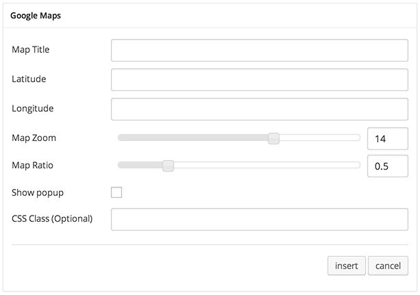
Options :
- Map Title : Set title of place or location you want to show on maps.
- Latitude : Set Latitude coordinate of location or place you want to show on maps.
- Latitude : Set Longitude coordinate of location or place you want to show on maps.
- Map Zoom : Set number of zoom level.
- Map Ratio : Set ratio or dimension of maps size.
- Show Popup : Check this to show tooltip with title above map pin.
- CSS Class (Optional) : Add aditional class in case you need to add custom styling for this element.
Google Maps

-
Testimonial
Add testimonial block with client picture.
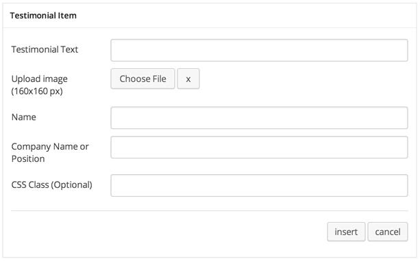
Options :
- Testimonial Image : Upload or choose image of author.
- Testimonial Author : Set name of testimonial author.
- Testimonial Author Additional Title : Set additional text that will be added next to author name.
- Image Floating : Select image align: Left or Right
- Testimonial Content : Type testimonial of content here.
- CSS Class (Optional) : Add aditional class in case you need to add custom styling for this element.
Testimonial

-
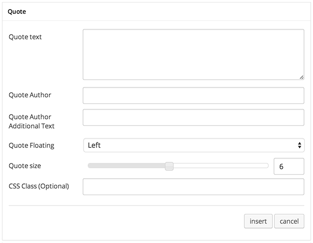
Quote
Show a pull quote within a paragraph or article of text.
Options :
- Quote Text : Main quote text write here.
- Quote Author : Set author name.
- Quote Author Additional Title : Set additional text that will be added next to author name.
- Quote Floating : The position of quote: Left or Right
- Quote Size : Set number of column size of quote.
- CSS Class (Optional) : Add aditional class in case you need to add custom styling for this element.
Quote

-
Alert
Standard alert box or message box.

Options :
- Alert Type : Type of alert box: Success, Info, Warning or Danger
- Main Text : Caption of alert box.
- Second Text : Main message of alert box.
- Show Close Button : Check this to show close button on alert box.
- CSS Class (Optional) : Add aditional class in case you need to add custom styling for this element.
Alert

-
Button
Insert button with anchor tags to direct users to other pages or sites.
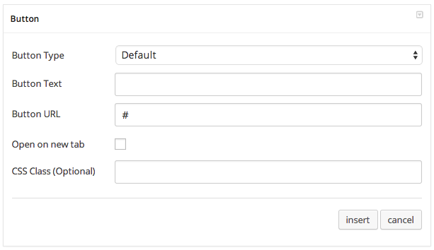
Options :
- Button Type : Type of button: Default, Primary, Success, Info, Warning or Danger
- Button Text : Button text to show what is button do or direct to.
- Button URL : Link of page to follow when clicked.
- Open on new tab : If checked it will open target link on new browser tab.
- CSS Class (Optional) : Add aditional class in case you need to add custom styling for this element.
Button

-
-
Accordion
Expand and collapse the content inside a container with a title.
To insert Accordion begin with adding a Wrapper and continue by adding content inside wrapper shortcode.

Option :
- CSS Class (Optional) : Add aditional class in case you need to add custom styling for this element.
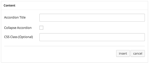
Options :
- Accordion Title : Insert title of accordion.
- Collapse Accordion : Check this option if you want to make this accordion item collapse.
- CSS Class (Optional) : Add aditional class in case you need to add custom styling for this element.
Accordion

-
Tabbing
Tabbing alias tabs allow you to show more content on the page using less space.
- Example : Use this to see example of this shortcode.
- Heading Wrapper : Insert wrapper of tabs heading.
 Options :
- CSS Class (Optional) : Add aditional class in case you need to add custom styling for this element.
- Heading Content : Insert tab heading, place it inside Heading Wrapper shortcode.
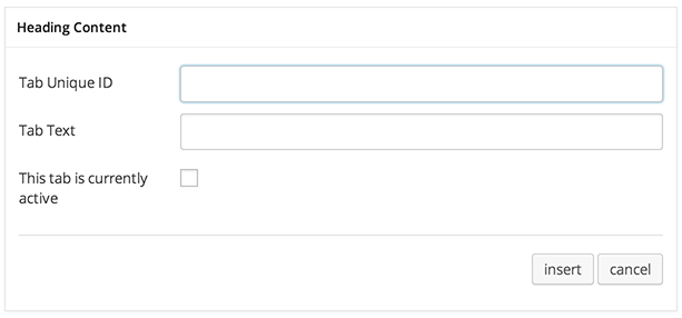 Options :
- Tab Unique ID : Add identifier of tab. Note: ID must be unique each tab.
- Tab Text : Tab heading title.
- This tab is currently active : Check this to make this tab active by default.
- Content Wrapper : Insert wrapper of tabs content.
 Options :
- CSS Class (Optional) : Add aditional class in case you need to add custom styling for this element.
- Content : Insert tab content inside of Content Wrapper shortcode.
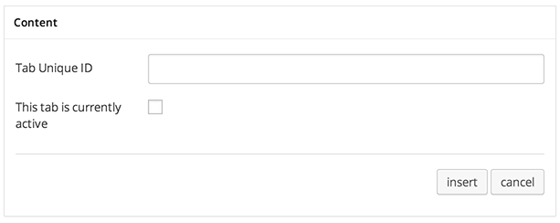 Options :
- Tab Unique ID : Add identifier of tab that associated with tab header. Note: ID must be match with Tab Unique ID at Header Wrapper.
- Tab Text : Tab heading title.
- This tab is currently active : Check this to make this tab active by default.
Tabbing
-
Image Slider
Insert a series of images using shortcode.
To insert Image Gallery begin with adding Wrapper and continue by adding Content inside Wrapper shortcode.

Options :
- CSS Class (Optional) : Add aditional class in case you need to add custom styling for this element.

Options :
- Insert your image : upload or choose image that you want to add
Image Slider
-
Team
Insert 2 column list that has picture, name.
Important Before you can use Team shortcode, you need to create / post Team first. Please go to: Team Post Type for further information.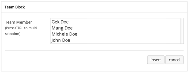
Options :
- Team Member : select member that you want to show.
Team Member

-
Media Embed
-
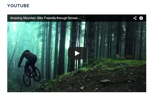
YouTube
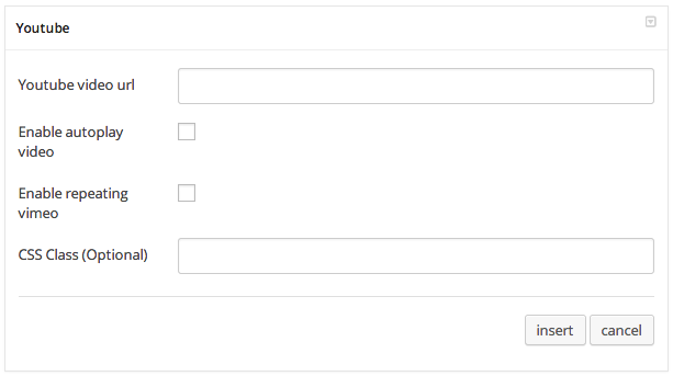
Options :
- YouTube Video URL : Insert your youtube video url.
- Enable Autoplay Video : Enable this option if you want to make autoplay your video.
- Enable Repeating Video : Enable this option if you want to make your video repeated.
- CSS Class (Optional) : Add aditional class in case you need to add custom styling for this element.
YouTube
-
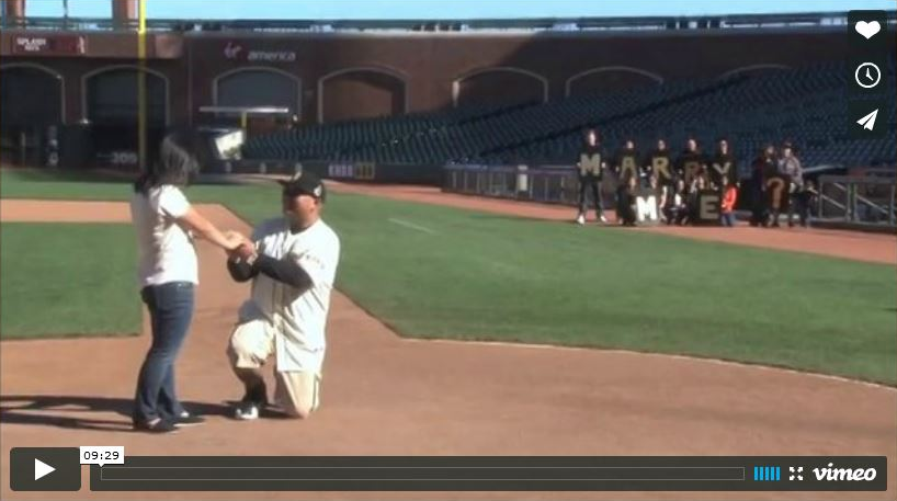
Vimeo

Options :
- Vimeo Video URL : Insert your vimeo video url.
- Enable Autoplay Video : Enable this option if you want to make autoplay your video.
- Enable Repeating Video : Enable this option if you want to make your video repeated.
- CSS Class (Optional) : Add aditional class in case you need to add custom styling for this element.
Vimeo
-
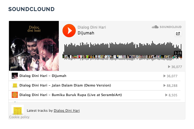
SoundCloud
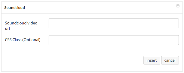
Options :
- SoundCloud Video URL : Insert your soundcloud url.
- CSS Class (Optional) : Add aditional class in case you need to add custom styling for this element.
SoundCloud
-
HTML 5 Video
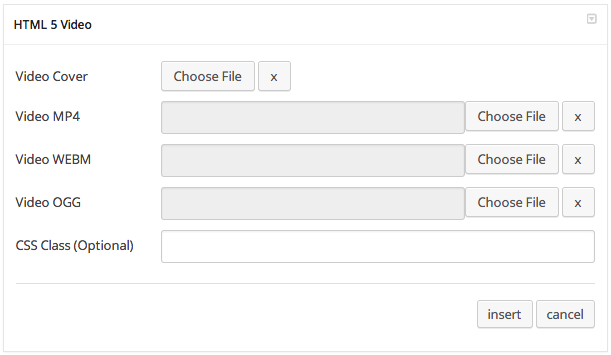
Options :
- Video Cover : Insert an image as video cover.
- Video MP4 : Select or upload mp4 video format.
- Video WEBM : Select or upload webm video format.
- Video OOG : Select or upload oog video format.
- Extra Class Name (Optional) : Add aditional class in case you need to add custom styling for this element.
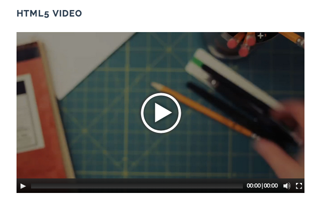
HTML 5 Video
-
-
360
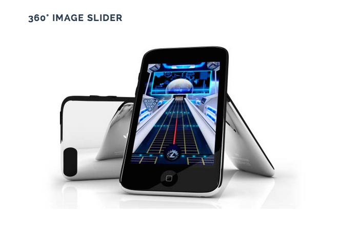
Showcasing your product in 360 degrees.
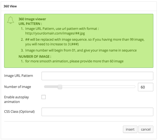
Options :
- Image URL Pattern : url pattern of where 360 images placed.
- Number of Image : Set number of your image.
- Enable Autoplay Animation : Check this option if you want to make your image autoplay.
- CSS Class (Optional) : Add aditional class in case you need to add custom styling for this element.
360
Credit Generator Shortcode
Display list of text with scrolling effect on modal popup.
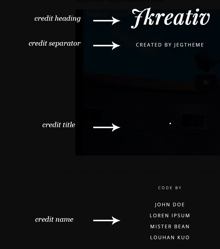
- Credit Heading : Insert big heading text.

Option :
- Credit heading text : Insert text for heading.
- Credit Separator : Add separator with big space.
- Credit Title : Insert title text.

Option :
- Credit title text : Insert text for title.
- Credit Name : Insert name text.

Option :
- Credit Name text : Insert text for name.
Credit Preview

