In this section, we will explain about creating Single Panorama. There are a few things that we’ll explain to you such as:
- Setup Panorama
- Panorama Type
- Panorama Toolbar
- Create Hotspot
- Create Tour
1. Setup Panorama
You can create Single Panorama on the Single Panorama dashboard. Go to the WordPress Dashboard → Virtual Tour → Single Panorama. If you already on the Single Panorama dashboard, then click the plus button (+) and you can start setup the panorama options.
On the panorama editor, you will find the basic option for single panorama under the Panorama tab. Here’s the list of panorama options:
- Panorama Name
Provide a name for your panorama. - Panorama Type
Choose your panorama image type. Please check the Panorama Type below for detail information. - Equirectangular Image
Upload an image as a panorama image. This option will be shown when you choose the equirectangular panorama type. - Cubemap Image
Upload an image as a panorama image. This option will be shown when you choose the cubemap panorama type. - Initial Coordinate
The value of this option will set automatically. Please check the Panorama Toolbar below for detail information point number 3. - Panorama Height Dimension
The height based on the percentage (%) of panorama width. (Example: 100 means 1:1, 200 means 2:1). - Toolbar Scheme
Choose which toolbar scheme you want to use for your panorama. - Enable Auto Rotate
Check this option to enable automatic rotation after panorama finish loading. - Auto Rotate Speed
Define auto rotate speed. - Auto Rotate Direction
Choose auto rotate direction for panorama image. - Show Autorotate Control
Enable this option to show the auto rotate control. - Show Compass
Enable this option to show the compass. - Compass North Location
Set compass north location, you can also use the above button to set compass north location. This option will be shown if you enable Show Compass option. - Show Zoom Control
Enable this option to show the zoom control. - Show Fullscreen Control
Enable this option to show the fullscreen control. - Show Hotspot & Tour List
Enable this option to show the hotspot & tour list info. - Panorama Map
Any option to control panorama map. - Show Panorama Map
Enable this option to show the panorama map. - Select Panorama Map
Choose the panorama map that you want to use. This option will be shown if you enable Show Panorama Map option. - Map Dimension
The dimension based on the percentage (%) of panorama container size. (Example: 10 means 1:10, 50 means 1:2). This option will be shown if you enable Show Panorama Map option. - CSS
Set CSS for this panorama.
2. Panorama Type
We provide 2 kind of panorama type which is equirectangular panorama type and cubemap panorama type. Below we will explain more detail for each panorama type.
- Equirectangular
When you choose to use the equirectangular panorama type, you will need to insert 1 image for the panorama image. You can use images below for example:https://support.jegtheme.com/wp-content/uploads/2019/10/bma-1.jpg
- Cubemap
If you choose to use the cubemap panorama type, you will need to insert 6 images which are for front area image, back area image, left area image, right area image, top area image, and bottom area image. It’s like a normal cube. You can use images below for example:https://support.jegtheme.com/wp-content/uploads/2019/10/front.jpg https://support.jegtheme.com/wp-content/uploads/2019/10/back.jpg https://support.jegtheme.com/wp-content/uploads/2019/10/left.jpg https://support.jegtheme.com/wp-content/uploads/2019/10/right.jpg https://support.jegtheme.com/wp-content/uploads/2019/10/top.jpg https://support.jegtheme.com/wp-content/uploads/2019/10/bottom.jpg
3. Panorama Toolbar
On the Single Panorama editor, we provide several buttons on the top toolbar that have important functions. Please check the image below for detail:
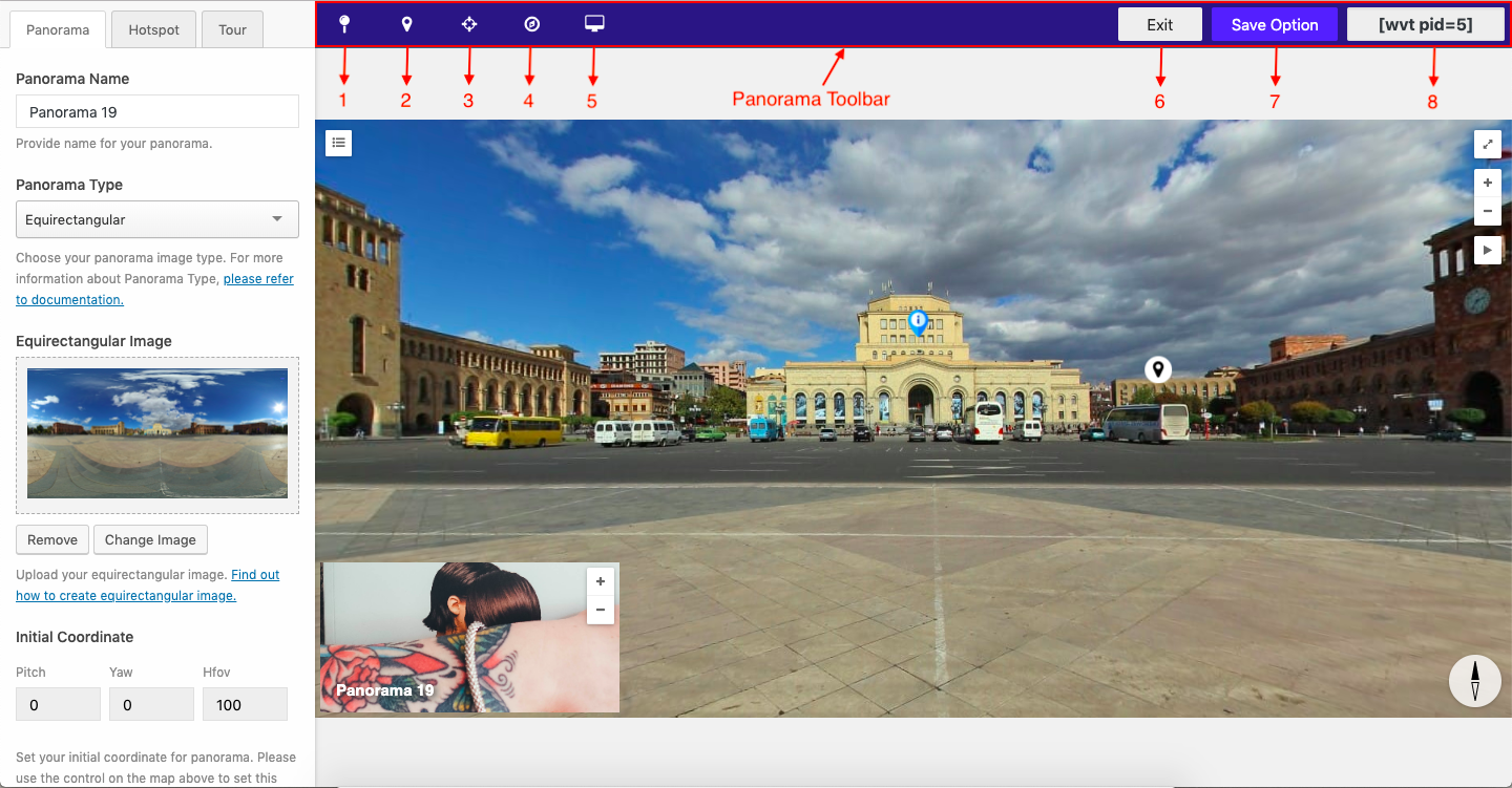
- Create Hotspot
You can use this button to toggle (show/hide) the create hotspot interface. - Create Tour
You can use this button to toggle (show/hide) the create tour interface. - Set Initial Coordinate
You can use this button to set the initial coordinate (initial view) of the panorama when the first load. You just need to find the spot that you want to use as initial coordinate by dragging the panorama view then click Set Initial Coordinate button. - Set Panorama North
You can use this button to set the north direction. You just need to find the spot that you want to use as north direction by dragging the panorama view then click the Set Panorama North button. - Device Mode
You can use this button to switch the panorama view based on device mode. We provide 3 kinds of device mode such as desktop mode, tablet mode, and phone mode. - Exit
You can use this button to exit from the panorama editor. - Save Option
You can use this option to save your panorama setup. - Panorama Shortcode
You can copy the panorama shortcode on this button. You just need to click the button and the panorama shortcode will copy automatically on the clipboard.
4. Create Hotspot
After have done with setup the panorama option, you can start create the Hotspot. You can add multiple hotspots on the single panorama.
The hotspot is part of the Single Panorama feature. With this feature, you will be able to flag or pin a certain spot on the panorama image and showing some information such as short caption, post content, product content, etc.
You can follow the instruction below to adding new hotspot:
- Click the Create Hotspot toolbar.
- After the create hotspot interface showed, you can drag the panorama view to find the spot that you want to put the hotspot pin.
- If you already find the right spot, then you can click ADD NEW button to adding a new hotspot.
- Next, you can set up the hotspot option to fit with your need.
Here’s the list of hotspot options:
- Hotspot Key
Hotspot key that you can use for CSS or JavaScript purpose. - Hotspot Title
Insert text for hotspot title. - Hotspot Shape
Choose hotspot shape. - Hotspot Badge
Badge for this hotspot. This option will be shown when you choose Badge shape on the Hotspot Shape option. - Hotspot Background Color
Choose the background color for the hotspot. This option will not be shown if you choose Badge shape on the Hotspot Shape option. - Hotspot Shape Width
Set shape size, bigger hotspot indicate that they need more attention. - Icon Type
Choose which icon type you want to use. This option will not be shown if you choose Badge shape on the Hotspot Shape option. - Hotspot Icon
Icon for this hotspot. This option will not be shown if you choose Badge shape on the Hotspot Shape option and you need to choose Font Icon on the Icon Type option. - Hotspot Icon Color
Color for this hotspot icon. This option will not be shown if you choose Badge shape on the Hotspot Shape option and you need to choose Font Icon on the Icon Type option. - Icon Font size
Set hotspot size, bigger hotspot indicate that they need more attention. This option will not be shown if you choose Badge shape on the Hotspot Shape option and you need to choose Font Icon on the Icon Type option. - Image Icon
Upload your image icon. This option will not be shown if you choose Badge shape on the Hotspot Shape option and you need to choose Image on the Icon Type option. - Hotspot Coordinate
Set the coordinate for this hotspot. - Hover Behaviour
Choose how hotspot behavior when hovered. - Select Product
Type the title of the WooCommerce product that you want to show. This option will be shown if you choose the WooCommerce Product on the Hover Behavior option. - Select Post
Type the title of the post that you want to show. This option will be shown if you choose the Post Content on the Hover Behavior option. - Hover Theme
Choose hover theme to be used. - Hover balloon min-width
Define the minimum width for the balloon. This option will be shown if you choose Short Tooltips or Long Text Tooltips on the Hover Behavior option. - Hover balloon max-width
Define maximum width for the balloon. This option will be shown if you choose Short Tooltips or Long Text Tooltips on the Hover Behavior option. - Tooltip Text
Insert text that shown on the tooltip when hotspot hovered. This option will be shown if you choose Short Tooltips on the Hover Behavior option. - Tooltip Position
Position of tooltips. This option will be shown if you choose Short Tooltips or Long Text Tooltips on the Hover Behavior option. - Tooltip Content
Tooltips content. This option will be shown if you choose Long Text Tooltips on the Hover Behavior option. - Click Behaviour
Choose how behavior reacts when hotspot clicked. - Hotspot URL
Insert URL for the hotspot. This option will be shown if you choose Open new page on the Click Behavior option. - Hotspot Video
Insert YouTube or Vimeo video. This option will be shown if you choose Video Popup on the Click Behavior option. - Hotspot Gallery
Show gallery when icon clicked. This option will be shown if you choose Gallery Popup on the Click Behavior option.
5. Create Tour
After have done with setup the hotspot option, you can start create the Tour. You can add multiple tours on the single panorama.
The tour also part of the Single Panorama feature. With this feature, you will be able to flag or pin a certain spot on the panorama image then assign certain single panorama on that spot. When the spot clicked, the single panorama that relates to that spot will be loaded dynamically.
You can follow the instruction below to adding new tour:
- Click the Create Tour toolbar.
- After the create tour interface showed, you can drag the panorama view to find the spot that you want to put the tour pin.
- If you already find the right spot, then you can click ADD NEW button to adding a new tour.
- Next, you can set up the tour option to fit with your need.
Here’s the list of tour options:
- Tour Key
Tour key that you can use for CSS or JavaScript purpose. - Tour Title
Insert text for tour title. - Select Tour
Select the single panorama as the tour spot. - Tour Shape
Choose the tour shape. - Tour Badge
Badge for this tour. This option will be shown if you choose Badge shape on the Tour Shape option. - Tour Background Color
Choose a background color for the tour. This option will not be shown if you choose Badge shape on the Tour Shape option. - Tour Shape Width
Set shape size, bigger tour indicate that they need more attention. - Icon Type
Choose which icon type you want to use. This option will not be shown if you choose Badge shape on the Tour Shape option. - Tour Icon
Icon for this tour. This option will not be shown if you choose Badge shape on the Tour Shape option and you need to choose Font Icon on the Icon Type option. - Tour Icon Color
Color for this tour icon. This option will not be shown if you choose Badge shape on the Tour Shape option and you need to choose Font Icon on the Icon Type option. - Icon Font Size
Set tour size, bigger tour indicate that they need more attention. This option will not be shown if you choose Badge shape on the Tour Shape option and you need to choose Font Icon on the Icon Type option. - Image Icon
Upload your image icon. This option will not be shown if you choose Badge shape on the Hotspot Shape option and you need to choose Image on the Icon Type option. - Tour Coordinate
Set the coordinate for this tour. - Hover Behaviour
Choose how hotspot behavior when hovered. - Tooltip Text
Insert text that shown on the tooltip when tour hovered. - Hover Theme
Choose hover theme to be used. - Tooltip Position
Position of tooltips. - Hover balloon min-width
Define the minimum width for the balloon. - Hover balloon max-width
Define maximum width for the balloon.