Image Box A grid containing an image, title, and description with a hover-scale animation. In this section, we will show you how to use JKIT-Image Box
The guide is separated into the sections below. Click on it to navigate to the designated section.
Activate JKit Button
Before starting, please make sure the Jkit element is already activated on Jeg Elementor Kit Dashboard → Elements
Adding JKit Icon Box to Page
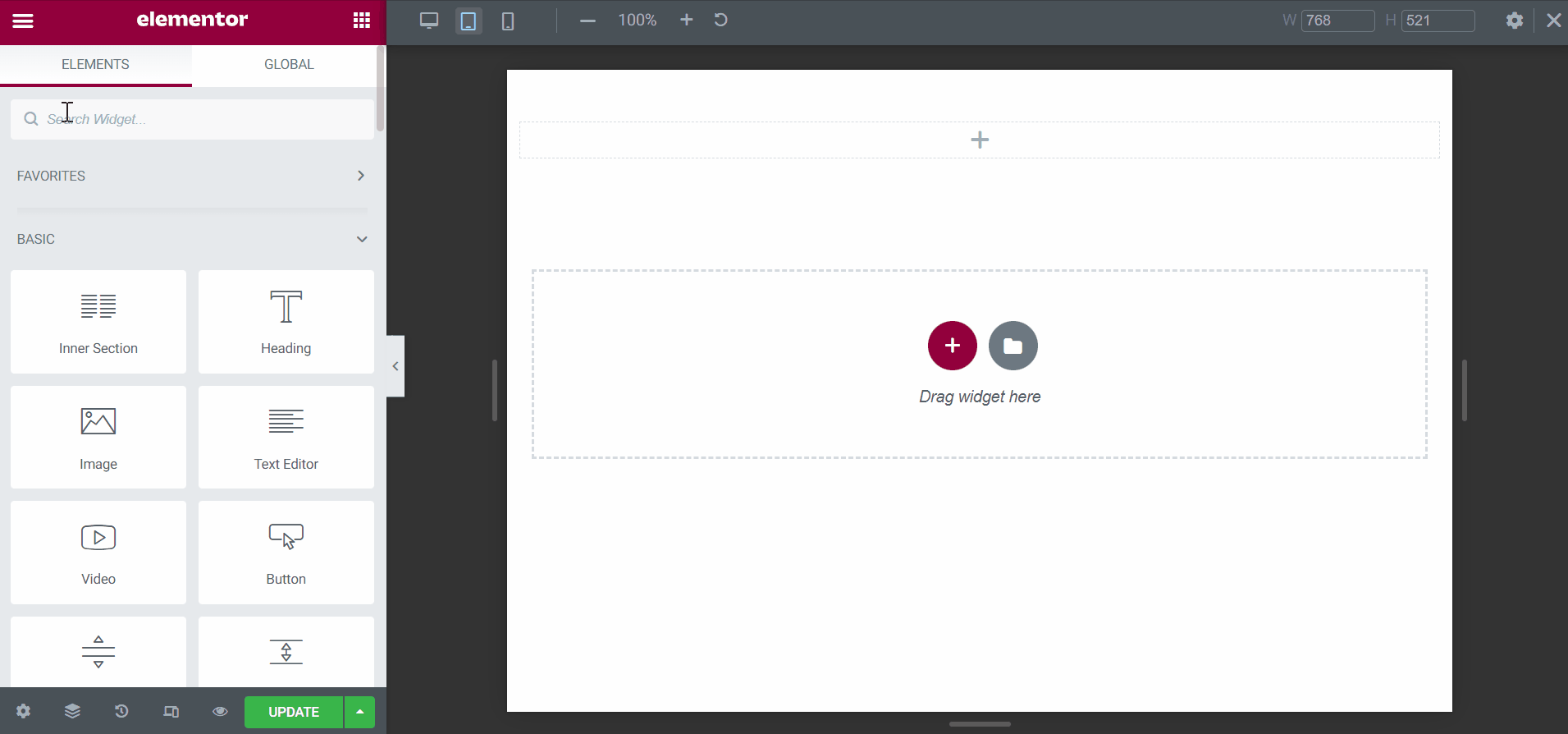
to add a JKit Icon Box to your page you can open Elementor on your page after Elementor opened you can search for “Image” on the sidebar and you can drag out the JKIT – Image Box
Content Setting
There are several options included in the Jkit Item Box content setting that you can adjust according to your need
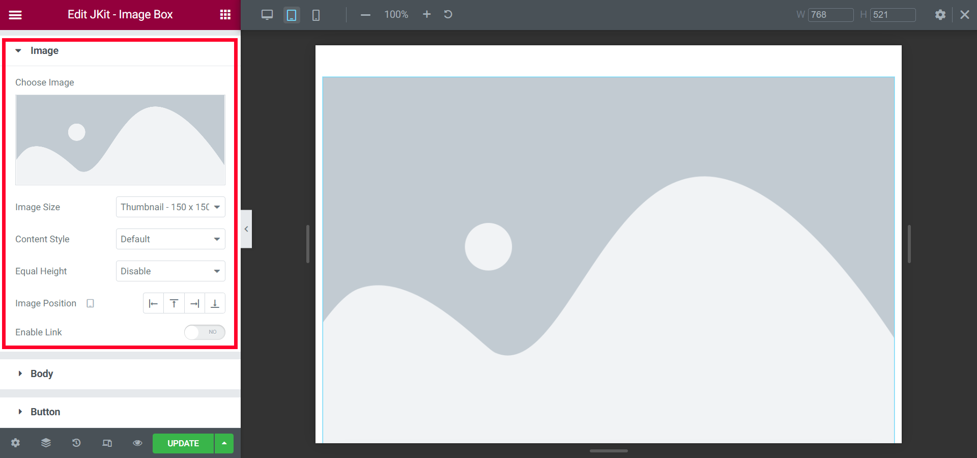
- Chose Image
select an image for the imageb box - Image Size
select image size - Content Style
choose the content style mode - Equal Height
This tool works for the content image box according to the size of the container
- Image Position
choose an image placement - Enable Link
add url links
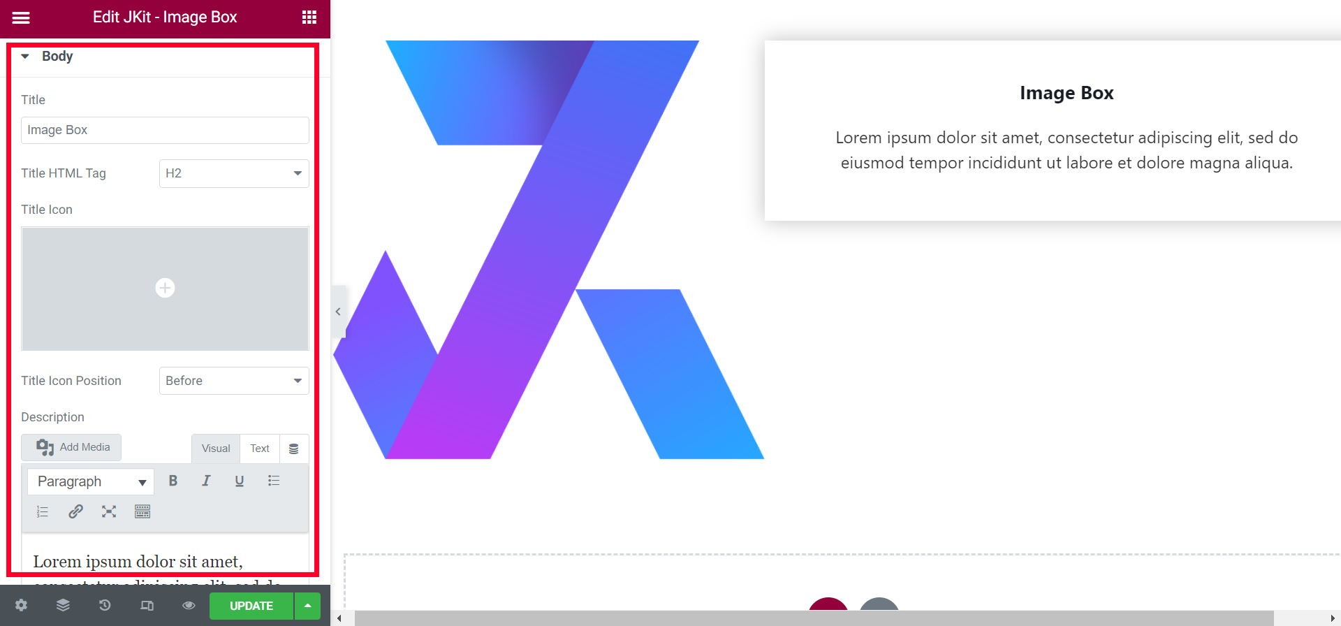
- Title
provide a title in the text box - Title HTML Tag
replace html tag
- Title Icon
selecting the boximage icon - Title Icon Position
choose icon position - Description
add a description to the image box - Alignment
selects the position of the word in the image box - Enable Hover Border Bottom
add a bottom border hover
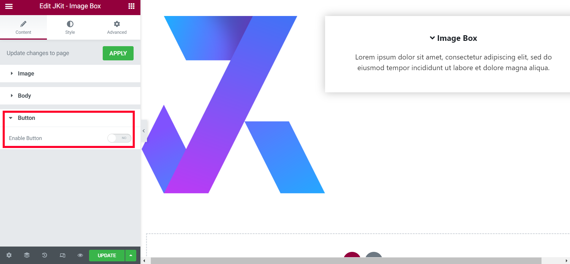
- Enable Button
add a button to the Image Box
Style Setting
You can adjust the style of the button as you like, JKit button style settings are separated into several groups. Click on it to navigate to the designated group
Image
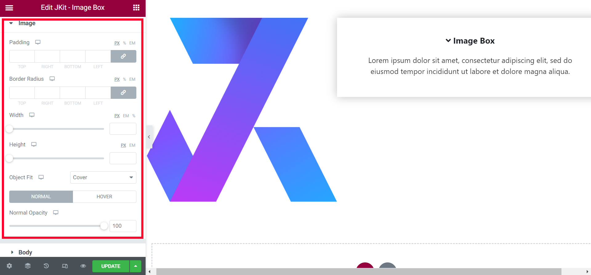
- Pading
Choosing a icon image size to make the main menu neater - Border Radius
smoothing the edges of the image - Width
set the size of the image with certain values - Height
set the height of the image - Object Fit
determine the size type - Normal
- Normal Opacity
to transfer the image
- Normal Opacity
- Hover
-
- Hover Opacity
to transfer the image on active hover - Hover Scale
a little zoom on active hover - Hover Animation
provide animation effects
- Hover Opacity
Body
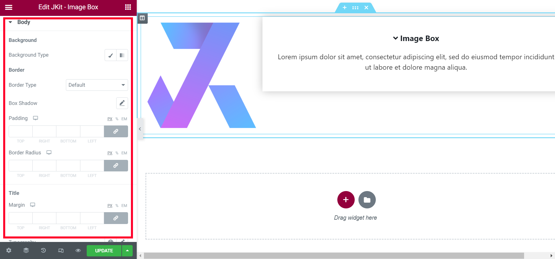
- Background Type
add background to the description box - Border Type
add a border to the description box - Box Shadow
Sets the shadow on the box - Padding
give free space - Border Radius
set each corner with specific values - Margin
gives free space in the image box - Icon Font Size
set the size of the title icon - Icon Speacing
gives the distance between the title icon with the title - Normal
- Normal Color
change the color of the tiles - Normal Icon Color
change the title icon color
- Normal Color
- Hover
- Normal Color
change the color of the tiles when Hover active - Normal Icon Color
change the title icon color when Hover active
- Normal Color
- Margin
gives free space in the image box - Typography
choose a font type - Normal
- Normal Color
choose the color of the fonts
- Normal Color
- Hover
- Hover Color
choose the color of the fonts when hover active
- Hover Color
Container
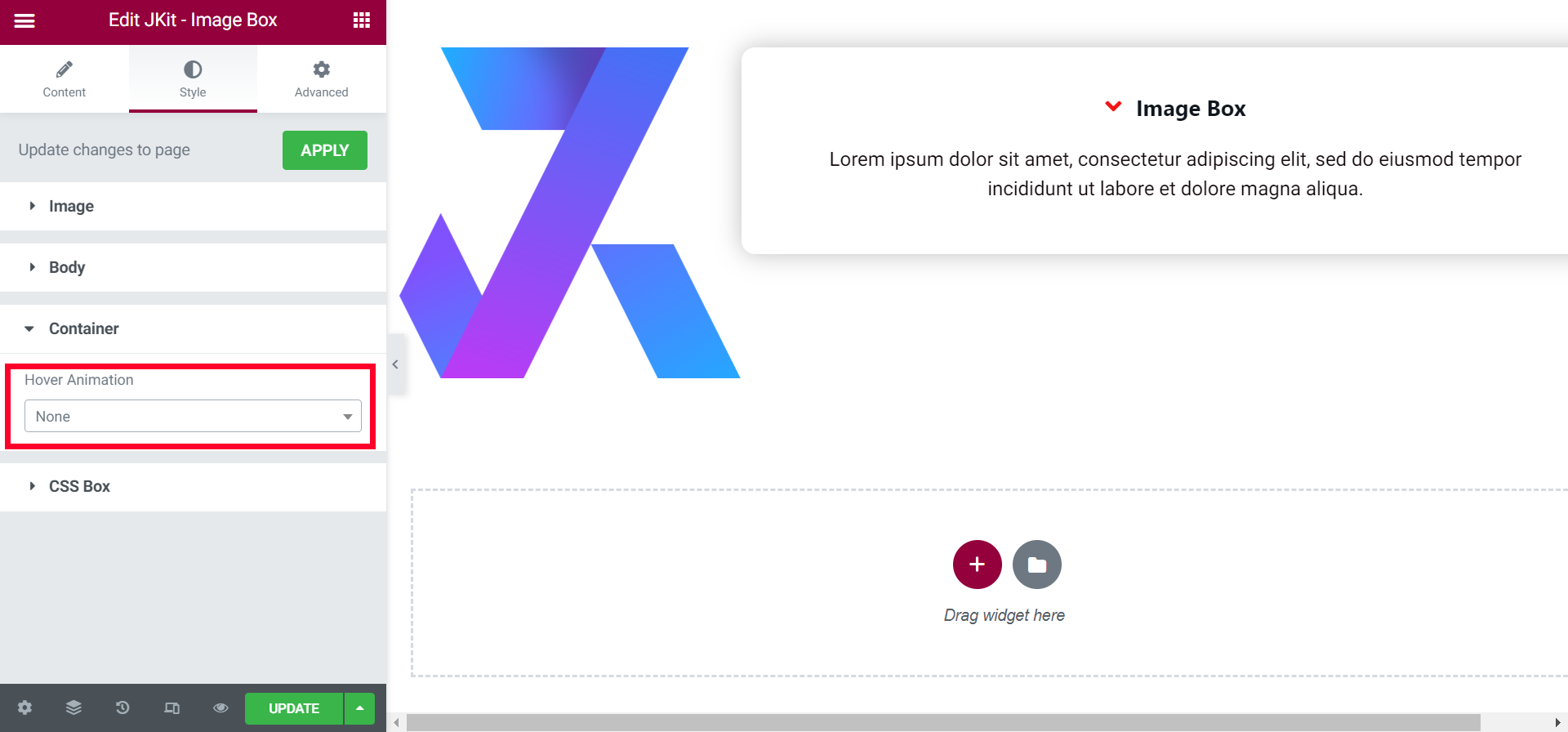
- Hover Animation
choose the animation for the image box
Css Box
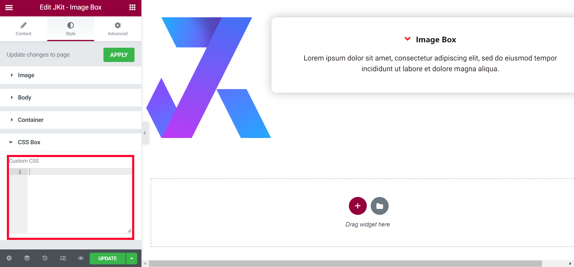
- Custom CSS
You can additional CSS on this box