Feature List to display product features, information, and any details with a useful feature list block to highlight everything you need in a feature.
In this section, we will show you how to create an Feature List with JKit -Feature List. This guide is separated into sections below. Click on the top to navigate to the specified section.
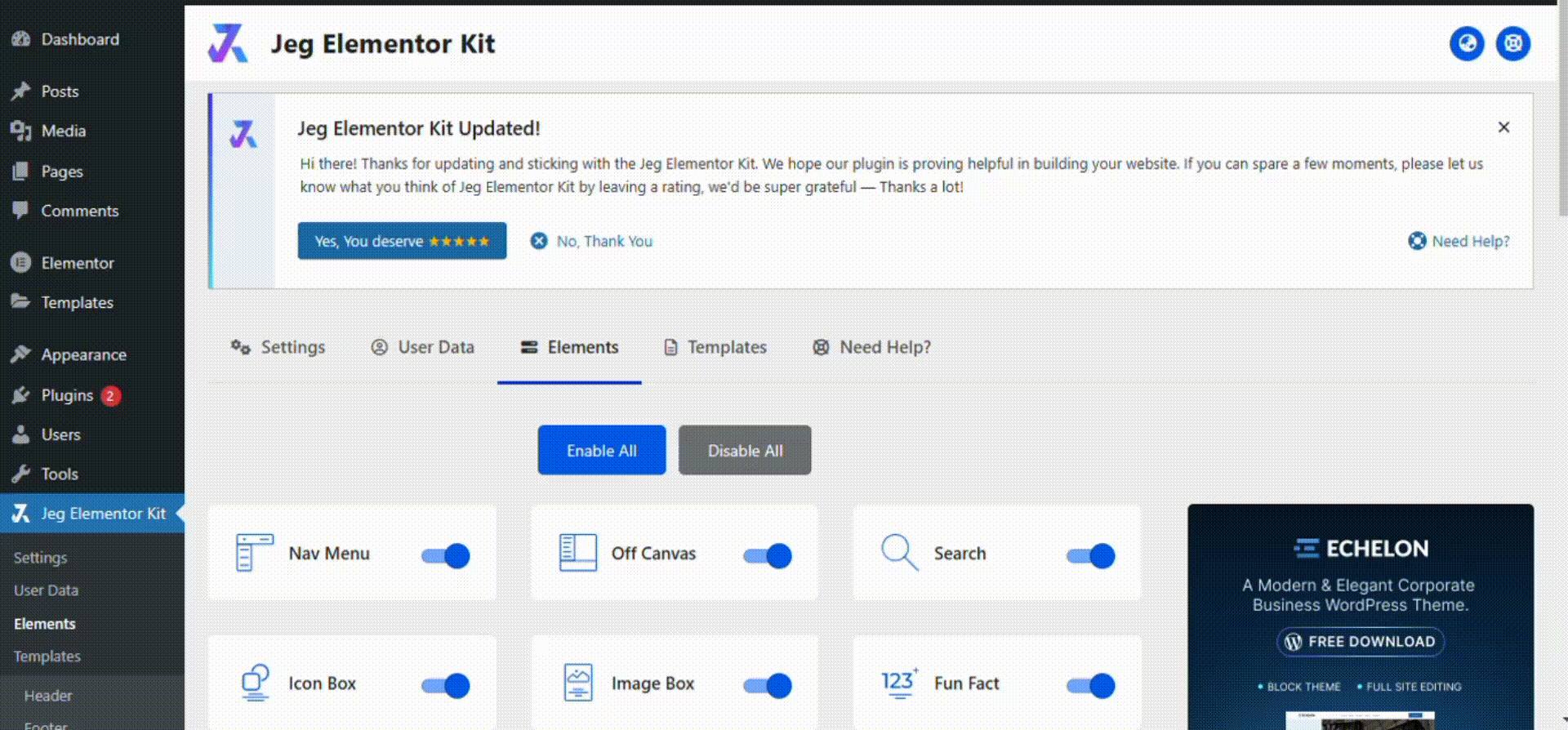
Activate JKit Feature List
Before starting, make sure that JKit elements are enabled in Element Dashboard. Jeg Elementor Kit Dashboard → Elements.
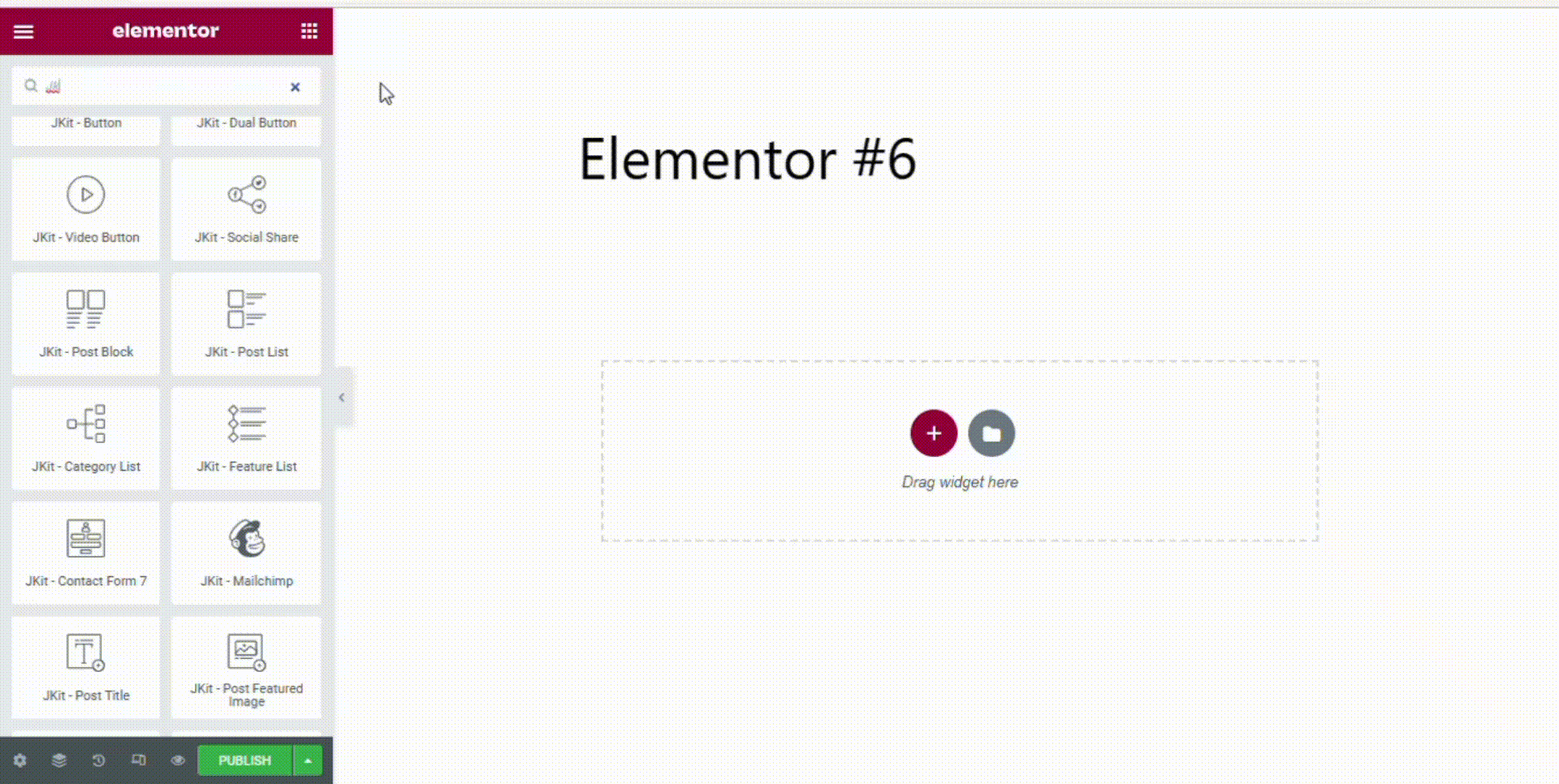
Adding JKit Feature List to Page
To add JKit Feature List to your page, you can open Elementor on your page, and search for “JKit – Feature List” in the sidebar.
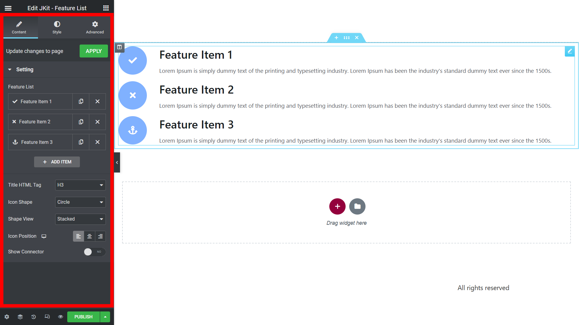
Content Setting
You can edit several options in the content settings on the Social Share menu as needed.
-
- Feature List
To display product features, information, and any details with a useful feature list block to highlight everything you need in a feature. - Add Item
To add another social media. - Title HTML Tag
That’s to replace the html tag of the title. - Icon Shape
To set the background shape of the icon.- Circle,
- Square,
- Rhombus.
- Shape View
To set the appearance of the background shape of the icon.- Framed,
- Stacked.
- Icon Position
Set the position of the icon.- Left
The position of the icon is on the left. - Top
The position of the icon is above. - RIght
The position of the icon is on the right.
- Left
- Show Connector
Displays the connector on the icon.
- Feature List
Style Setting
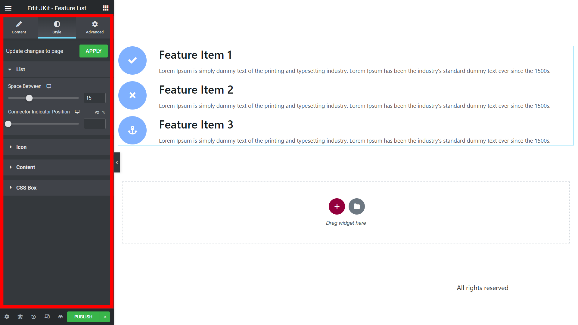
The JKit Feature List style settings are divided into groups, so you can change them according to your needs. Click on it to navigate to the designated group.
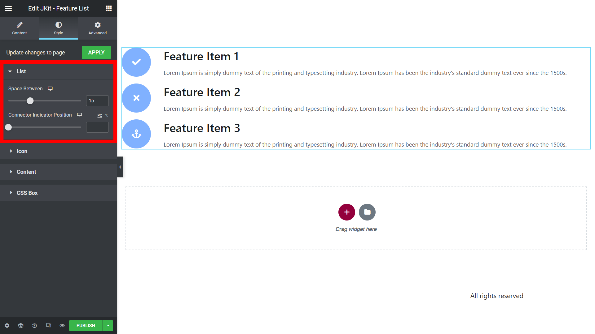
List
You can change several options on the List of the Feature List menu.
-
- Space Between
To set the distance between listsconnector indicators. - Connector Type
To set the connector type.- Classic,
- Modern.
- Connector Style
To change the connector on icon.- Solid
To turn the connector into a straight line. - Dashed
To change the connector to a dotted line. - Dotted
To turn the connector into a dotted dot.
- Solid
- Connector Color
To change the color of the connector line on the icon. - Connector Width
To set the thickness of the connector line. - Connector Indicator Position
Set the position indicator in the connector.
- Space Between
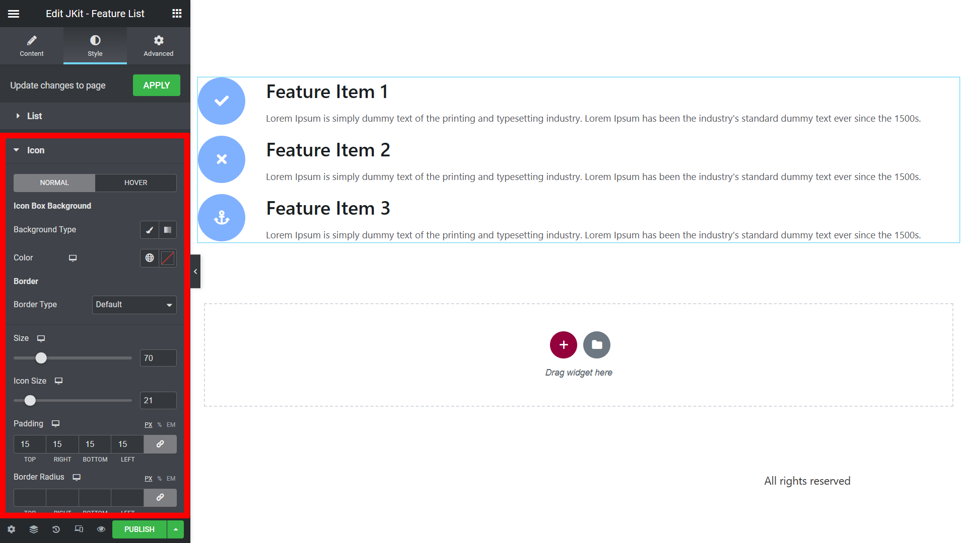
Icon
You can change several options on the Icon of the Feature List menu.
-
- Normal
Resize image- Background Type
To set the color or image used on background. - Color
To change the color background box icon. - Border Type
To specify the choice of border border of each content list background.- Default
- None
- Solid
- Double
- Dotted
- Dashed
- Groove
- Size
To set the background size of the icon. - Icon Size
To change the icon size. - Padding
Provides space between the background icon and the connector line. - Border Radius
Creates an elliptical border or rounded corners on the icon background. - Spacing
Change various settings from the gallery list
- Background Type
- Hover
Change various settings from the gallery list- Background Type
Change various settings from the gallery list - Color
Change various settings from the gallery list - Border Type
Change various settings from the gallery list- Default
- None
- Solid
- Double
- Dotted
- Dashed
- Groove
- Size
Change various settings from the gallery list - Icon Size
Change various settings from the gallery list - Padding
Change various settings from the gallery list - Border Radius
Change various settings from the gallery list - Spacing
Change various settings from the gallery list
- Background Type
- Normal
CSS Box
You can add CSS code according to the class and id that was made before.
Created in Denpasar, Bali by Jegtheme. 2026