JKit – Countdown is used to count down the time specified by the user, so that the user can set the time to attend the upcoming event.
The guide is separated into the sections below. Click on it to navigate to the designated section.
- Activate JKit – Countdown (#)
- Adding JKit – Countdown to Page (#)
- Content Setting JKit – Countdown (#)
- Style Setting JKit – Countdown (#)
Activate JKit – Countdown
Before starting, please make sure the Jkit element is already activated on Jeg Elementor Kit Dashboard → Elements

Adding JKit – Countdown
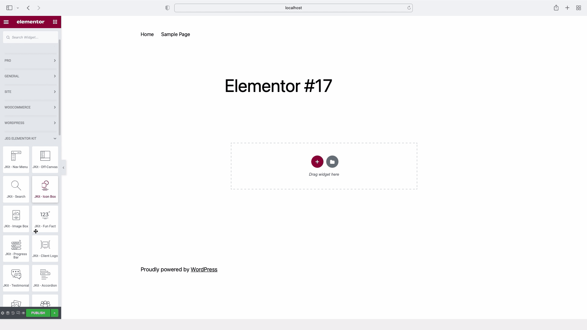
to add JKit – Countdown Text to your page you can open Elementor in your page once Elementor is opened you can search for JKit – Countdown in search widget.
Content Setting JKit – Countdown
The following are the sections in Content JKit – Countdown along with their explanations.There are several options included in the JKit – Countdown content setting that you can adapt to your needs. Click the content icon to navigate to the specified section.
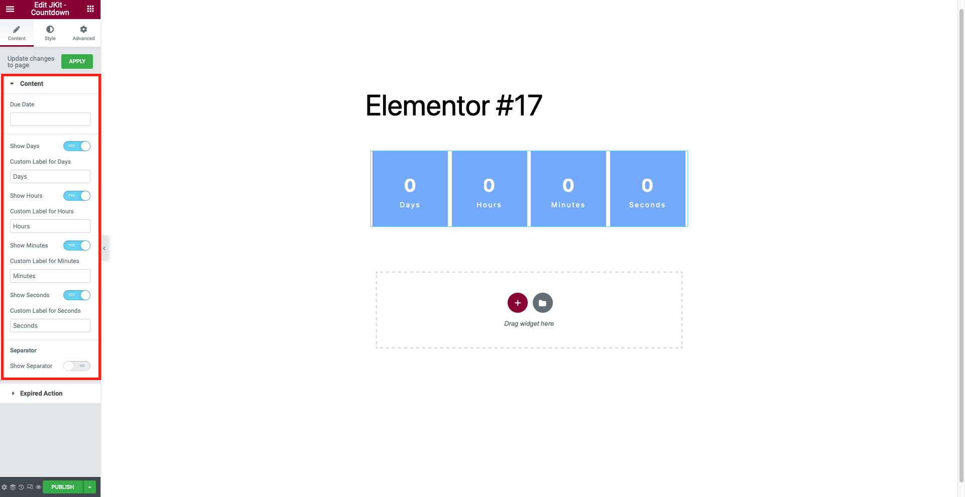
Content
-
- Due Date
Used to select the time - Show Days
Used to fill the days - Custom Label for Days
Used to change the text of the days - Show Hours
Used to fill the hours - Custom Label for Hours
Used to change the text of the hours - Show Minutes
Used to fill in minutes - Custom Label for Minutes
Used to change the text of the minutes - Show Seconds
Used to fill seconds - Custom Label for Seconds
Used to change the text of the seconds - Show Separator
Used to make separator
- Due Date
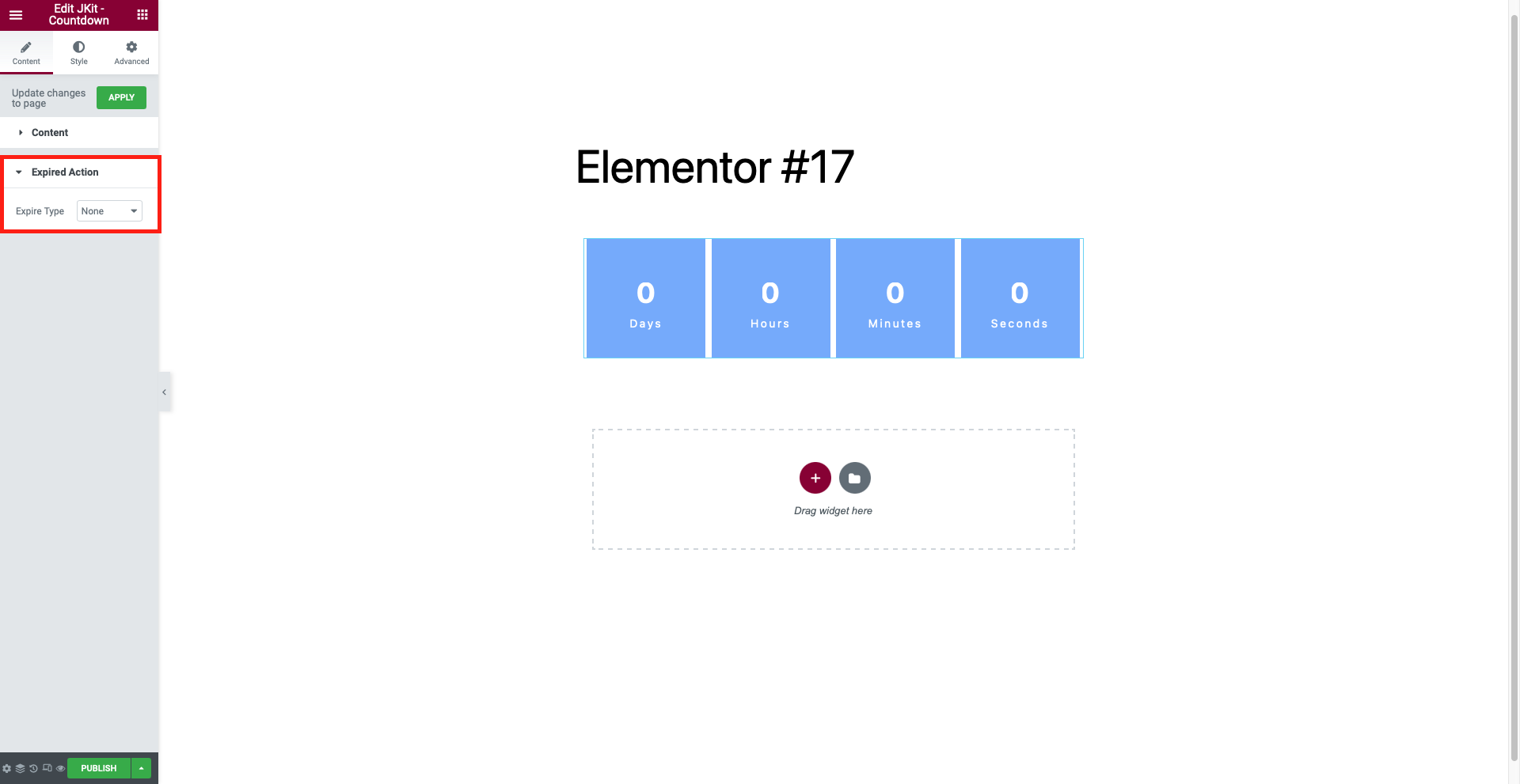
Expired Action
-
- Expire Type
To select an expired type - On Expiry Title
To make the title expiry - On Expiry Content
To make content expiry - Link
Used to upload link
- Expire Type
Style Setting JKit – Countdown
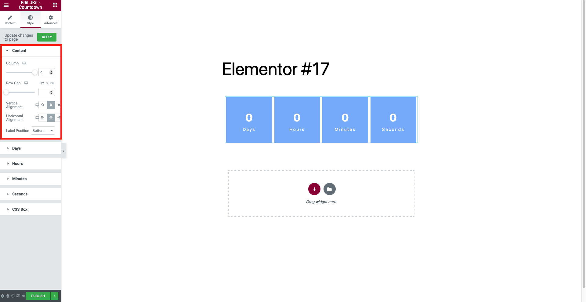
Settings JKit – Countdown is divided into sections, so you can configure them however you like. Here are the parts of JKit – Countdown.
Content
-
- Column
To reduce the column - Row Gap
To divide the distance between the lines - Vertical Alignment
To align vertically - Horizontal Alignment
To align horizontally - Label Position
To change the label position
- Column
Days

-
- Digit
- Color
To change the color of the digit
- Color
- Background
- Background Type
Select background from digit
- Background Type
- Border
- Border Type
Choose borders - Box Shadow
Used to add shadows - Typography
To change digit - Padding
Change the padding of the digit - Margin
Change the margin of the digit - Border Radius
Set all angles with a certain value
- Border Type
- Label
- Color
To change the color of the label - Typography
To change label
- Color
- Background
- Background Type
Select background from label
- Background Type
- Border
- Border Type
Choose borders - Box Shadow
Add an icon to the button - Padding
Change the padding of the label - Margin
Change the margin of the label - Border Radius
Set all angles with a certain value
- Border Type
- Background
- Background Type
Select background from background
- Background Type
- Border
- Border Type
Choose borders - Box Shadow
Used to add shadows - Border Radius
Set all angles with a certain value - Vertical Alignment
To align vertically - Horizontal Alignment
To align horizontally - Width
To widen the background - Height
To extend the background
- Border Type
- Separator
- Color
To change the color of the separator - Typography
To change separator - Vertical Position
To align vertically - Horizontal Position
To align horizontally
- Color
- Digit
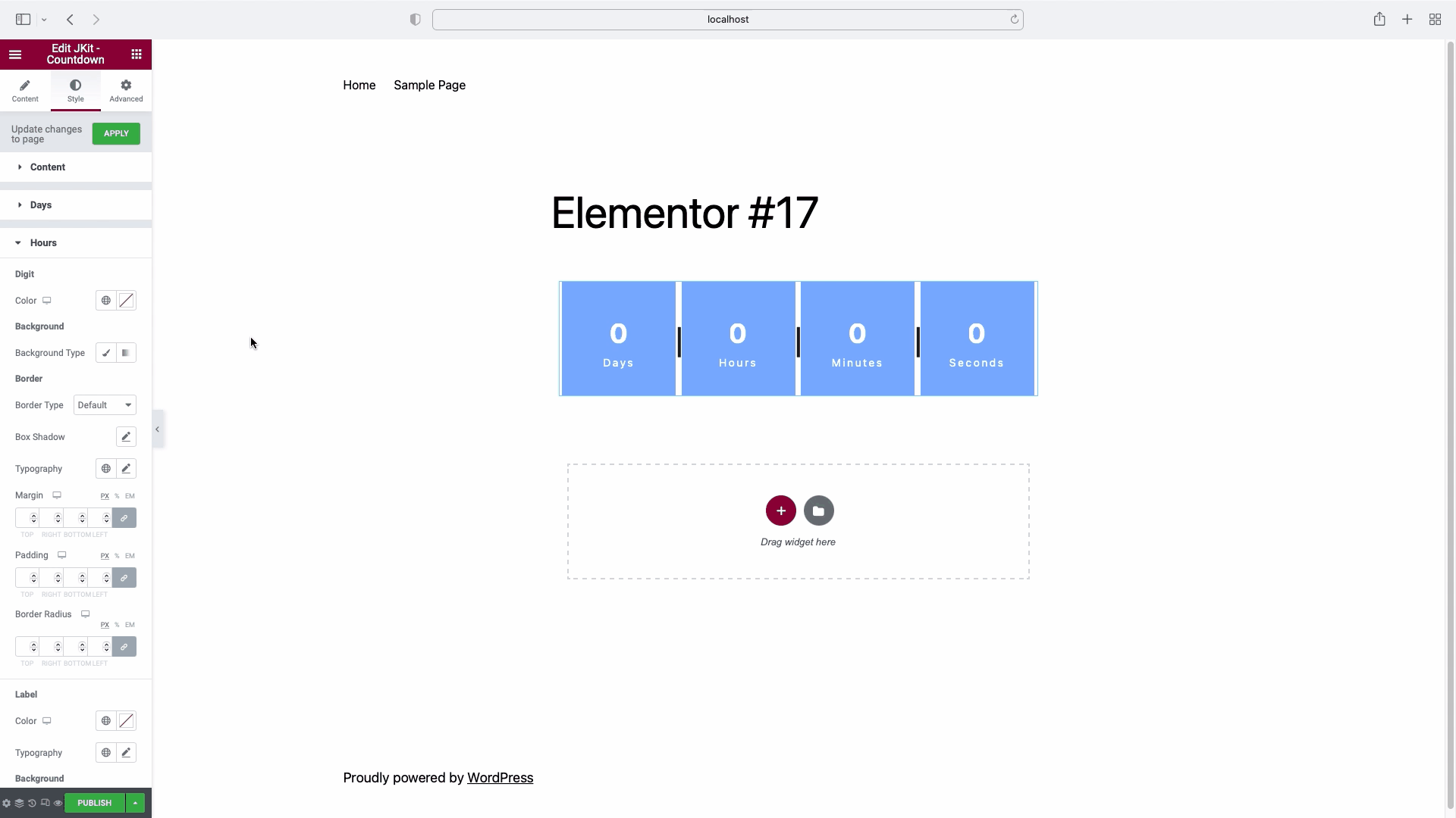
Hours
-
- Digit
- Color
To change the color of the digit
- Color
- Background
- Background Type
Select background from digit
- Background Type
- Border
- Border Type
Choose borders - Box Shadow
Used to add shadows - Typography
To change digit - Padding
Change the padding of the digit - Margin
Change the margin of the digit - Border Radius
Set all angles with a certain value
- Border Type
- Label
- Color
To change the color of the label - Typography
To change label
- Color
- Background
- Background Type
Select background from label
- Background Type
- Border
- Border Type
Choose borders - Box Shadow
Add an icon to the button - Padding
Change the padding of the label - Margin
Change the margin of the label - Border Radius
Set all angles with a certain value
- Border Type
- Background
- Background Type
Select background from background
- Background Type
- Border
- Border Type
Choose borders - Box Shadow
Used to add shadows - Border Radius
Set all angles with a certain value - Vertical Alignment
To align vertically - Horizontal Alignment
To align horizontally - Width
To widen the background - Height
To extend the background
- Border Type
- Separator
- Color
To change the color of the separator - Typography
To change separator - Vertical Position
To align vertically - Horizontal Position
To align horizontally
- Color
- Digit
Minutes

-
- Digit
- Color
To change the color of the digit
- Color
- Background
- Background Type
Select background from digit
- Background Type
- Border
- Border Type
Choose borders - Box Shadow
Used to add shadows - Typography
To change digit - Padding
Change the padding of the digit - Margin
Change the margin of the digit - Border Radius
Set all angles with a certain value
- Border Type
- Label
- Color
To change the color of the label - Typography
To change label
- Color
- Background
- Background Type
Select background from label
- Background Type
- Border
- Border Type
Choose borders - Box Shadow
Add an icon to the button - Padding
Change the padding of the label - Margin
Change the margin of the label - Border Radius
Set all angles with a certain value
- Border Type
- Background
- Background Type
Select background from background
- Background Type
- Border
- Border Type
Choose borders - Box Shadow
Used to add shadows - Border Radius
Set all angles with a certain value - Vertical Alignment
To align vertically - Horizontal Alignment
To align horizontally - Width
To widen the background - Height
To extend the background
- Border Type
- Separator
- Color
To change the color of the separator - Typography
To change separator - Vertical Position
To align vertically - Horizontal Position
To align horizontally
- Color
- Digit
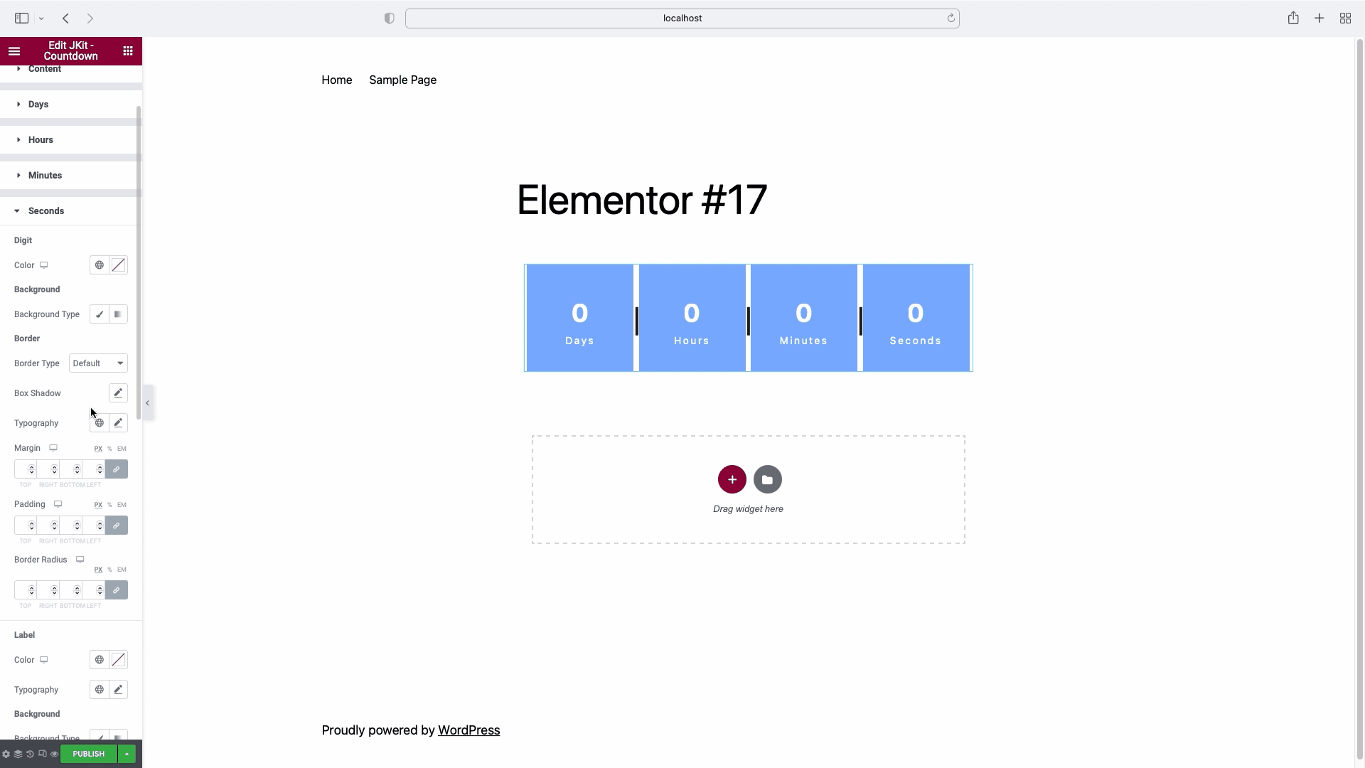
Seconds
-
- Digit
- Color
To change the color of the digit
- Color
- Background
- Background Type
Select background from digit
- Background Type
- Border
- Border Type
Choose borders - Box Shadow
Used to add shadows - Typography
To change digit - Padding
Change the padding of the digit - Margin
Change the margin of the digit - Border Radius
Set all angles with a certain value
- Border Type
- Label
- Color
To change the color of the label - Typography
To change label
- Color
- Background
- Background Type
Select background from label
- Background Type
- Border
- Border Type
Choose borders - Box Shadow
Add an icon to the button - Padding
Change the padding of the label - Margin
Change the margin of the label - Border Radius
Set all angles with a certain value
- Border Type
- Background
- Background Type
Select background from background
- Background Type
- Border
- Border Type
Choose borders - Box Shadow
Used to add shadows - Border Radius
Set all angles with a certain value - Vertical Alignment
To align vertically - Horizontal Alignment
To align horizontally - Width
To widen the background - Height
To extend the background
- Border Type
- Digit
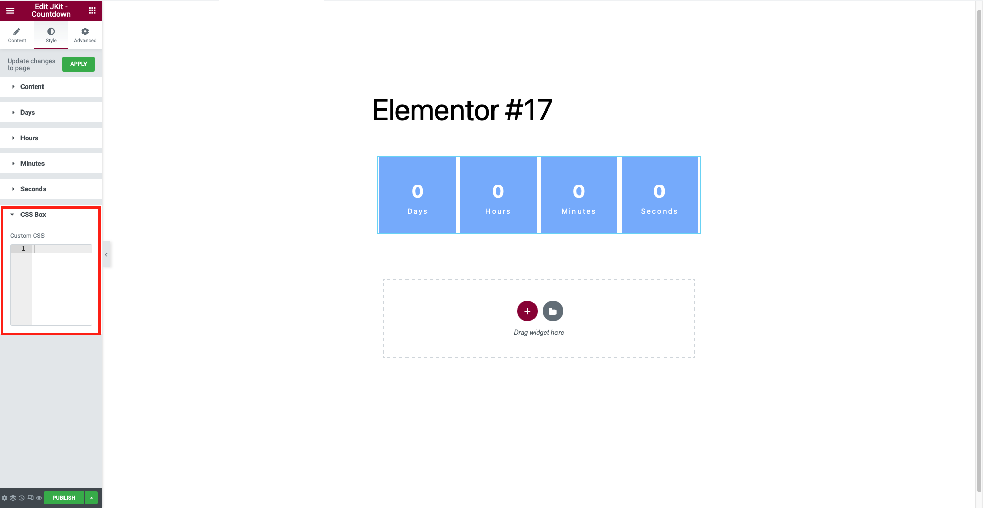
CSS Box
You can put further CSS code here in accordance with the defined class and id.