JKIT – Testimonial Add testimonials on your site. Useful to increase users belief in your products or services.
The guide is separated into the sections below. Click on it to navigate to the designated section.
Activate JKit Button
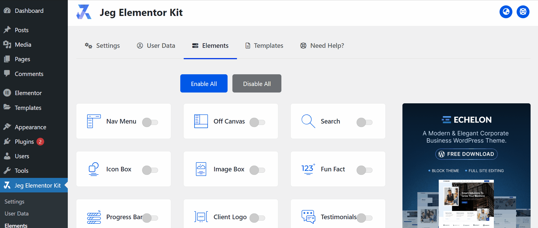
Before starting, please make sure the Jkit element is already activated on Jeg Elementor Kit Dashboard→ Elements
Adding JKit Testimonial to Page
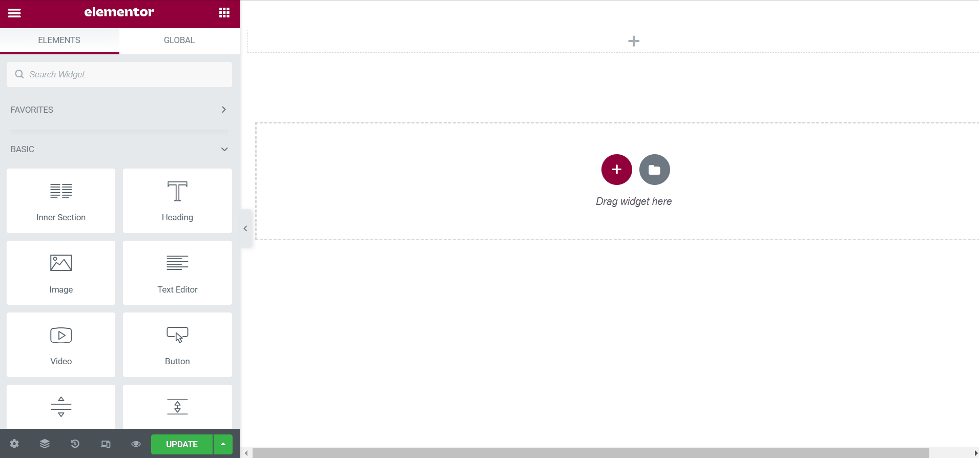
to add a JKit Icon Box to your page you can open Elementor on your page after Elementor opened you can search for “Testimonial” on the sidebar and you can drag out the JKIT – Testimonial
Content Setting
There are several options included in the Jkit Item Box content setting that you can adjust according to your need
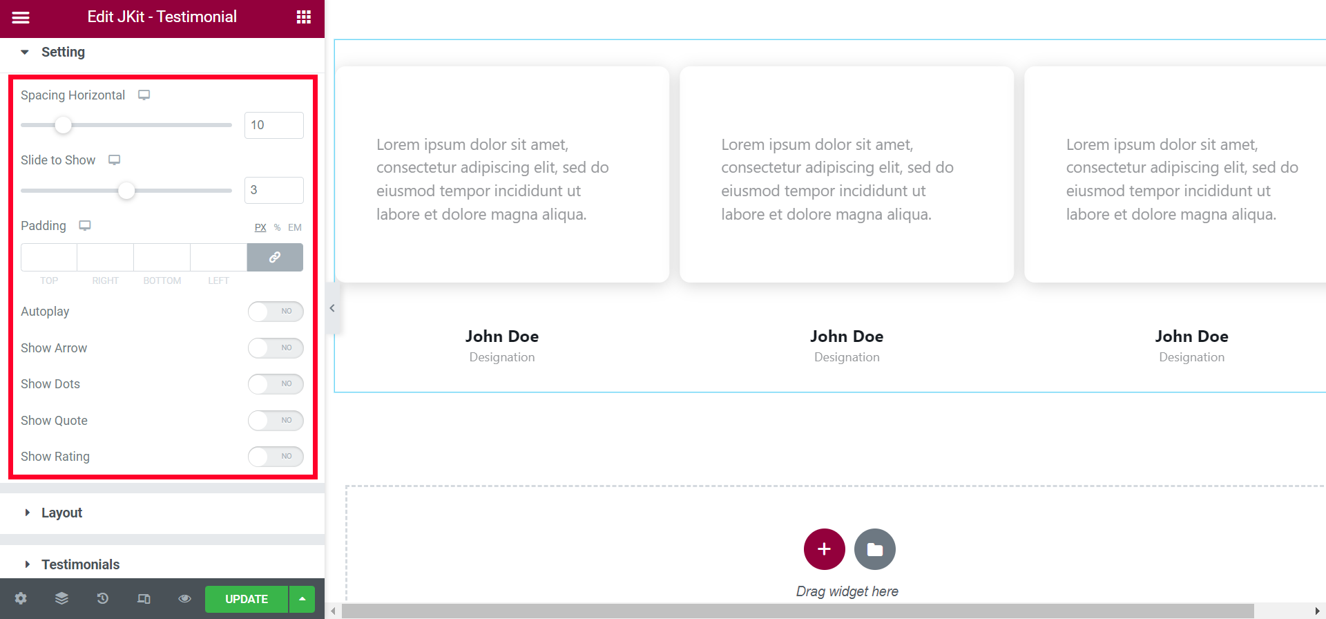
- Spacing Horizontal
provide space between content - Slide To Show
Set the amount of content to be displayed - Padding
tidy up content - Autopaly
enable the Autoplay feature - Show Arrow
to display the arrow - Show Dots
to display the Dots - Show Quete
to display the Quete - Show Rating
to display the Rating
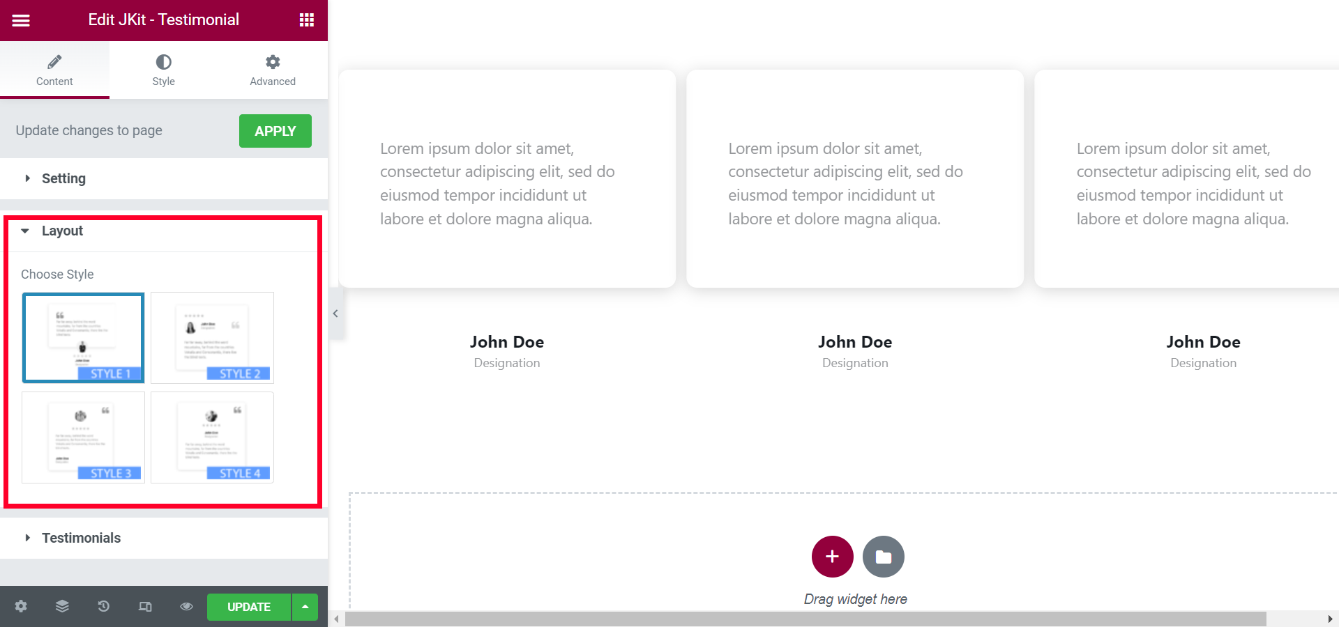
- Chose Style
choose the type of style provided
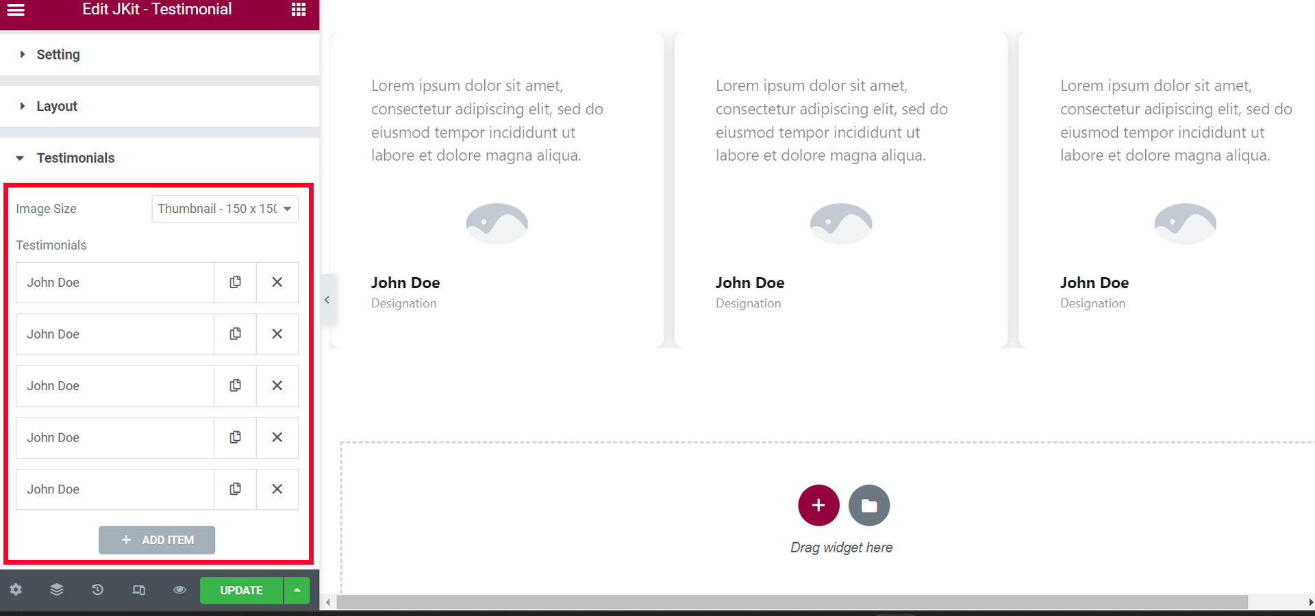
- Image Size
select image size - Testimonials
set content
Style Setting
You can adjust the style of the button as you like, JKit button style settings are separated into several groups. Click on it to navigate to the designated group
- Content Wrapper (#)
- Description (#)
- Quote (#)
- Rating (#)
- Client Name (#)
- Client Designation (#)
- Arrow (#)
- Dots (#)
- Arrow (#)
- Css Box (#)
Content Wrapper (#)
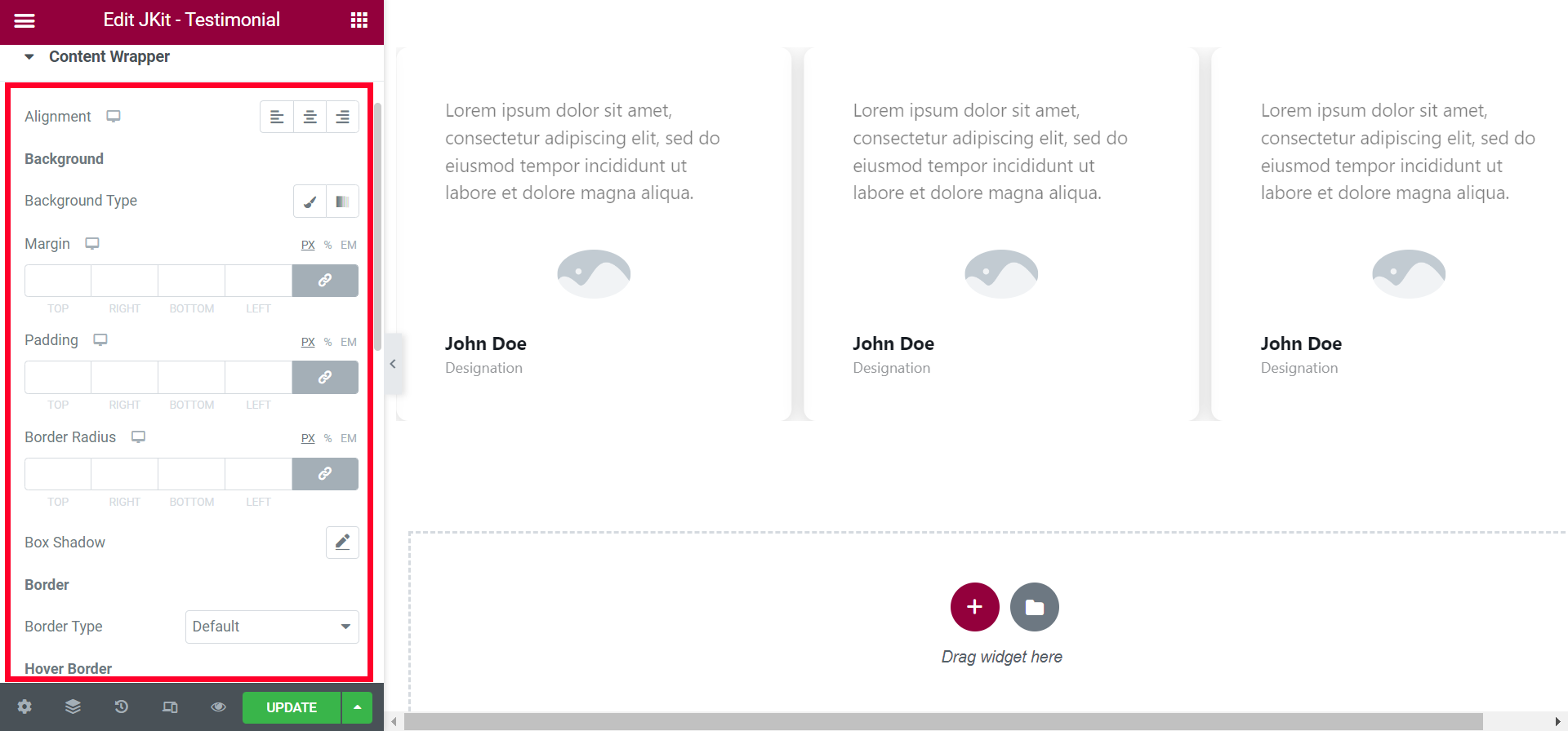
- Aligment
choose the placement of the fonts - Background Type
select the type of background - Margin
give space to the content - Padding
give empty space in the content - Border Radius
set all corners of the content with certain values - Box Shadow
add a shadow box effect - Border Type
choose the type of border that has been provided - Border Type “hover”
choose the type of border that has been provided - Backgrounf Type
select the type of background - Hover Direction
choose the direction of the background hover - Fix Height
set the height of the content
Description (#)
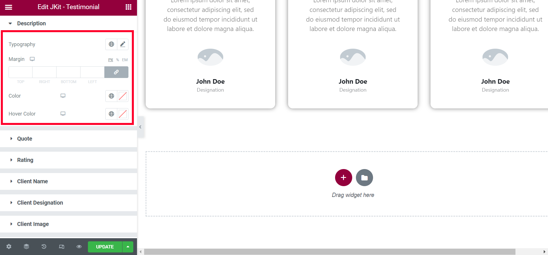
- Typography
select the type of font to be used - Margin
give space to the content - Color
choose a color for the text - Hover Color
choose a color for the text
Quote (#)
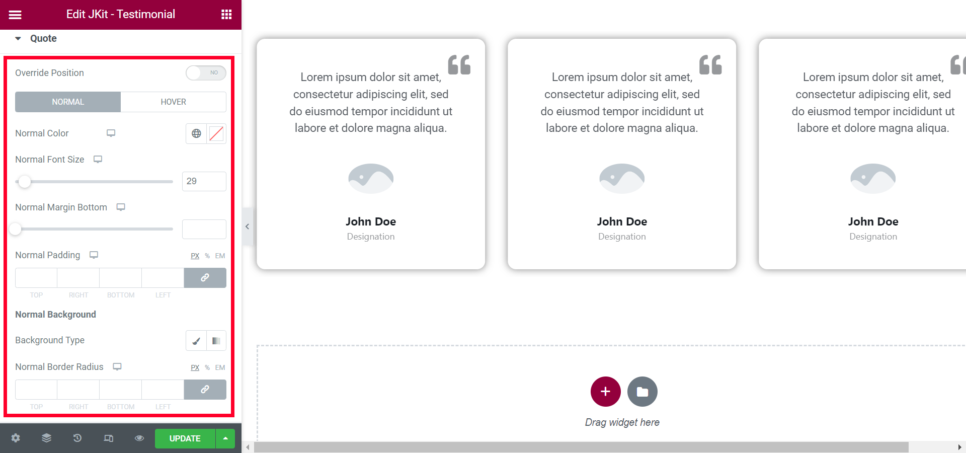
- Override Position
to adjust the position of the quote icon - Normal
-
- Normal Color
choose the color of the quotes - Normal Font Size
set the size of the quote - Normal Margin Bottom
give the distance between the quote icon and the text below it - Normal Padding
give empty space in the quote - Background Type
select the type of background - Normal Border Radius
set each corner with a specific value for the quote background
- Normal Color
-
- Hover
-
- Hover Color
choose the color of the quotes - Hover Font Size
set the size of the quote - Hover Margin Bottom
give the distance between the quote icon and the text below it - Hover Padding
give empty space in the quote - Background Type
select the type of background - Hover Border Radius
set each corner with a specific value for the quote background
- Hover Color
-
Rating (#)
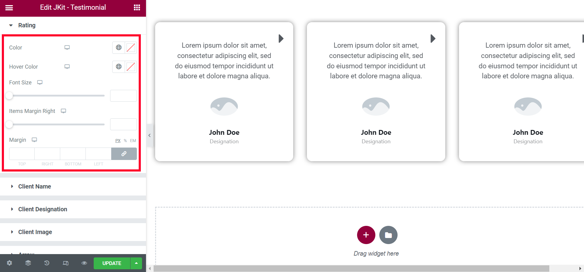
- Color
choose a color for the rating icon - Hover Color
choose a color for the rating icon - Font Size
determines the size of the rating icon - Items Margin Right
set the gap between rating icons - Margin
set the distance between the rating icon with the client name
Client Name (#)
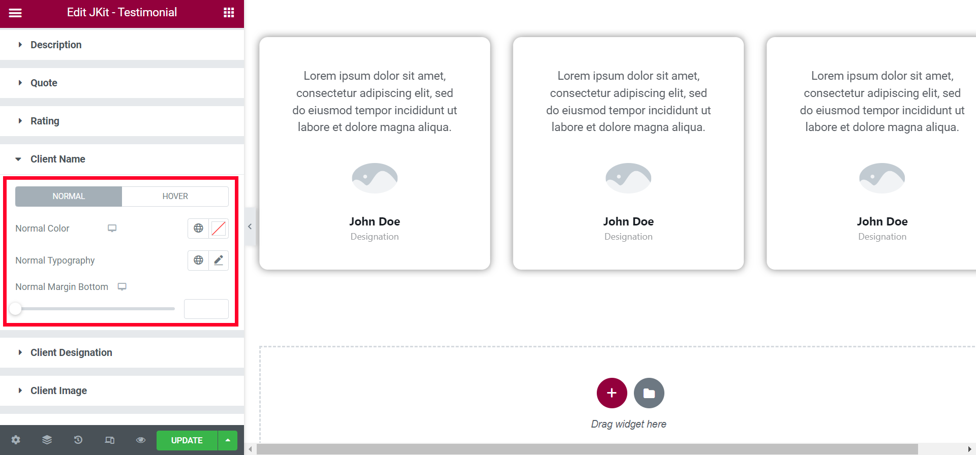
- Normal
-
- Normal Color
choose the color of the text - Normal Typography
select the type of font to be used - Normal Margin Bottom
put a gap between Client Name and Client Designation
- Normal Color
-
- Hover
-
- Hover Color
choose the color of the text - Hover Typography
select the type of font to be used - Hover Margin Bottom
put a gap between Client Name and Client Designation
- Hover Color
-
Client Designation
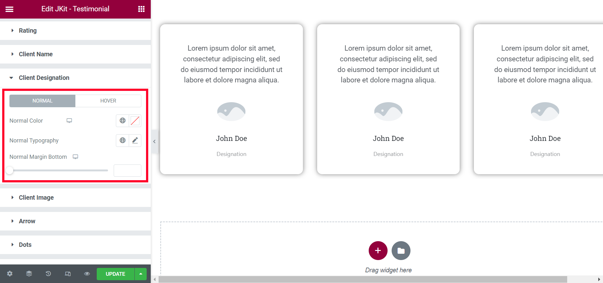
- Normal
-
- Normal Color
choose the color of the text - Normal Typography
select the type of font to be used - Normal Margin Bottom
leave a gap between the client designation and the bottom margin
- Normal Color
-
- Hover
-
- Hover Color
choose the color of the text - Hover Typography
select the type of font to be used - Hover Margin Bottom
leave a gap between the client designation and the bottom margin
- Hover Color
-
Client Image (#)
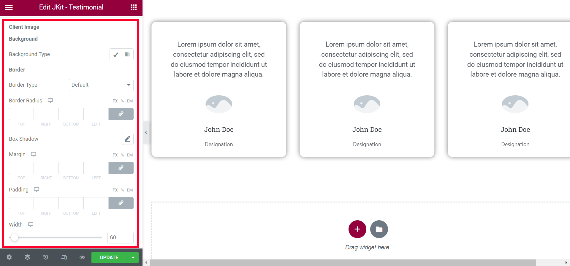
- Background Type
select the type of background - Border Type
choose the type of border that has been provided - Border Radius
set all corners of the content with certain values - Box Shadow
add a shadow box effect - Margin
give free space - Padding
to reduce the size of the image - Width
enlarge image size
Arrow (#)
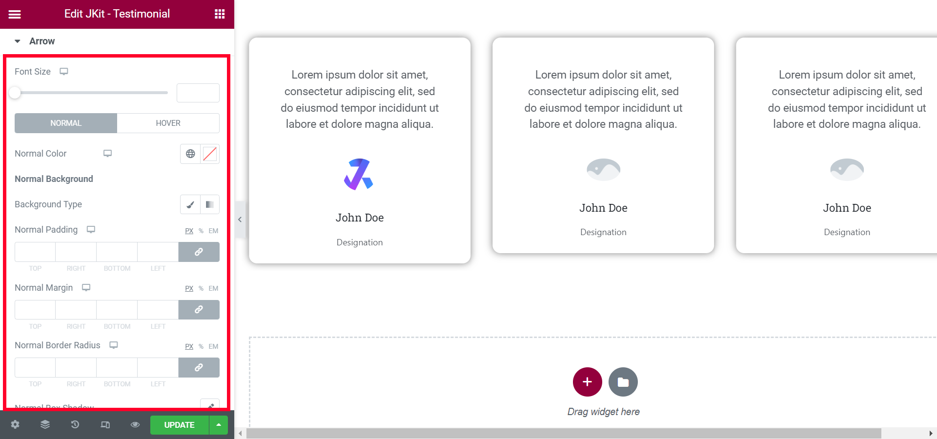
- Font Size
zoom in zoom out arrow icon - Normal
-
- Normal Color
choose the color of the quotes - Background Type
select the type of background - Normal Padding
give spacing between icon arrows - Normal Margin
give spacing between icon arrows - Normal Border Radius
set each corner with a specific value for the quote background - Normal Box Shadow
add a shadow box effect - Border Type
choose the type of border that has been provided - Normal Opacity
to transfer the icon arrow
- Normal Color
-
- Hover
-
- Hover Color
choose the color of the quotes - Background Type
select the type of background - Hover Padding
give spacing between icon arrows - Hover Margin
give spacing between icon arrows - Hover Border Radius
set each corner with a specific value for the quote background - Hover Box Shadow
add a shadow box effect - Border Type
choose the type of border that has been provided - Hover Opacity
to transfer the icon arrow
- Hover Color
-
Dots (#)
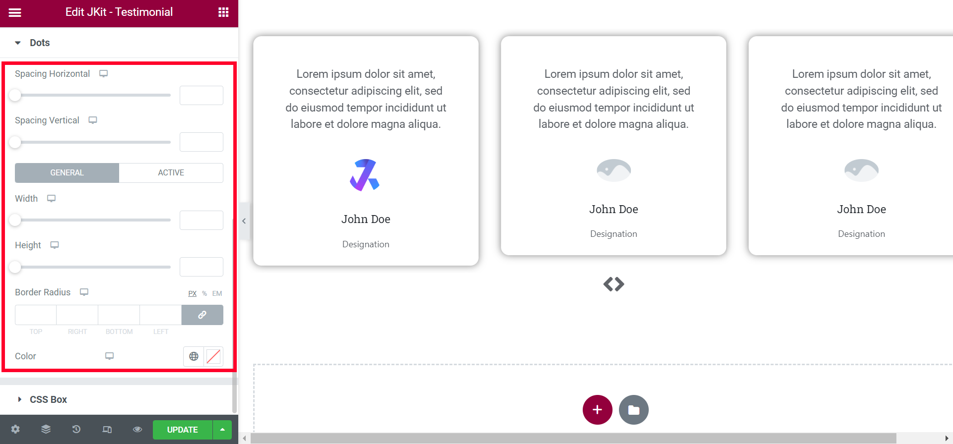
- Spacing Horizontal
set the height of the content - Spacing Vertikal
choose a background colo - General
-
- Width
set the size of the image with certain values - Height
set the height of the image - Border Radius
set all angles with a certain value - Color
choose a color
- Width
-
- Active
-
- Width
set the size of the image with certain values - Height
set the height of the image - Border Radius
set all angles with a certain value - Color
choose a color
- Width
-
CSS BOX
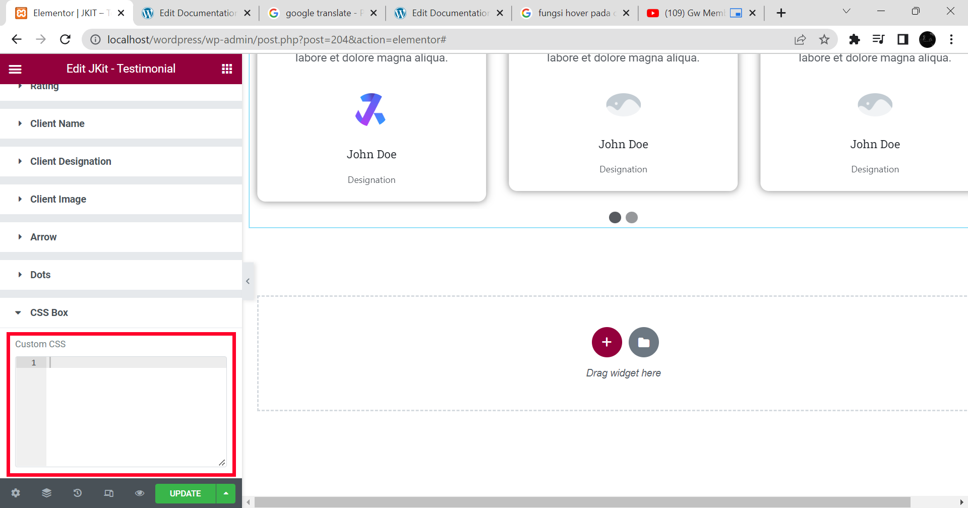
- Custom CSS
You can additional CSS on this box