JKIT- Fun Fact. A box that include icon and number content. This time we will give you a tutorial using JKIT, as follows
The guide is separated into the sections below. Click on it to navigate to the designated section.
- Activate JKIT Fun Fact (#)
- Adding JKIT Fun Fact Menu to Page (#)
- Content Setting (#)
- Style Setting (#)
Activate JKIT Fun Fact
Before starting, please make sure the JKit button is already activated on Jeg Elementor Kit Dashboard ➞Elements
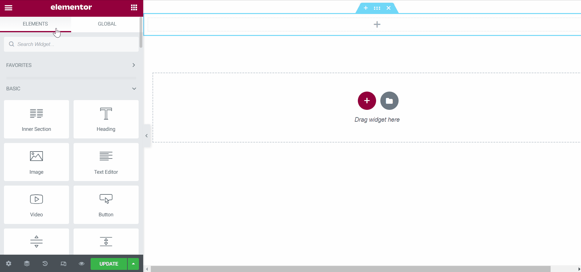
Adding JKIT Fun Fact To The Page
Content Setting
There are several options included in the Jkit Fun Fact content setting that you can adjust according to your need
You can adjust the style of the button as you like, JKit Nav Menu style settings are separated into several groups. Click on it to navigate to the designated group
Setting

- Text Alignment
to select the font position - Justify Content
Choose to play vertical or horizontal menus - Align Items
choose the placement of the fonts - Title HTML Tag
replace hatml tag in title - Enable Hover Border Button
added a bottom hover border
Icon
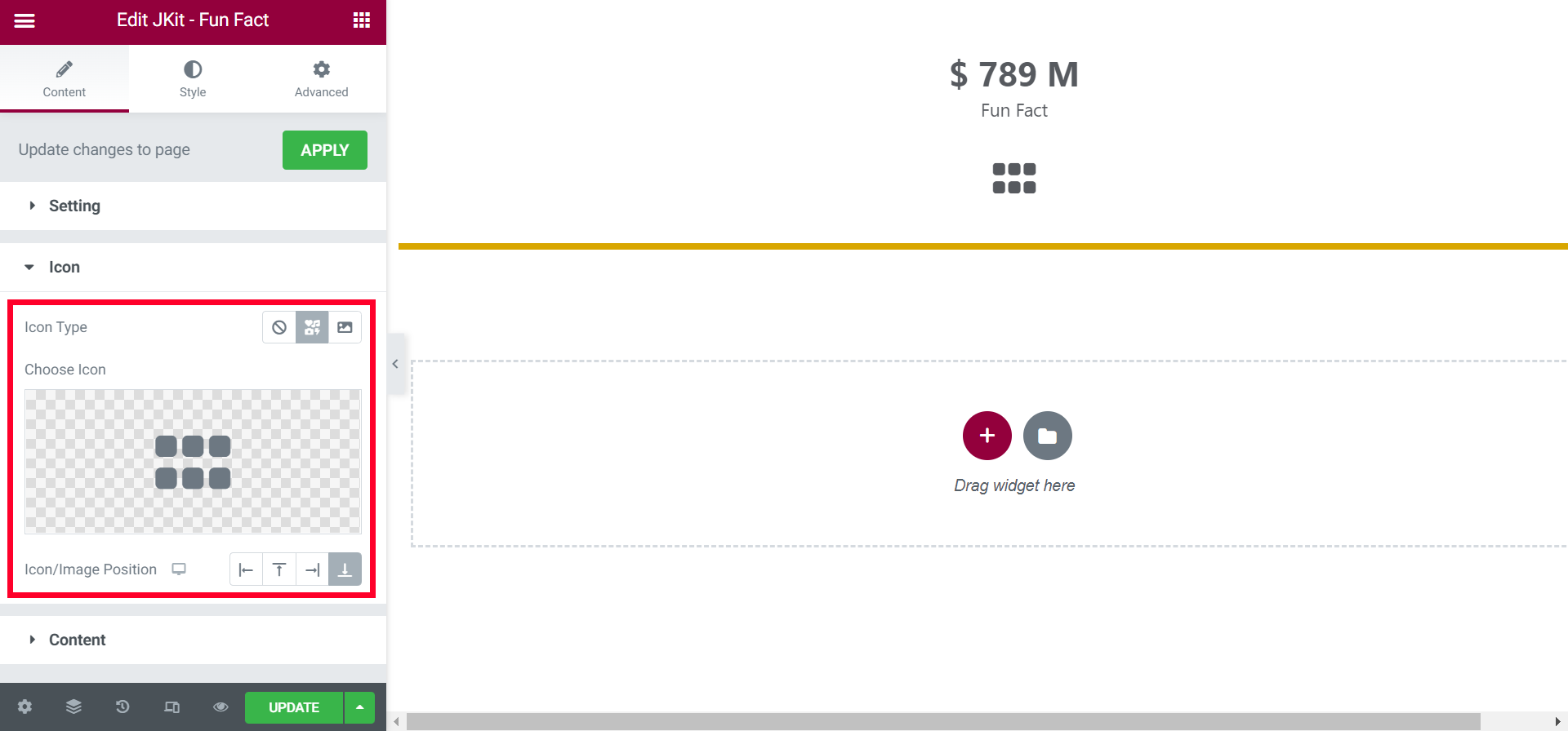
- Icon Type
choose between none, icon, image - Choose Icon
choose the icon as needed - Icon/Image Position
choose icon position
Content
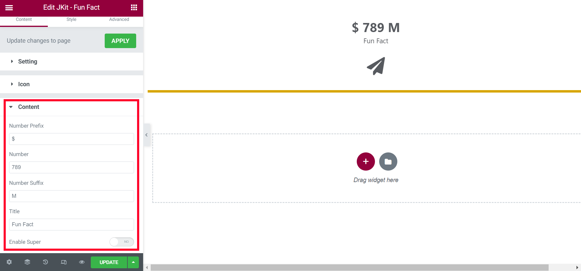
- Number Prefix
choose a prefix font - Number
choose a limit point number - Number Suffix
choose a suffix font - Title
choose words for the title - Enable Super
add additional titles
Style Setting
You can adjust the style of the button as you like, JKit Nav Menu style settings are separated into several groups. Click on it to navigate to the designated group
Icon (#)
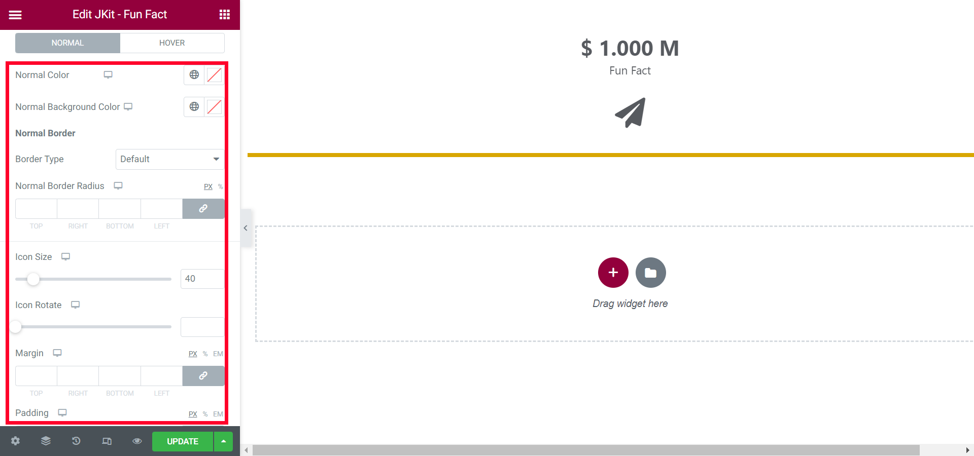
- Normal
- Normal Color
choose icon color - Normal Background Color
choose a background color - Border Type
select the border type - Normal Border Radius
tidy up all the corners - Icon Size
set the size of the icon - Icon Rotate
set rotation - Margin
to give distance - Padding
give free space - Box Shadow
give a shadow effect
- Normal Color
- Hover
- Hover Color
choose icon color when hover active - Hover Background Color
choose a background color when hover active - Border Type
select the border type when hover active - Hover Border Radius
tidy up all the corners when hover active - Hover Animation
tidy up all the corners when hover active - Icon Size
set the size of the icon when hover active - Icon Rotate
set rotation when hover active - Margin
to give distance when hover active - Padding
give free space when hover active - Box Shadow
give a shadow effect when hover active
- Hover Color
Content (#)

- Number Color
choose a color for the number - Number Typhography
choose the type of font for the number - Spacing
gives the distance between the number and the title icon - Right Spacing
gives the distance between the number and the number suffix - Spacing
provides a spacing for the title - Title Color
color the title - Title Typhography
choose the type of font for the title - Padding
give free space
Super (#)

- Color
choose a color for the super - Typhography
choose the type of font for super - Top
gives vertical space between super and number suffix - Horizontal Space
gives horizontal space between super and number suffix - Vertical Position
choose the vertical position
Background (#)
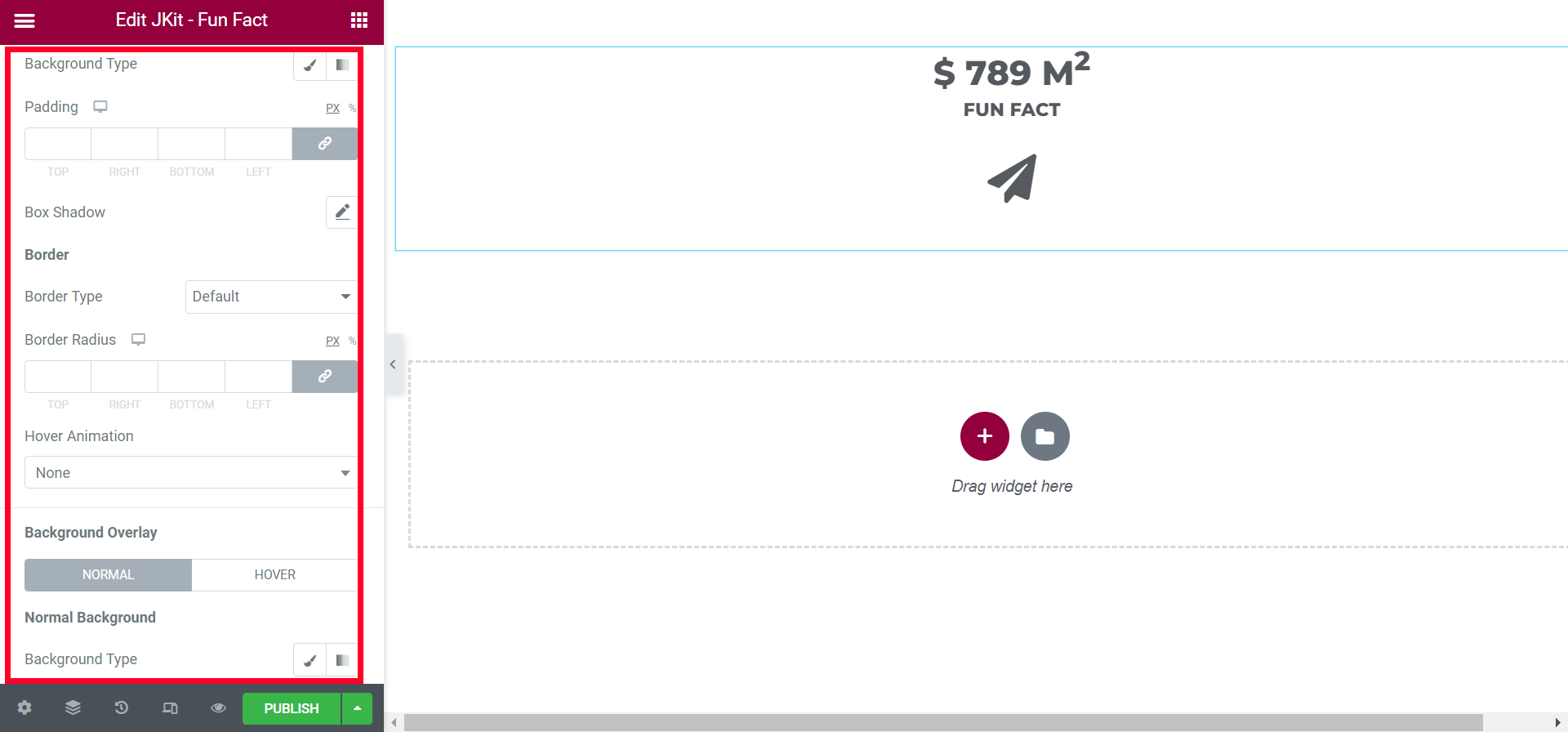
- Background Type
choose a background color - Padding
give free space - Box Shadow
give a shadow effect - Border Type
select the border type - Border Radius
tidy up all the corners of the border - Hover Animation
select the type of animation - Normal
- Background Type
choose a background color
- Background Type
- Hover
- Background Type
choose a background color when hover active - Hover Background Overlay Direction
set the styling to the direction of the background when the fun fact element is hovered
- Background Type
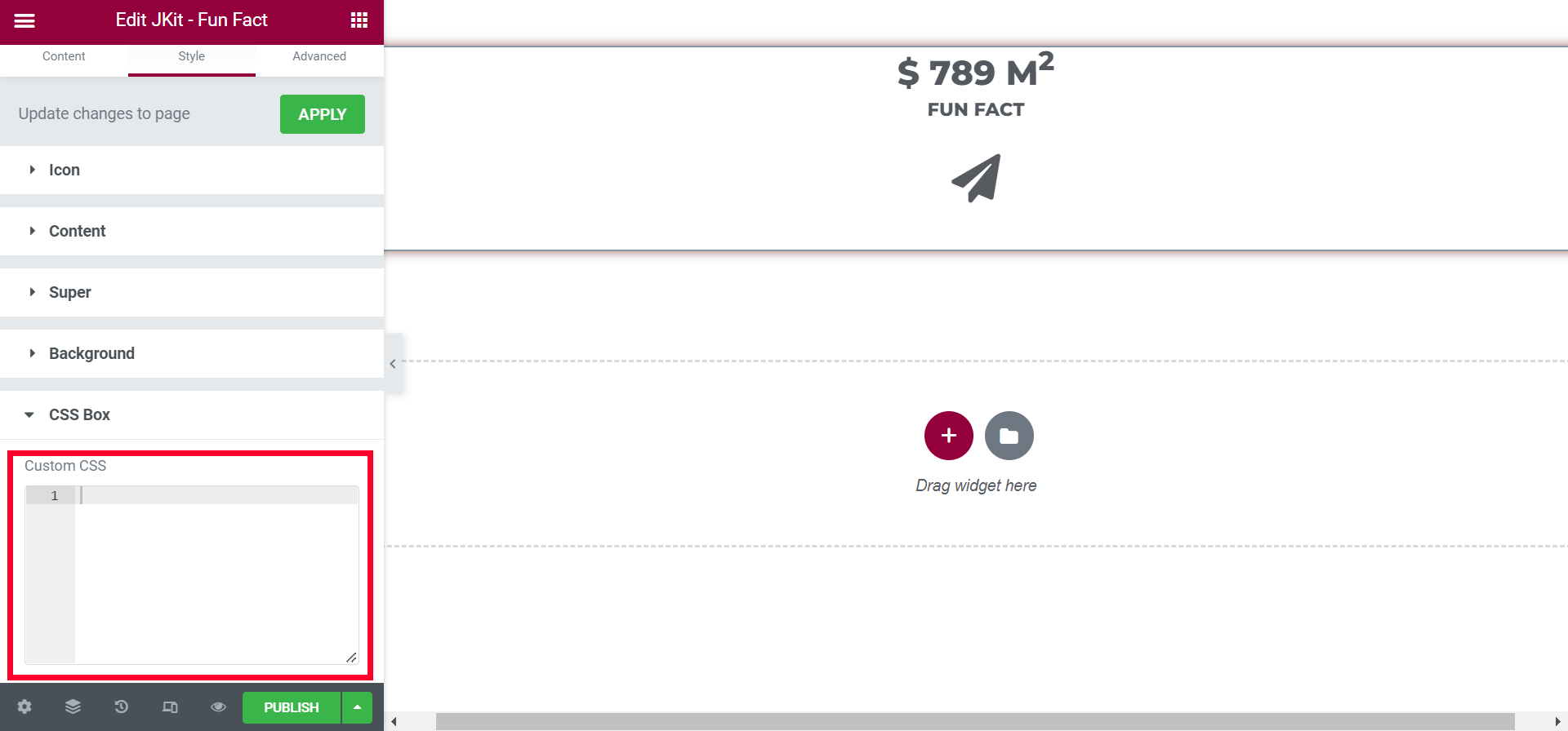
CSS BOX
You can additional CSS on this box