JKIT-NAV MENU makes it easy for you to create main menus such as HOME, OUR MENU,
This time we will give you a tutorial using JKIT Nav Menu, as follows
The guide is separated into the sections below. Click on it to navigate to the designated section.
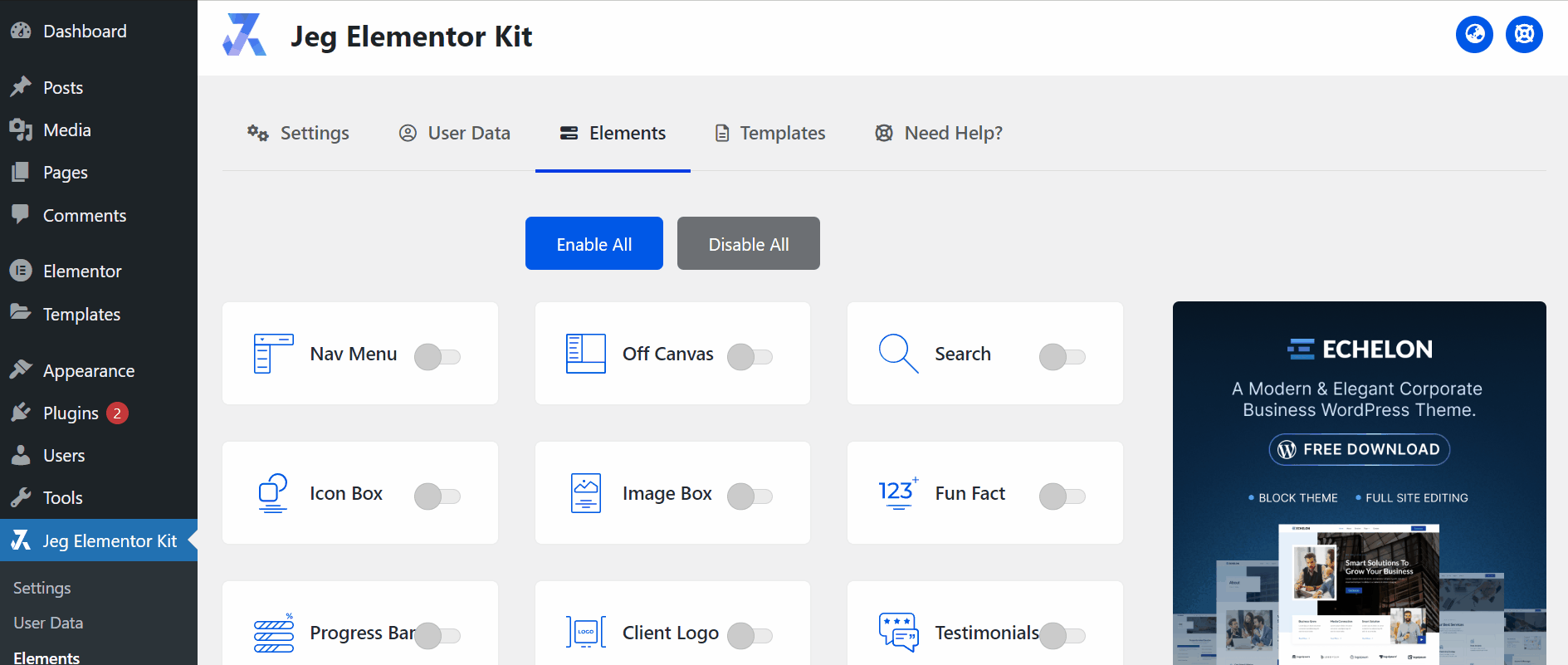
Activate JKIT -NAV MENU
Before starting, please make sure the JKit button is already activated on Jeg Elementor Kit Dashboard ➞Elements
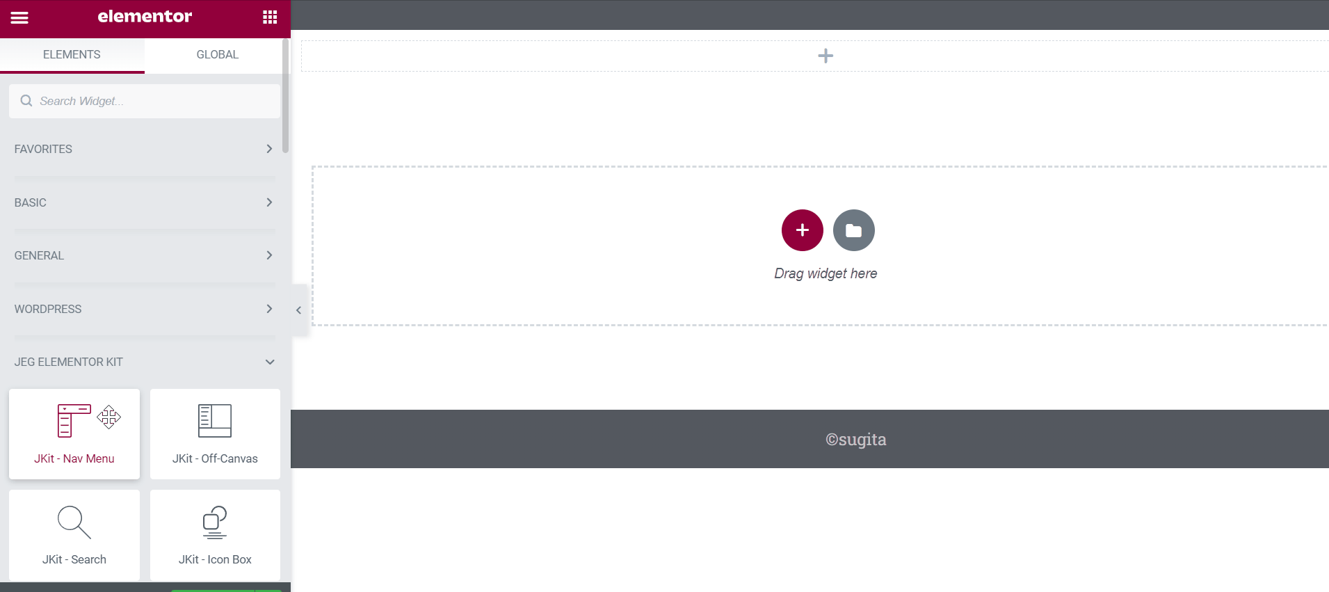
Adding JKIT NAV-MENU To The Page
to add a JKit button to your page you can open Elementor on your page after Elementor opened you can drag out the JkIT – Nav Menu
Content Setting
There are several options included in the Jkit Nav Menu content setting that you can adjust according to your need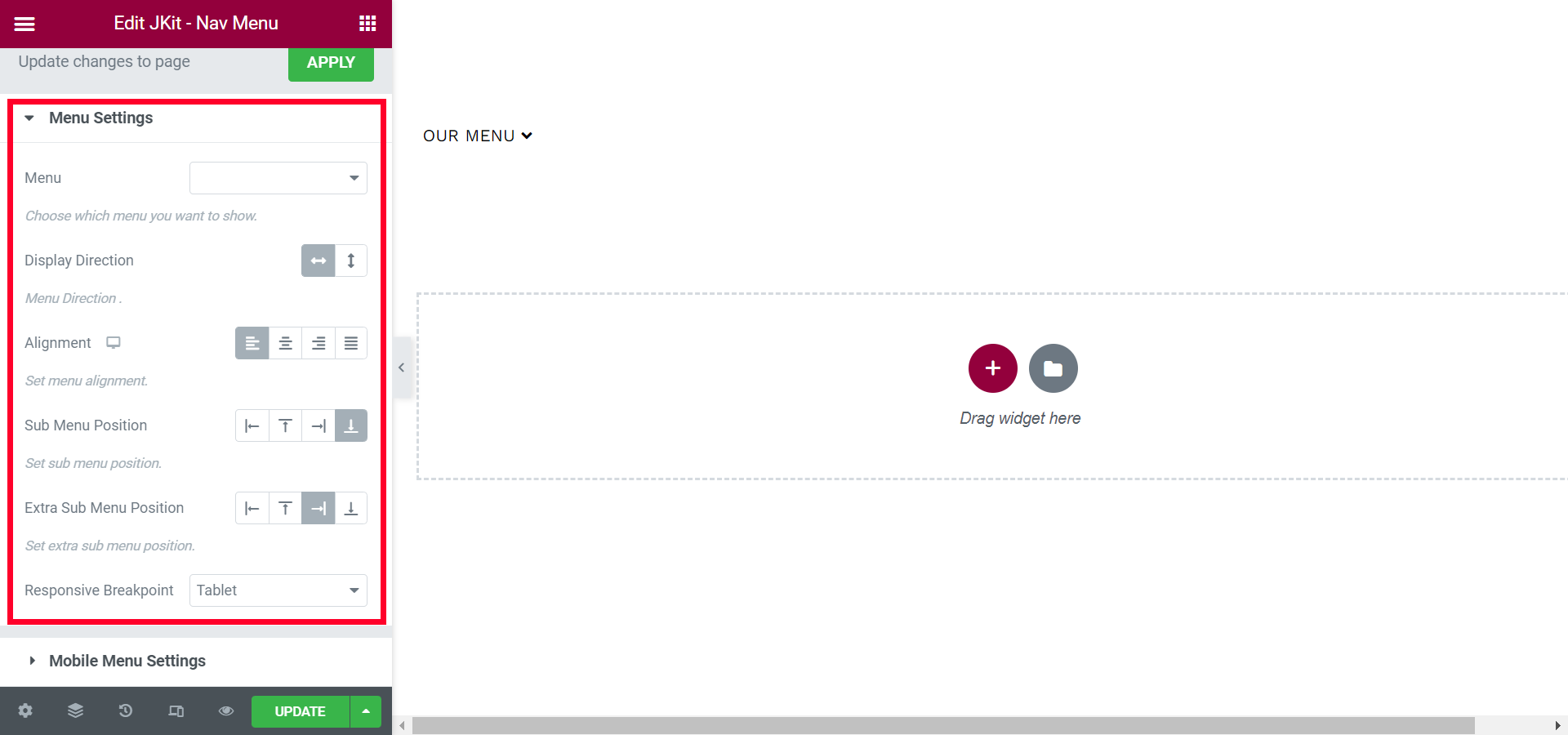
- Menu
to select an existing setting - Display Direction
Choose to play vertical or horizontal menus - Alignment
to select the main menu to be buttoned, centered, or left - Sub Menu Position
select the sub menu position - Extra Sub Menu Position
select the extra sub menu position - Responsive Break Point
Choose when Responsive will activate
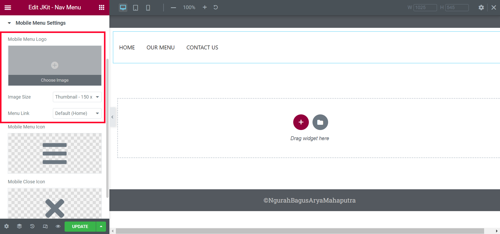
- Mobile Menu Logo
choosing a logo when mobile responsive active - Image Size
to select the size of the image - Menu Link
To add a URL to the Main Menu
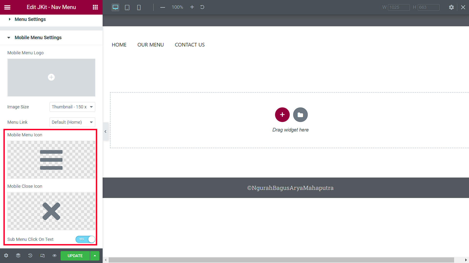
- Mobile Menu Icon
to select the mobile main menu icon - Mobile Close Icon
Select the Mobile Menu icon when you want to close the mobile menu - Sub Menu Click On The Text
To add a sub
Style Setting
You can adjust the style of the button as you like, JKit Nav Menu style settings are separated into several groups. Click on it to navigate to the designated group
Menu Wrapper
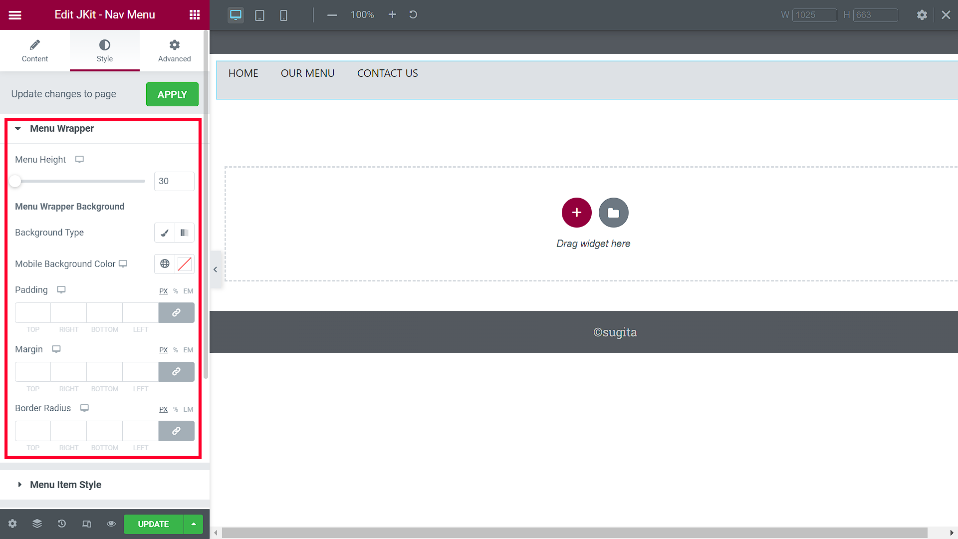
- Menu Height
selecting the high main menu - Background Type
Change the link to redirect when the button clicked - Mobile Background Color
Choosing a background color from the Main Menu - Padding
Choosing a padding size to make the main menu neater - Margin
Choosing a padding size to make the main menu neater to the center - Border Radius
tidy up the edges of the border
Menu Item Style
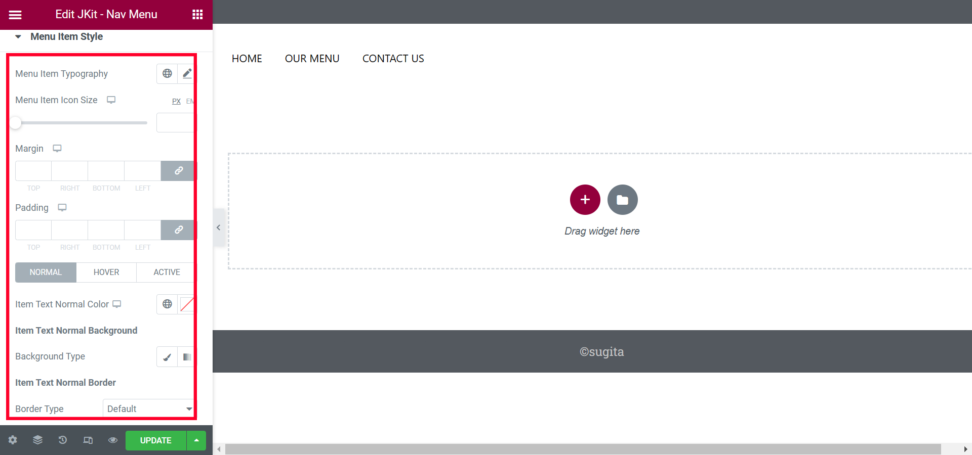
- Menu Item Typography
Choosing a font type - Menu Item Icon Size
Change the link to redirect when the button is clicked - Padding
Choosing a padding size to make the main menu neater - Margin
Choosing a padding size to make the main menu neater to the center - Normal
-
- Item Text Normal Color
Choose a Text Color - Background Type
choosing a background color - Border Type
Choosing the type of body you want
- Item Text Normal Color
-
- Hover
-
- Transition Duration
Setting the Transition Speed - Item Text Hover Background
Setting the Transition Speed - Border Type
Choosing the type of body when Hover active
- Transition Duration
-
- Active
-
-
- Transition Duration
add color on the front page when the menu page is pressed - Item Text Active Background
add color after the button is used - Border Type
add a border after the button is used
- Transition Duration
-
Sub Menu Item Style
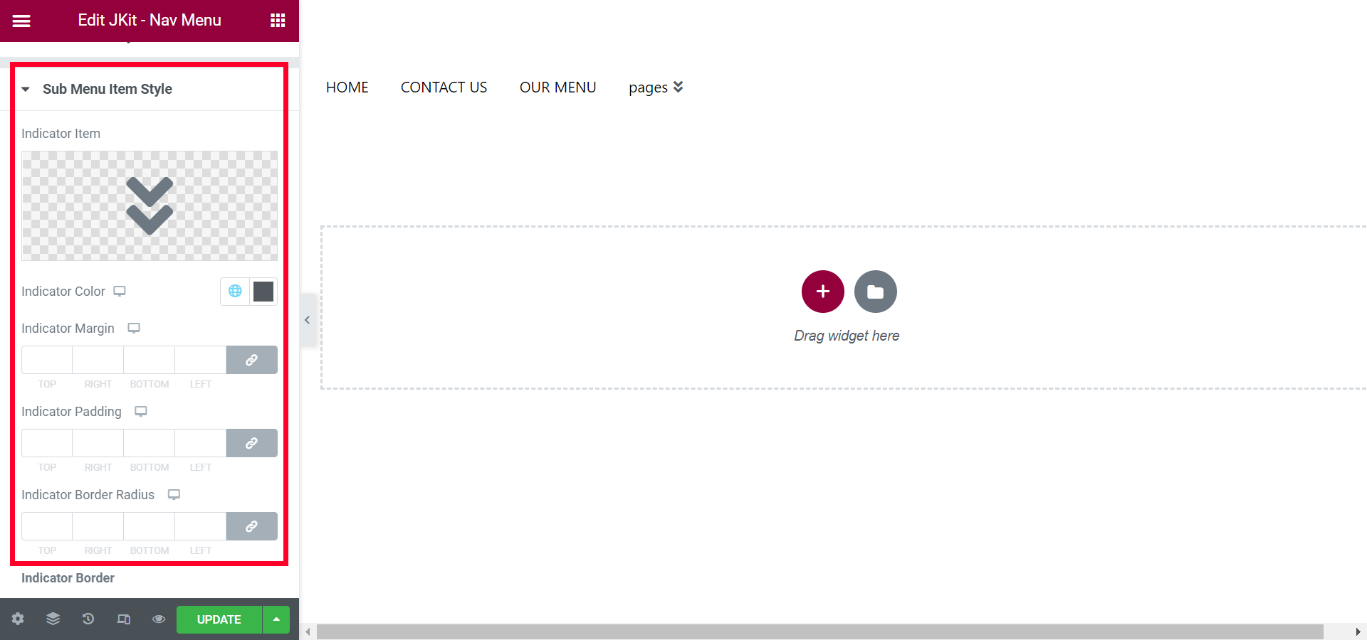
- Indicator Item
choose the indicator icon - Indicator Color
choose the color of the icon indicator - Indicator Margin
set the spacing between icon and menu - Indicator Padding
layout between icons and menus - Indicator Border Radius
tidy up the edges of the border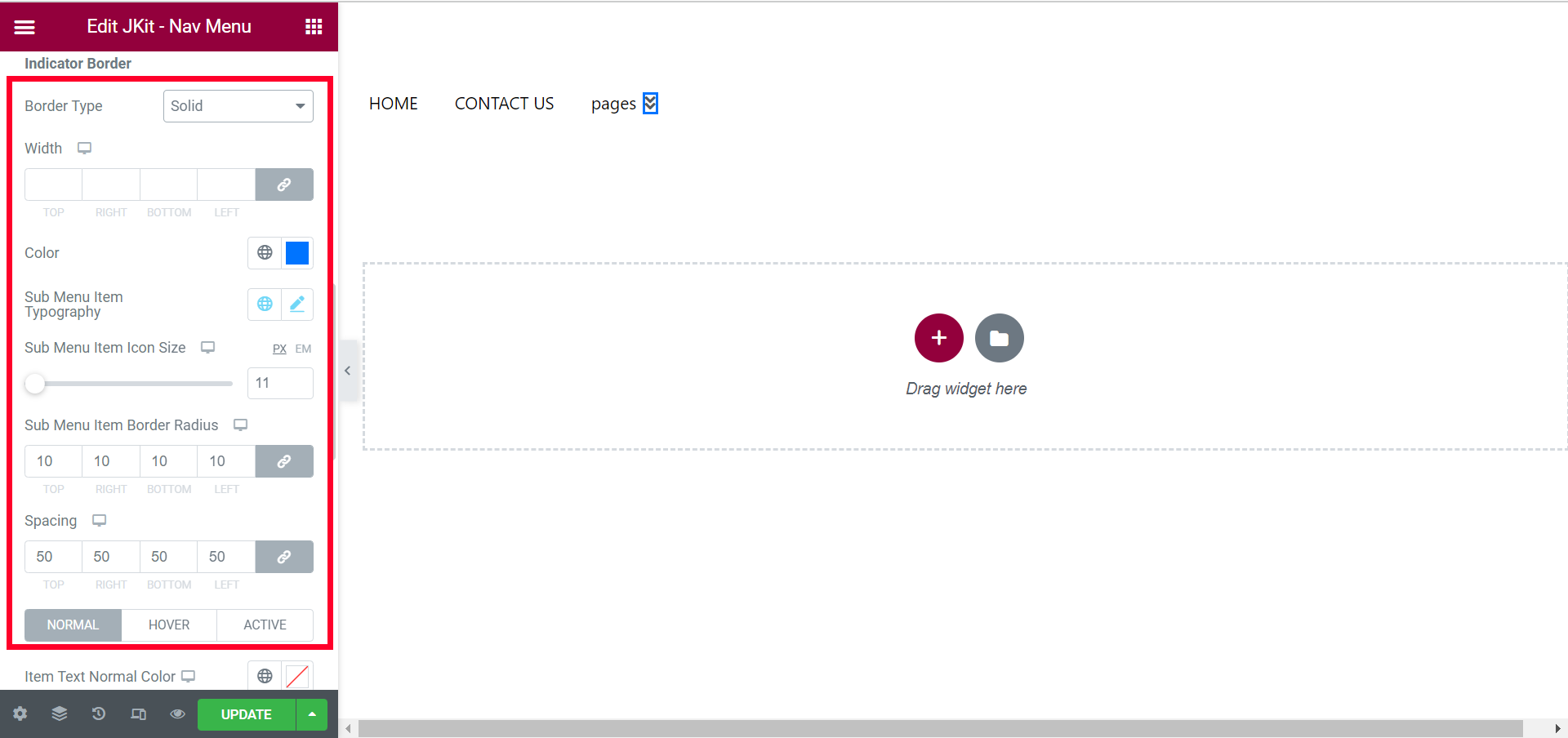
- Border Type
select the border type - Width
To thicken, thin the border - Color
choose a border color - Sub Menu Item Typography
to select the sub menu font type - Sub Menu Item Icon Size
to determine the size of the sub menu icon - Sub Menu Item Border Radius
smoothed the sub menu borders - Speacing
to expand the sub menu - Normal
- Item Text Normal Color
choose the color of the sub menu text - Item Text Active Background
add background in sub menu - Items Border
add Border in sub menu - Border Type
add Border in sub menu - Border Radius
beautify the top border - Border Type
add Border in sub menu - Border Radius
beautify the bottom border
- Item Text Normal Color
- Border Type
- Hover
- Transition Duration
set the transition speed - Item Text Hover Color
choose a transition color - Items Border
add Border in sub menu - Background Color
adding backgrounds - Border Type
add a border in the transition
- Transition Duration
- Active
-
- Item Text Active Color
choose an active color - background Type
Choose an active background - Border Type
add a border
- Item Text Active Color
Sub Menu Panel Style
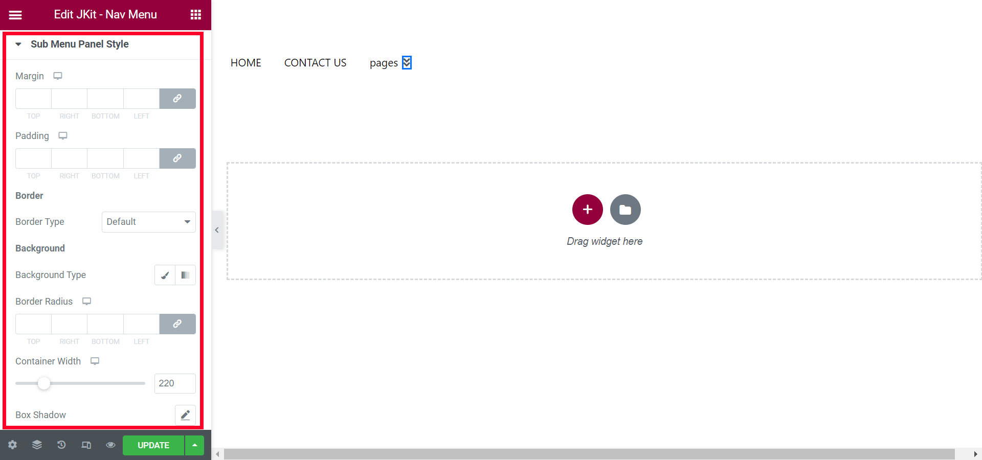
- Margin
set the spacing of sub menus - Padding
increase the size of sub menus - Border Type
choose borders - Background Type
choose the background sub-menu - Border Radius
set all angles with a certain value - Container Width
set the length of the sub menu with a certain value - Box Shadow
set the shadow of the sub menu box
Hamburger Menu Style
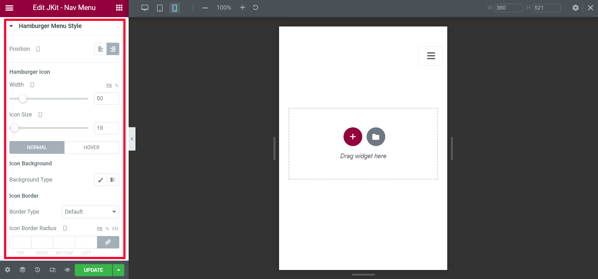
- Position
set the layout of the hamburger icon - Width
set the width with a certain Value - Icon Size
set the size of the hamburger icon - Normal
- Background Type
set the background on the hamburger icon - Border Type
choose a border type - Icon Border Radius
set all angles with a certain value - Icon Color
change the icon color - Margin
Adjust the position of the icon to make it tidier - Padding
give free space - Width close icon
set the width of the close icon - Icons Size close icon
set the size of the close icon
- Background Type
- Hover
- Background Type
set the background - Border Type
choose a border type - Icon Hover Border Radius
set all angles with a certain value - Icon Hover Color
change the icon hover color - Margin
Adjust the position of the icon hover to make it tidier - Padding
give free space - Width close icon
set the width of the close icon - Icons Size close icon
set the size of the close icon
- Background Type
- Normal close Icon
-
- Background Type
set the background on the close icon - Border Type
choose a border type - Icon Border Radius
set all angles with a certain value - Close Color
change the icon color - Margin
Adjust the position of the icon to make it tidier - Padding
give free space - Width
set the width of the close icon - Icons Size
set the size of the close icon
- Background Type
Mobile Menu Logo
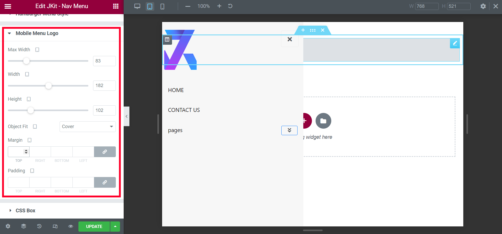
- MAx Width
used to provide a maximum width limit - Width
set the width of the logo icon - Height
adjust the height according to your needs - Object Fit
Select the size of the image according to the container - Margin
Adjust the position of the icon to make it tidier - Padding
give free space
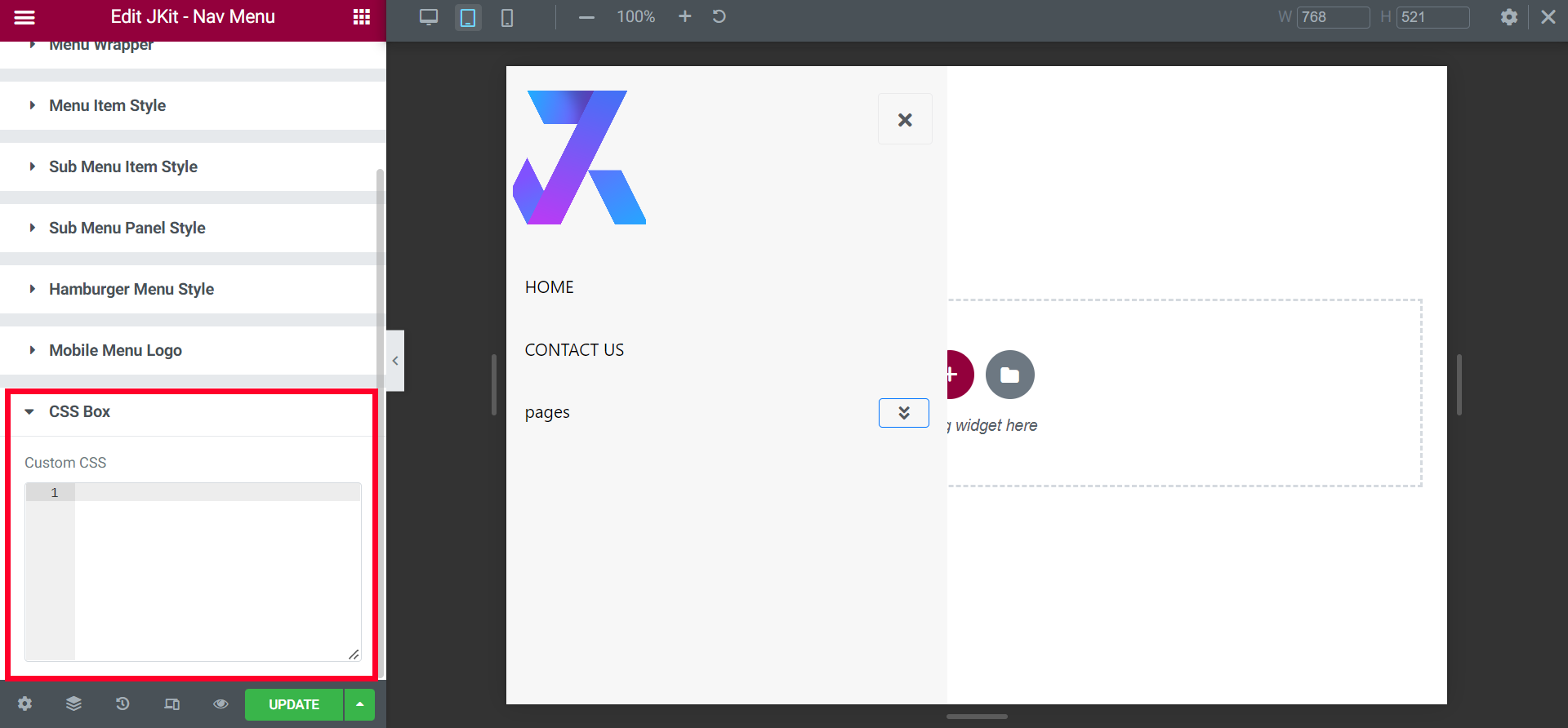
Css Box
You can additional CSS on this box